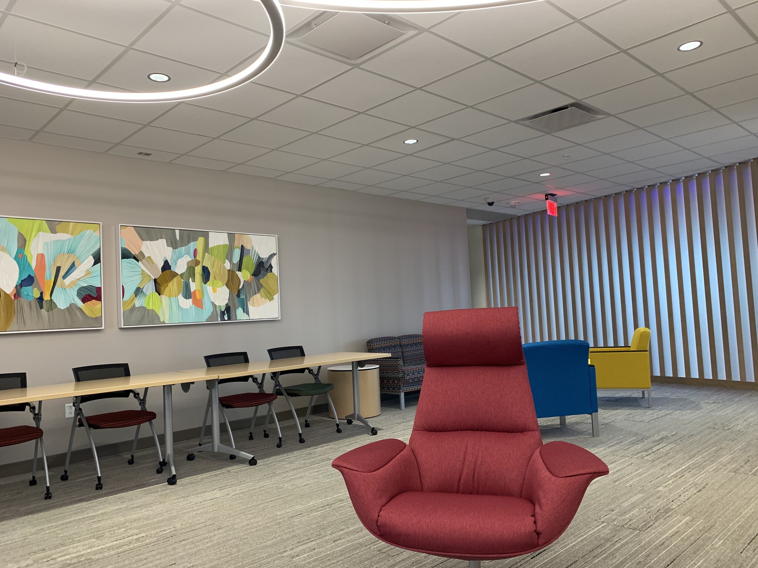
Shannon had the opportunity to tour the new SSM Health / St. Louis University hospital in the Tiffany Neighborhood. I was lucky enough to tag along.
Man, what a feat of engineering and modern process flow we just witnessed. I am humbled once again by healthcare workers, designers, architects, engineers and construction workers who can execute something on this scale.
Before I share our experience, I need to come clean and say that over the years I’ve been critical of the treatment of the Pevely Building and others that were razed along Grand near Chouteau. I’ve also been critical of suburban designs, site plans and land banking/acres of grass that St. Louis University (SLU) has produced since we moved here in the 1990s.
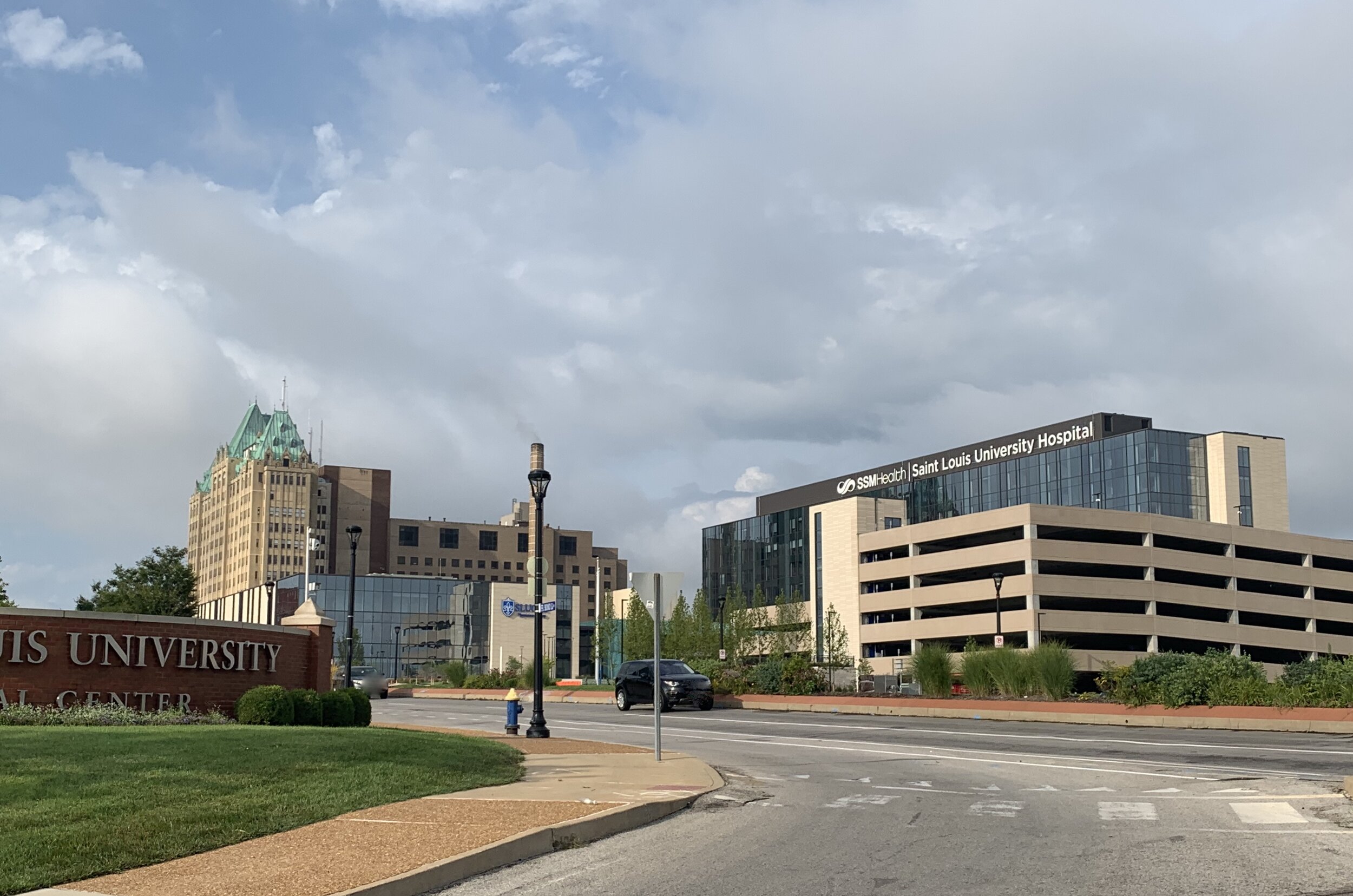
I stand by that criticism of both process and outcome; but, I am a realist and know that hospitals are unique structures and the massive St. Louis hospitals serve a sizable number of patients from far away in Missouri, Illinois and beyond. Parking is necessary; yet, it should always be shielded from views from the streets. As of today, the structured parking is not shielded from Grand and Chouteau, in fact it is front and center. That could of course change with future infill, but today, it is prominent.
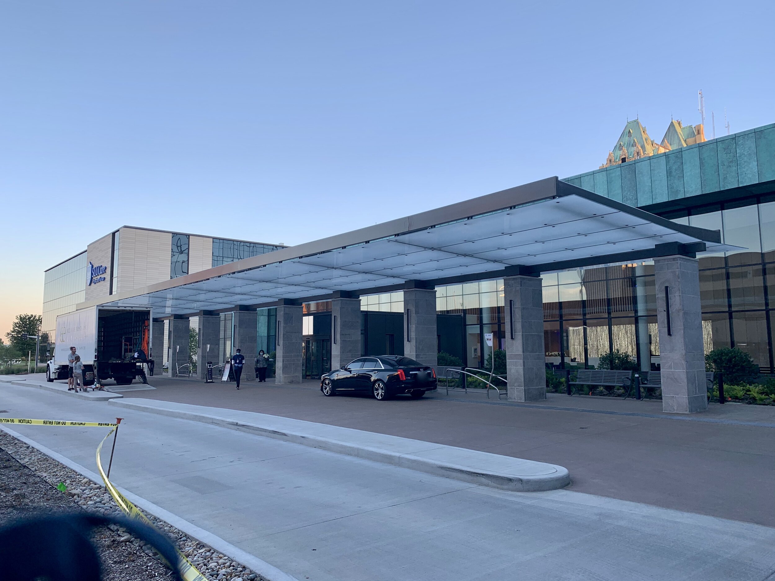
On the other hand, the SLU Care Physicians Group building along Grand is well placed and looks handsome as a city building.
I have hope that recent leadership changes can steer a ship in the right direction when it comes to SLU-owned properties. I have lots of love for SLU and want nothing more success for them and to be an urban campus that is part of our city, not an impenetrable island within our city.
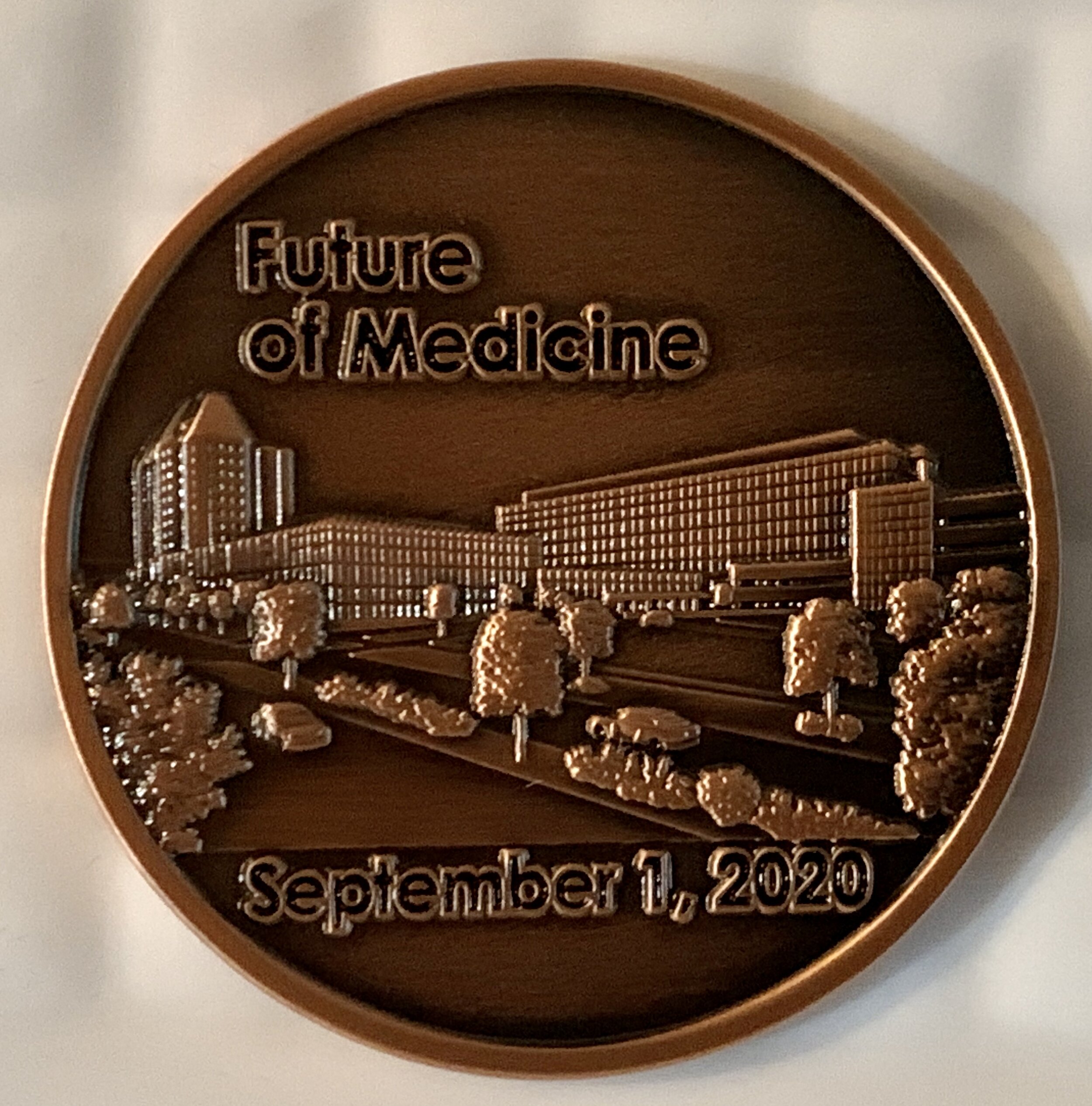
For this post, the focus is on the new $550M hospital, physicians building and parking structure that should officially open on September 1, 2020.
We entered the parking garage from South Grand and noticed plenty of protected bike racks, placed right at the ground level corner with a ramp for easy entry. There are electric vehicle charging stations, and the interior overhead lighting is designed to glow with various colors, blue for handicapped spots and green for open spots on each level.
It’s a harbinger of the hi-tech approach that permeates the design of these buildings.
We were informed that the engineers and architects interviewed professors and health care workers to get feedback on the ideal design of the ambulatory care, physicians and hospital buildings.
The protected drop-off and lobby entrance that connect the physician’s building and hospital has nods to the copper patina look of the Fermin Desloge hospital tower and other buildings that give SLU a unique calling card.
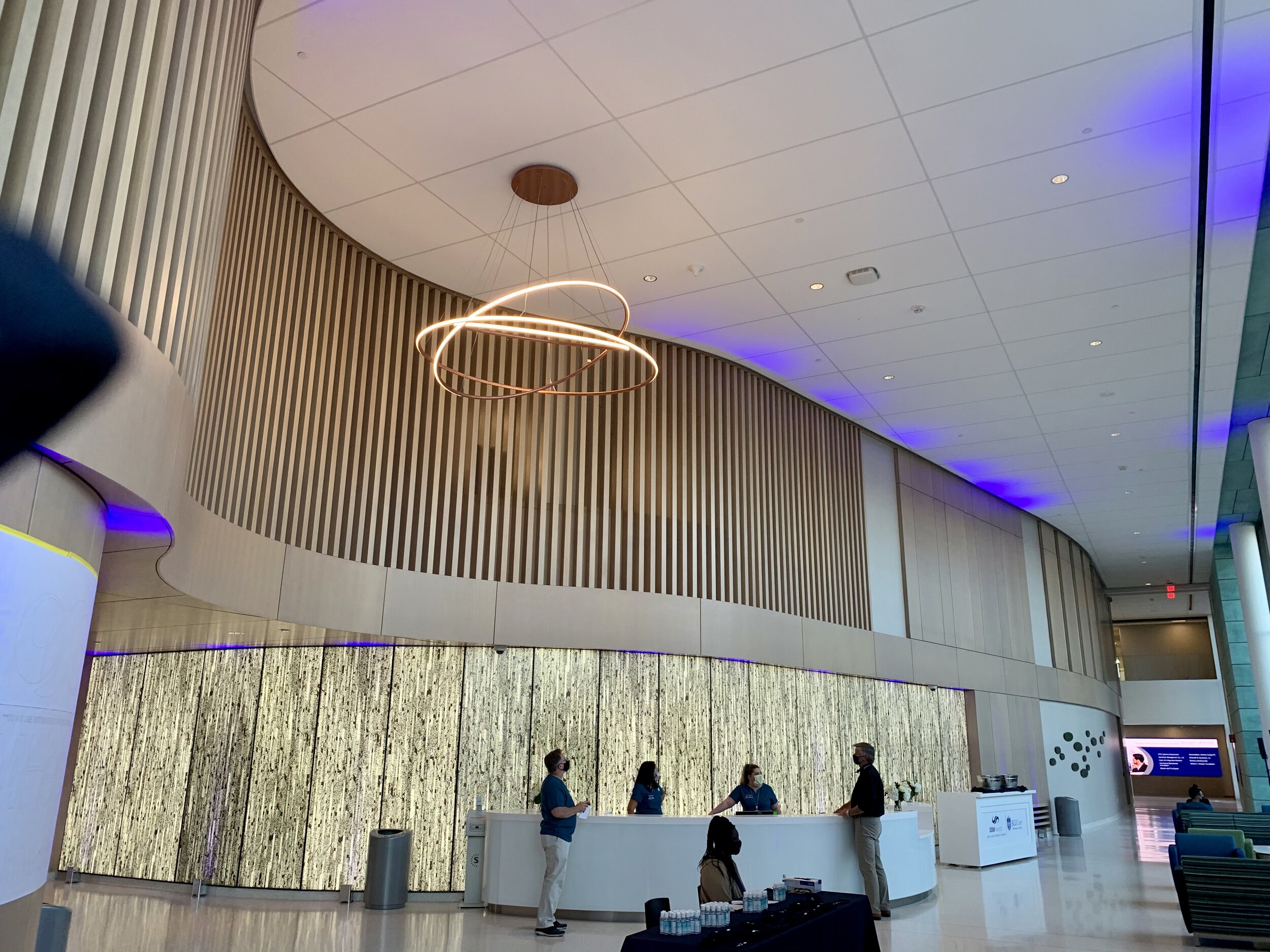
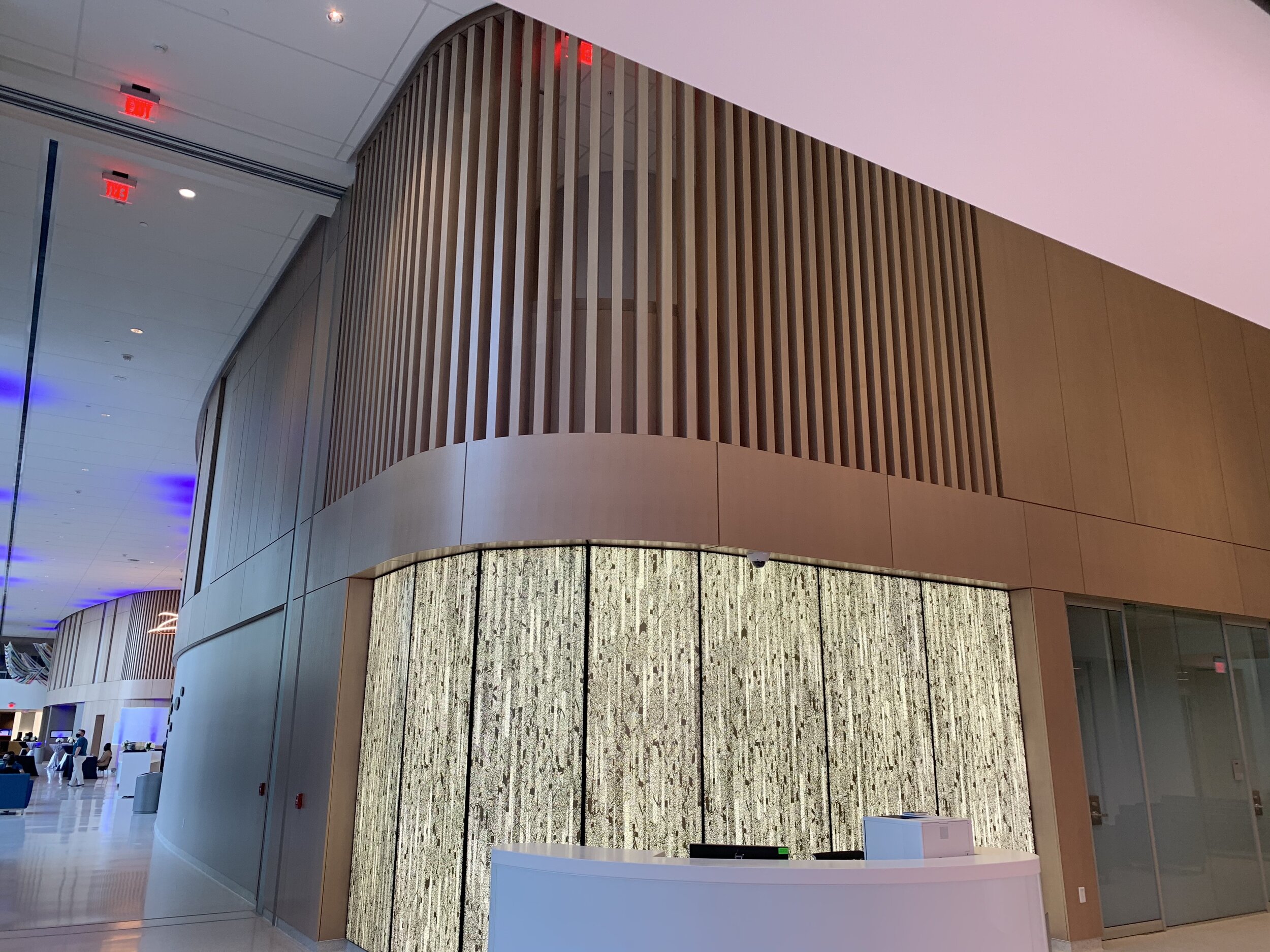
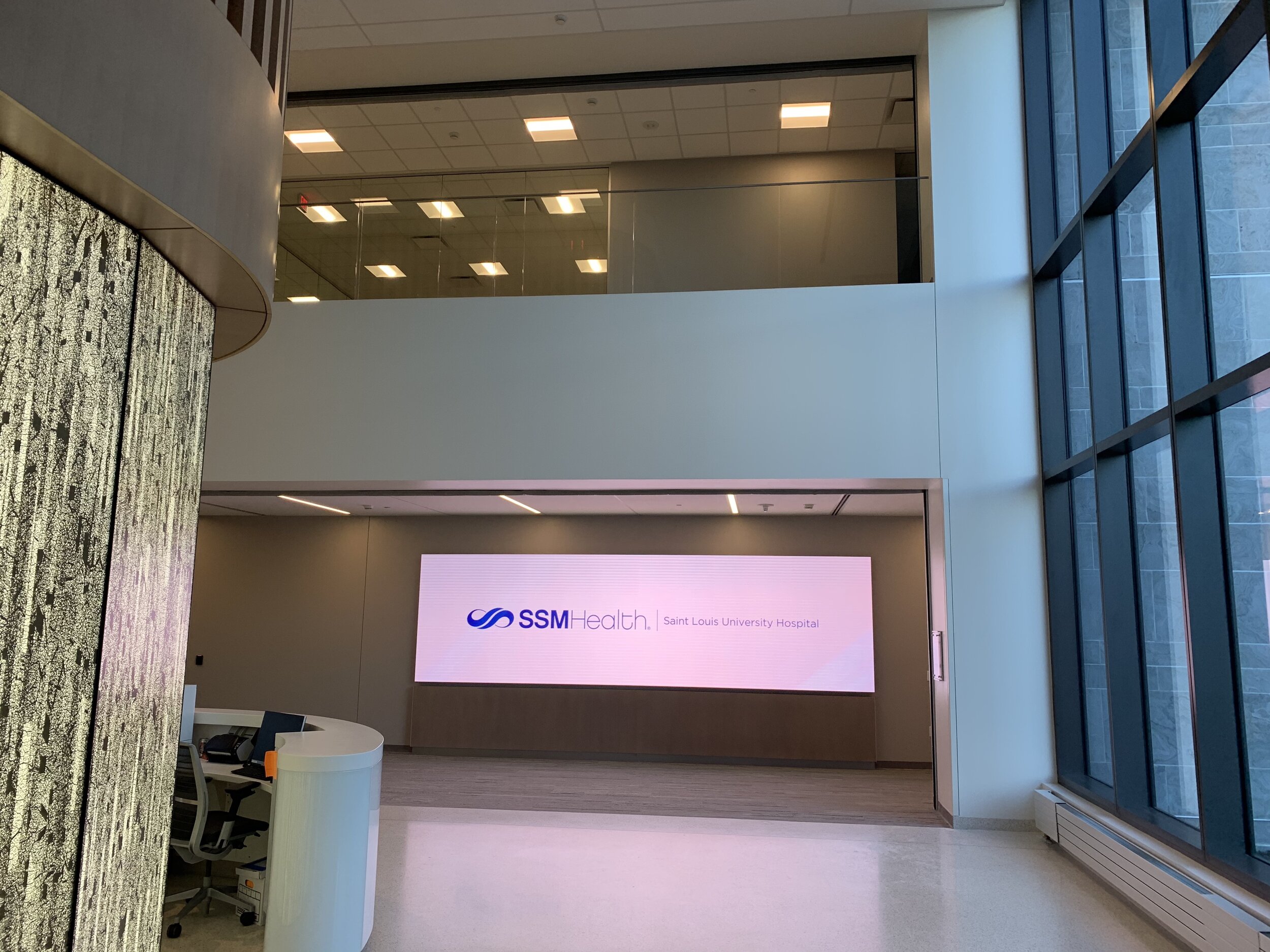
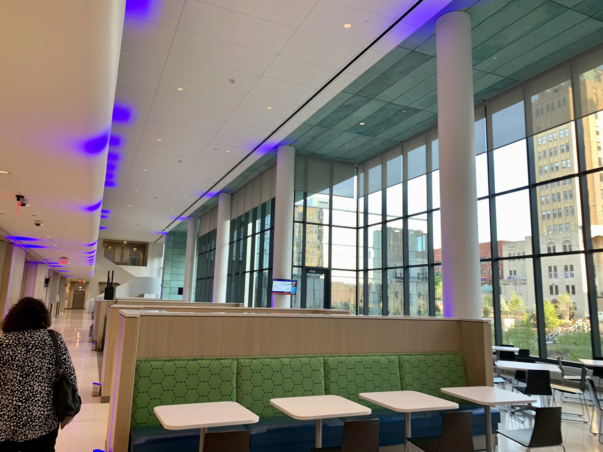
The lobby connecting the two new buildings is bright, tall and open. There are massive digital screens to provide visitors and employees with real time information.
High-process design is the overall theme of these facilities. You can see LEAN and Six Sigma methodology all over them. It flows seamlessly from one area to another with process and efficiency first of mind. And not just for employees, teachers and residents, the patient’s experience is fully prioritized.
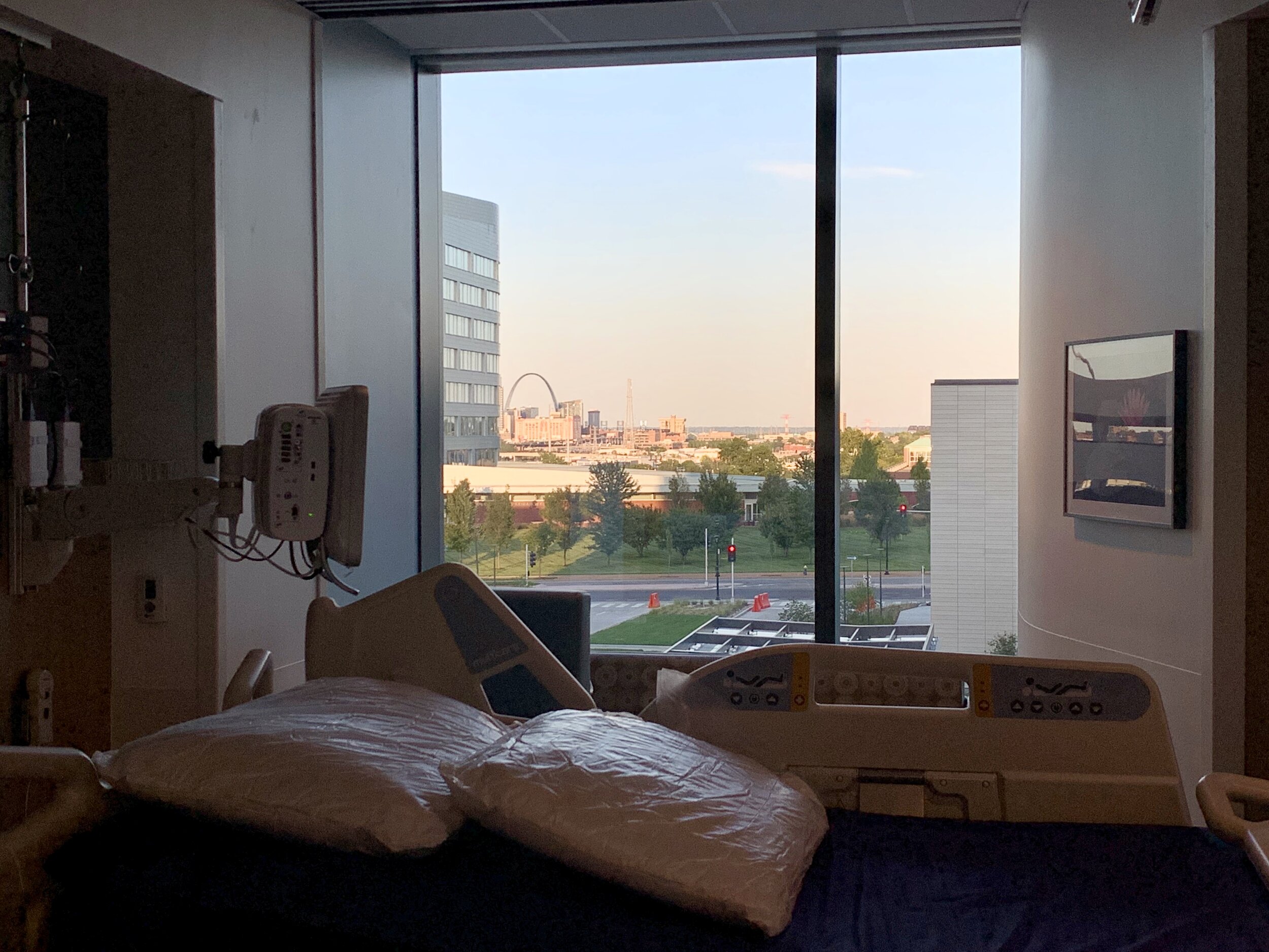
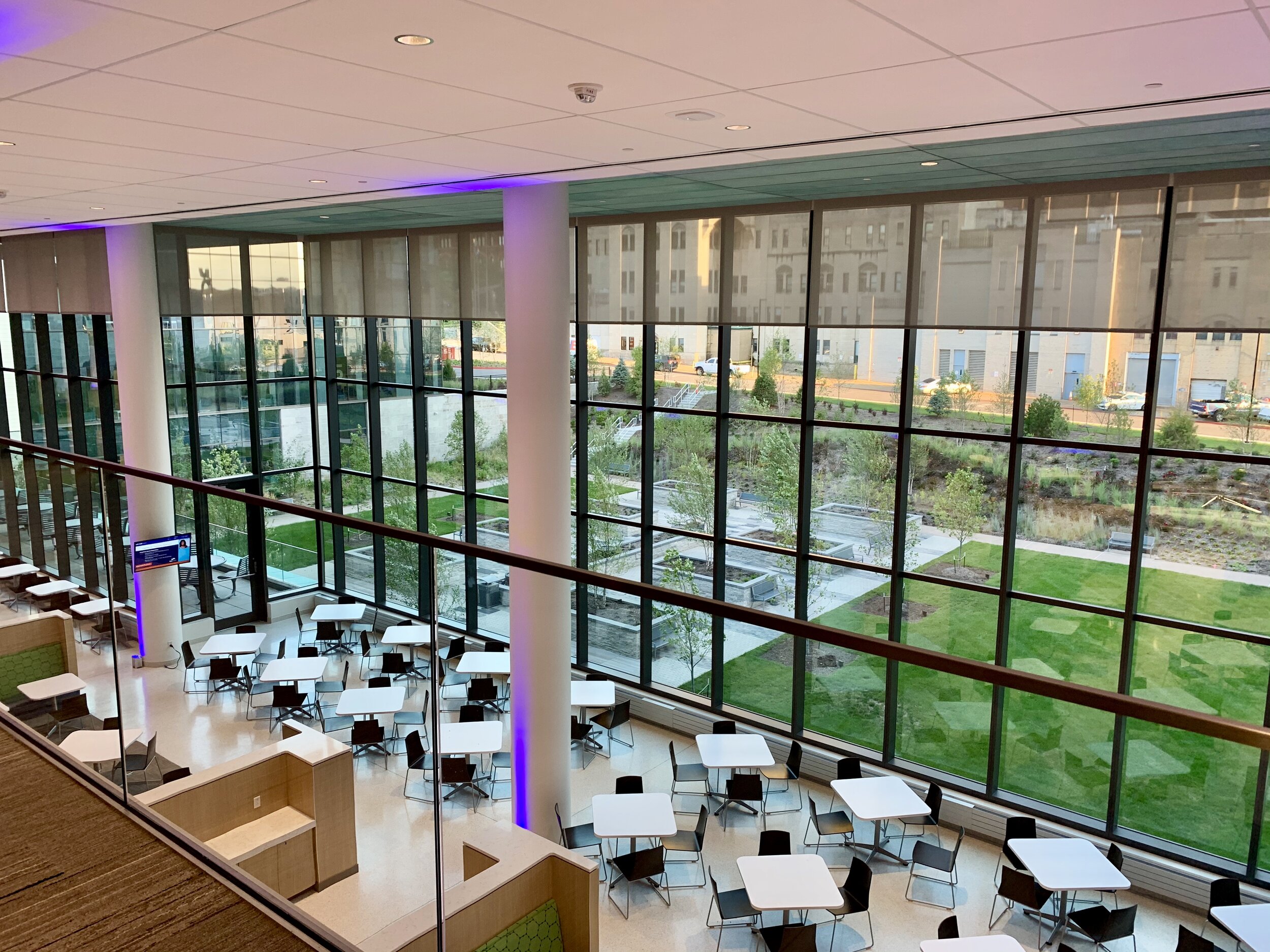
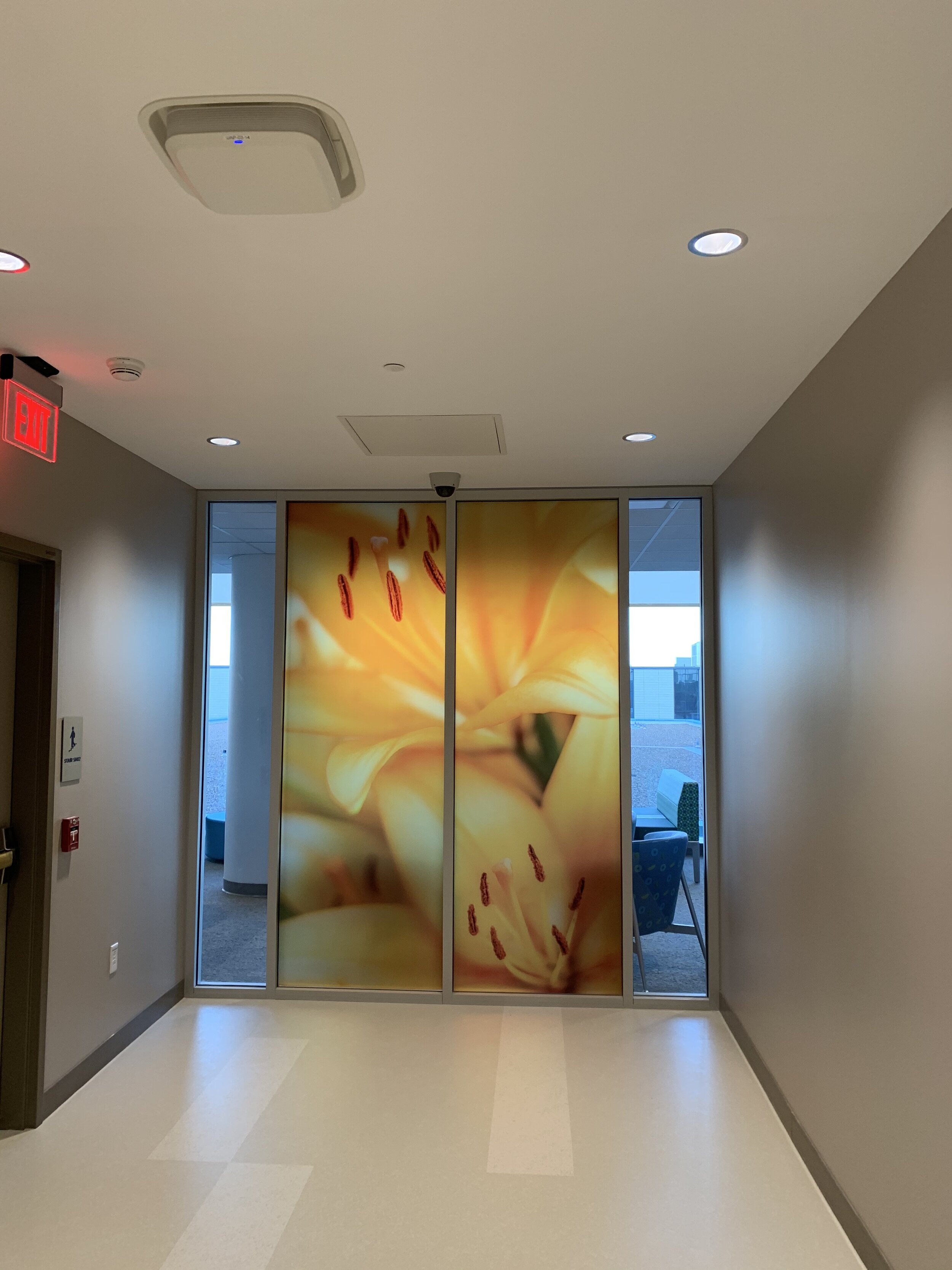
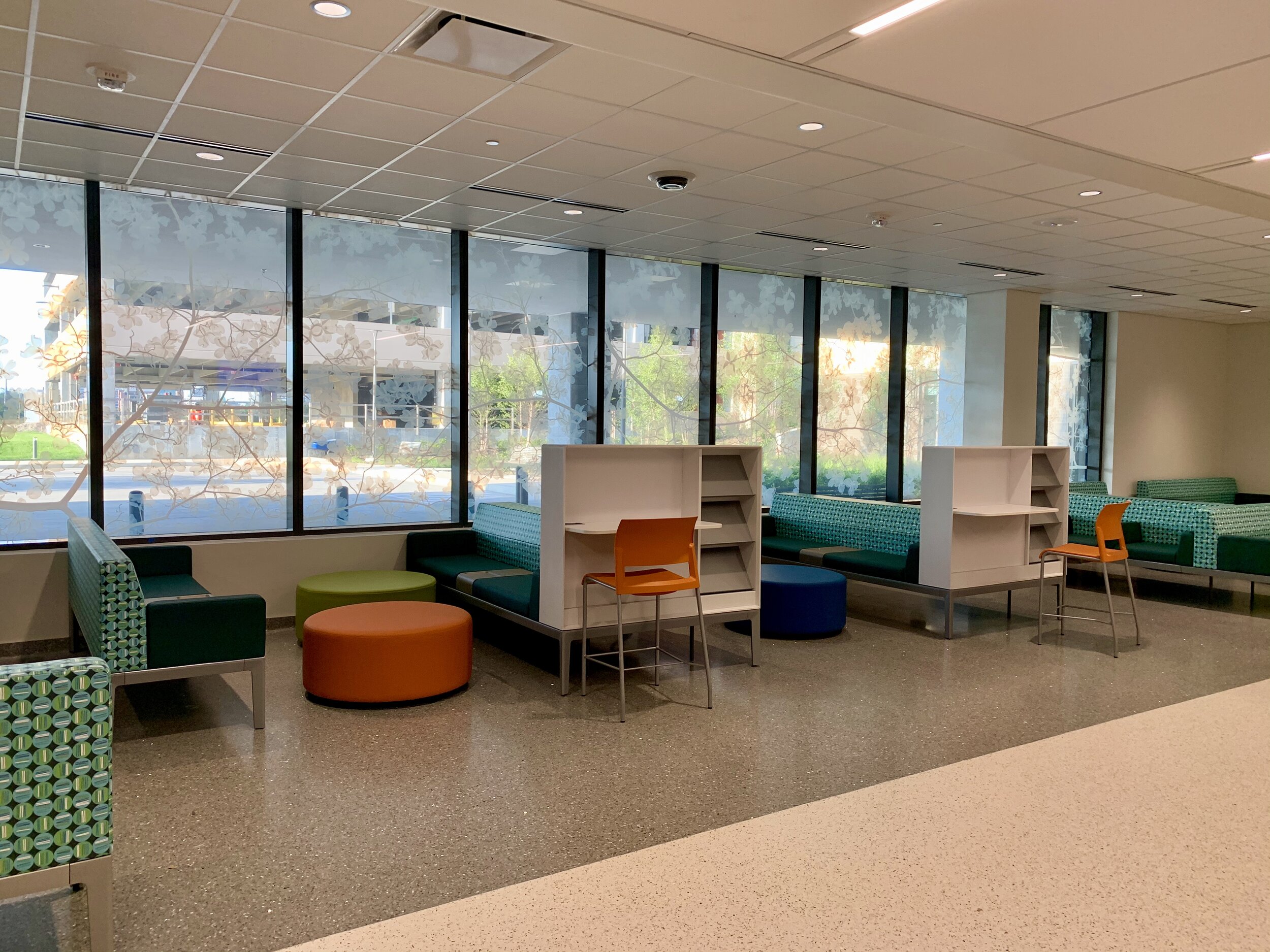
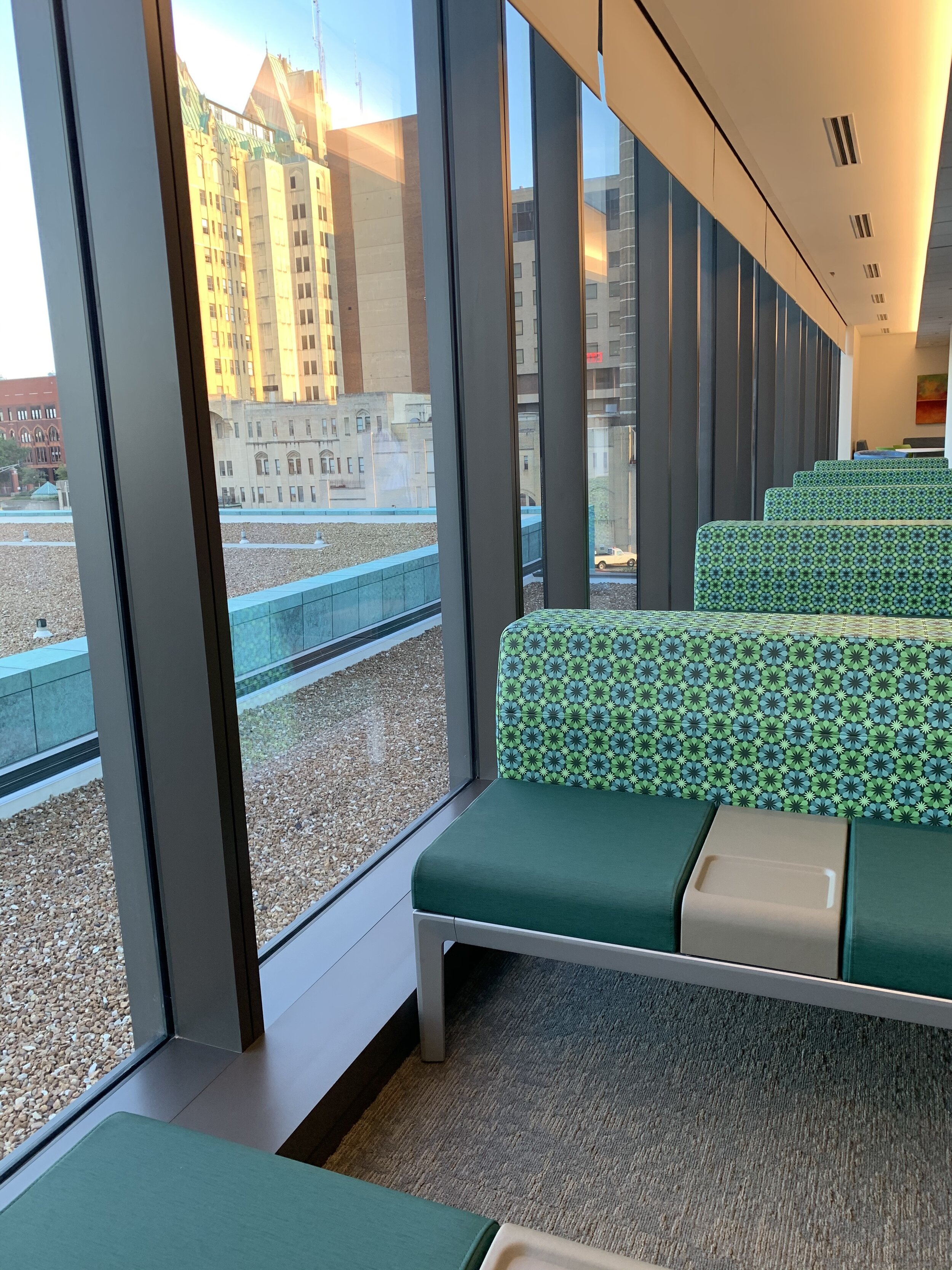
The other pervasive element is copious natural light. I’ve never seen a hospital with as much attention to patient, visitor and employee health and aesthetics.
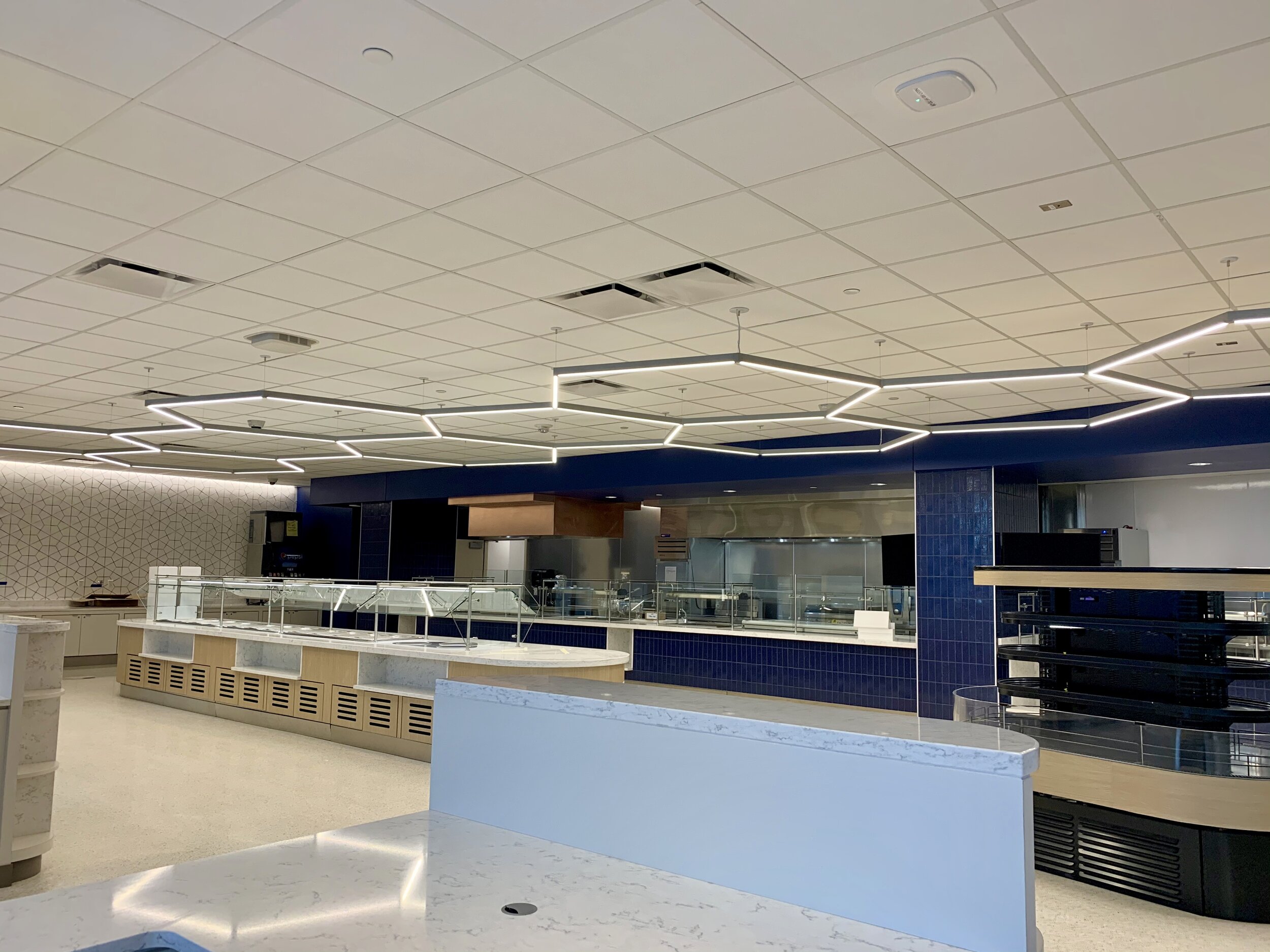
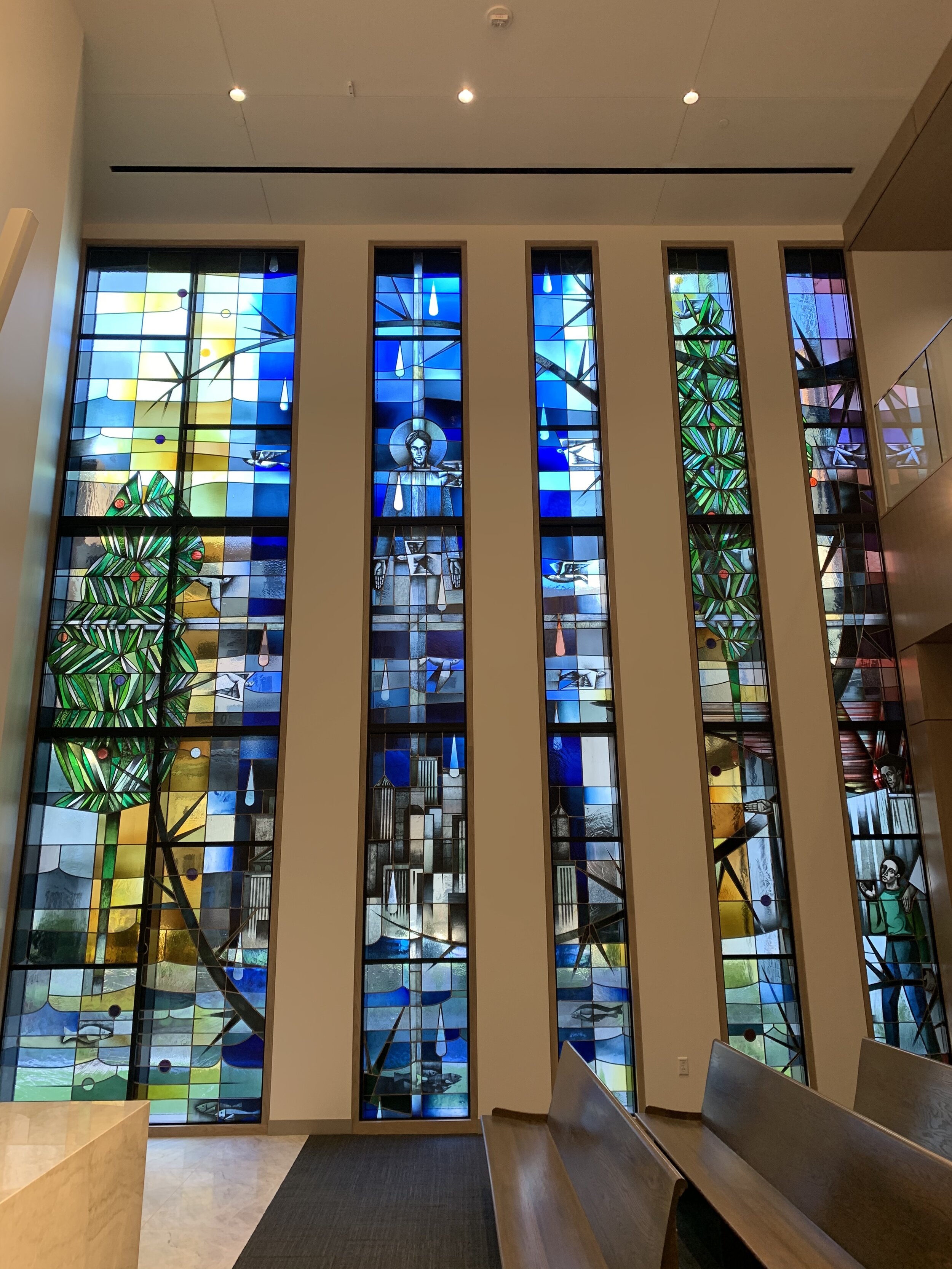
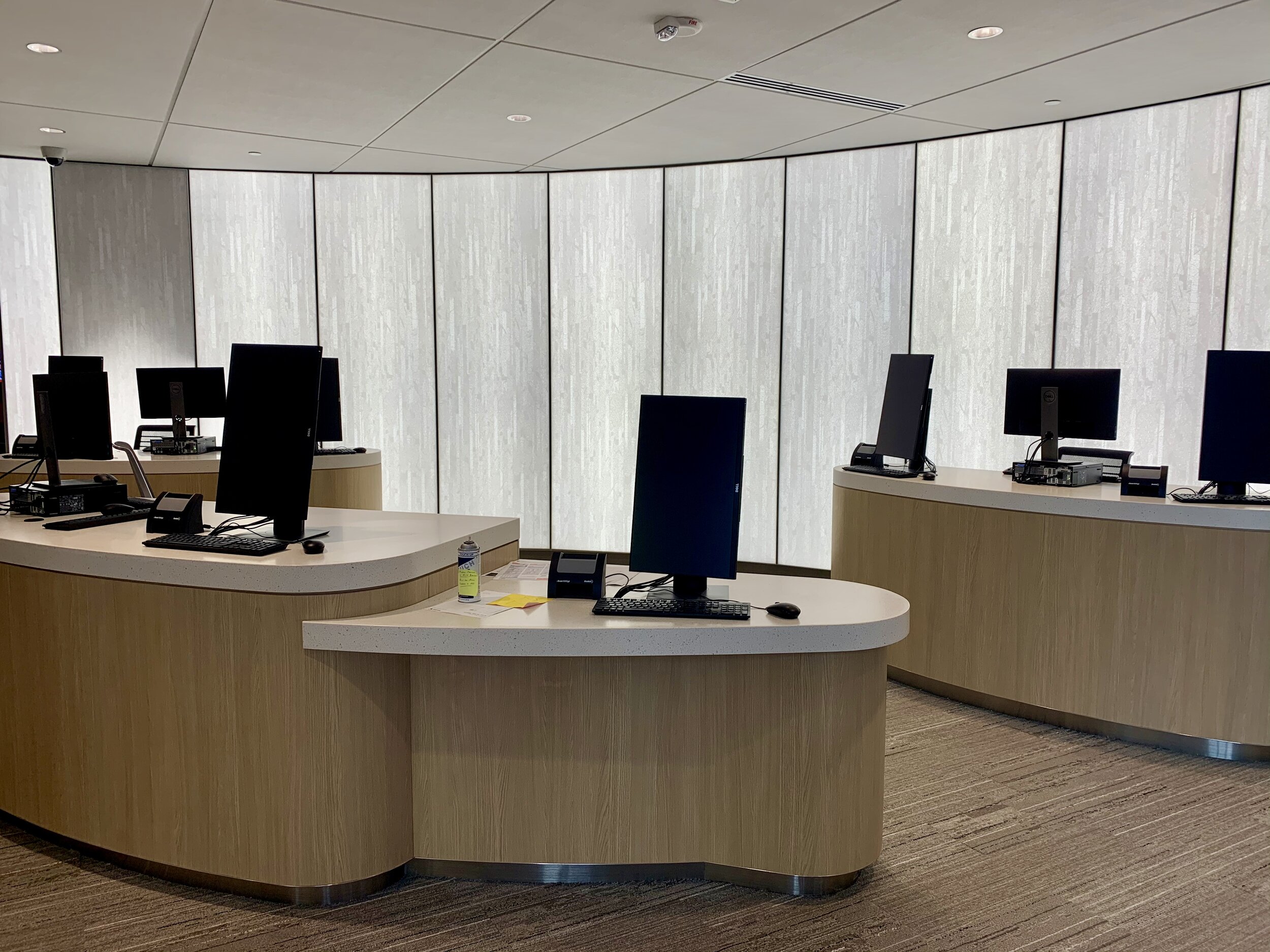
Natural and creative LED lighting emanates in the most unexpected places like the patient rooms, the cafeteria, the chapel and check-in areas.
The cafeteria dining space overlooks a garden area between the new connector and the old hospital complex.
The employee workout space/gym overlooks Grand and has floor to ceiling windows.
Again, the patient health and well-being was clearly prioritized; but the interns, employee and teaching aspect was considered as well, separating the patient from the small army of people learning, observing and training for future health care careers.
The tour guide was from SSM marketing, but his description of how everything was designed enlightened those on the tour. Everyone kept saying, “this makes sense” and “I’ve never seen a hospital so inviting and bright and easy to navigate”.
The halls are labelled like a street grid, with street-like signs with various names like “Community Avenue” to orient visitors who aren’t used to massive structures like this. Believe it or not, this really helped me get grounded on where I was in a place I will only visit once or twice a year.
The ambulatory care center is the utmost example of stepwise care. There is an immediate holding area for diagnosis with chemical showers immediately inside the entrance should a patient need optical or full body rinse. The spaces flow through the various stages of care and admission and next steps.
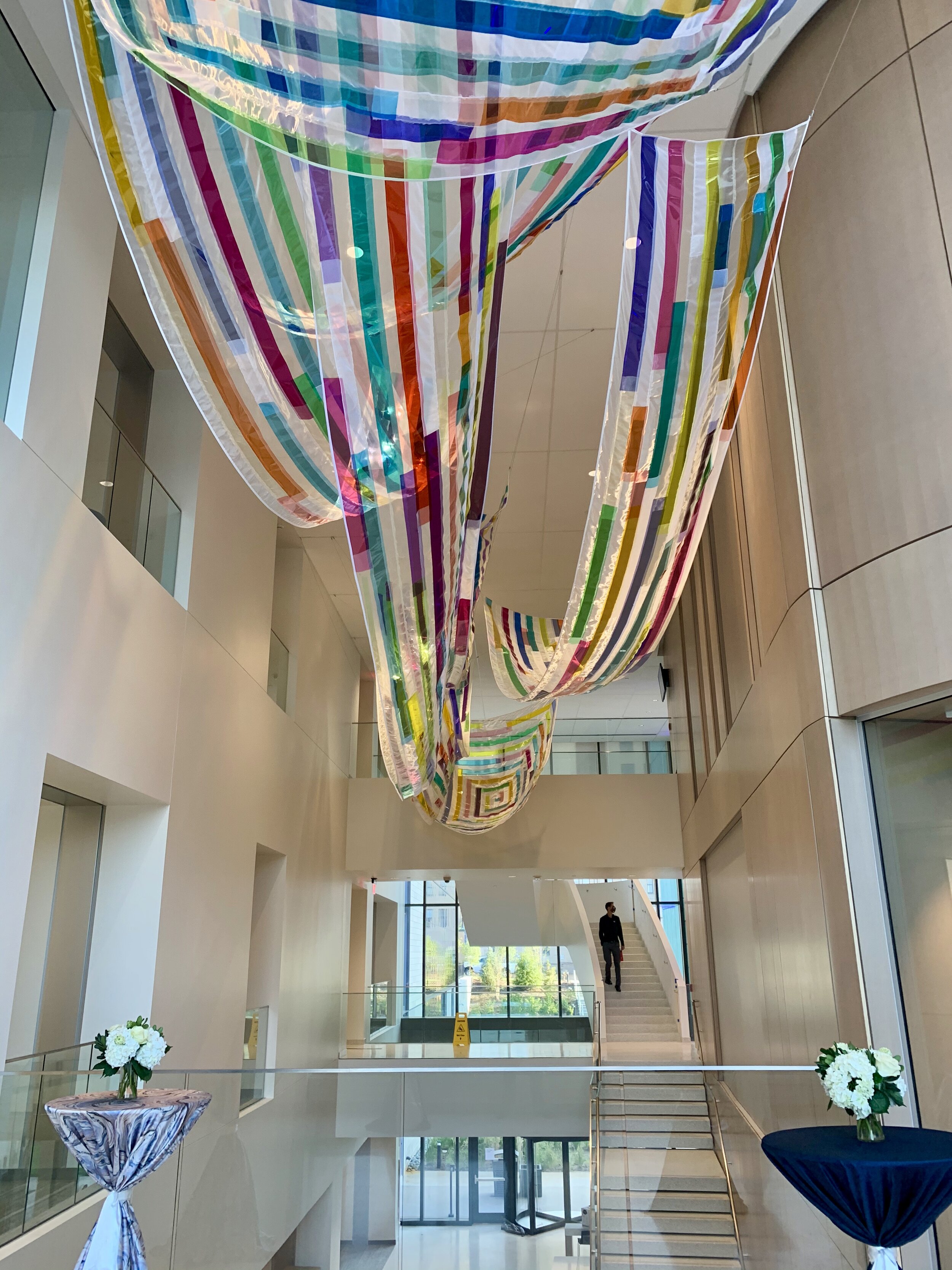
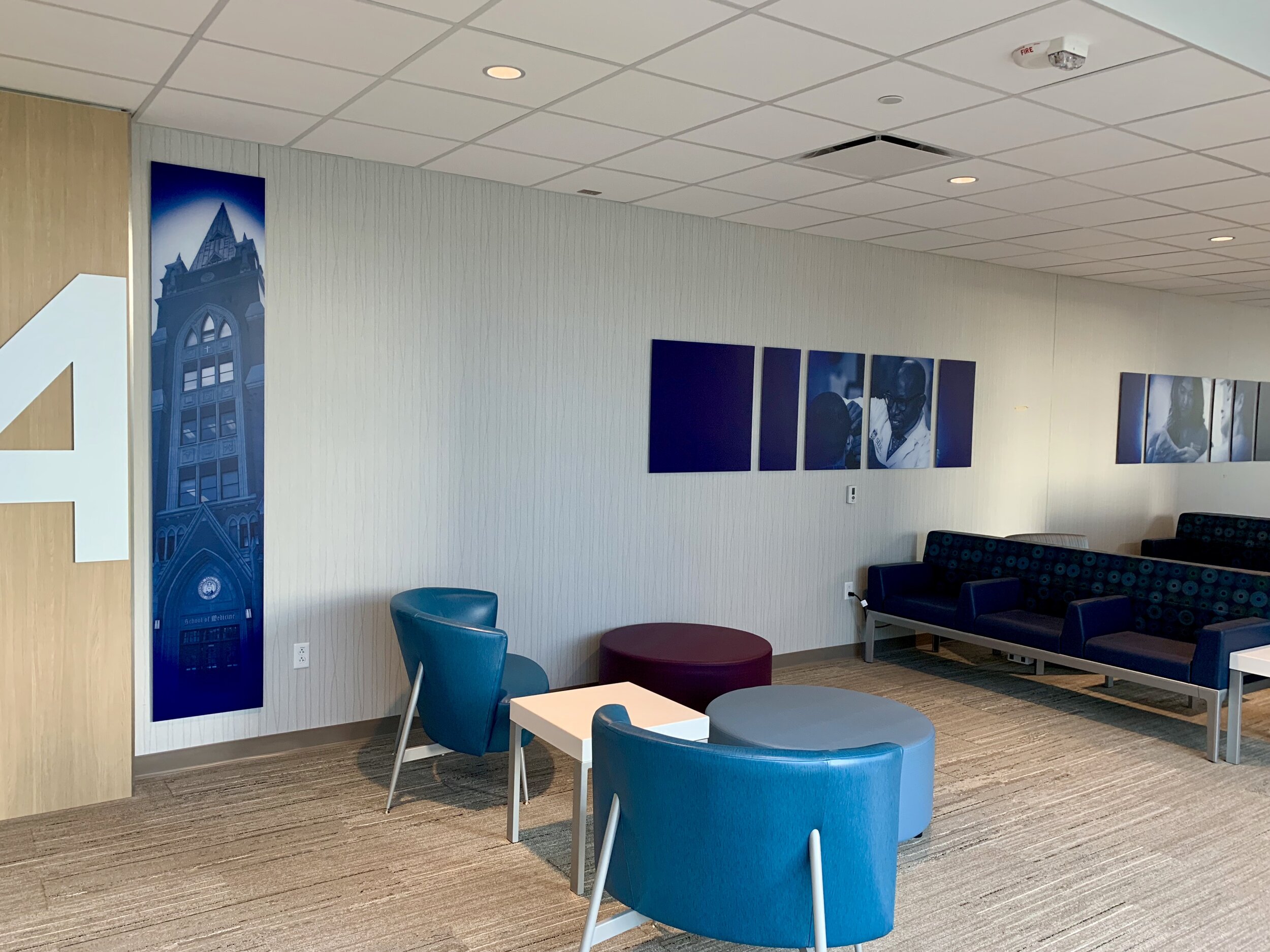
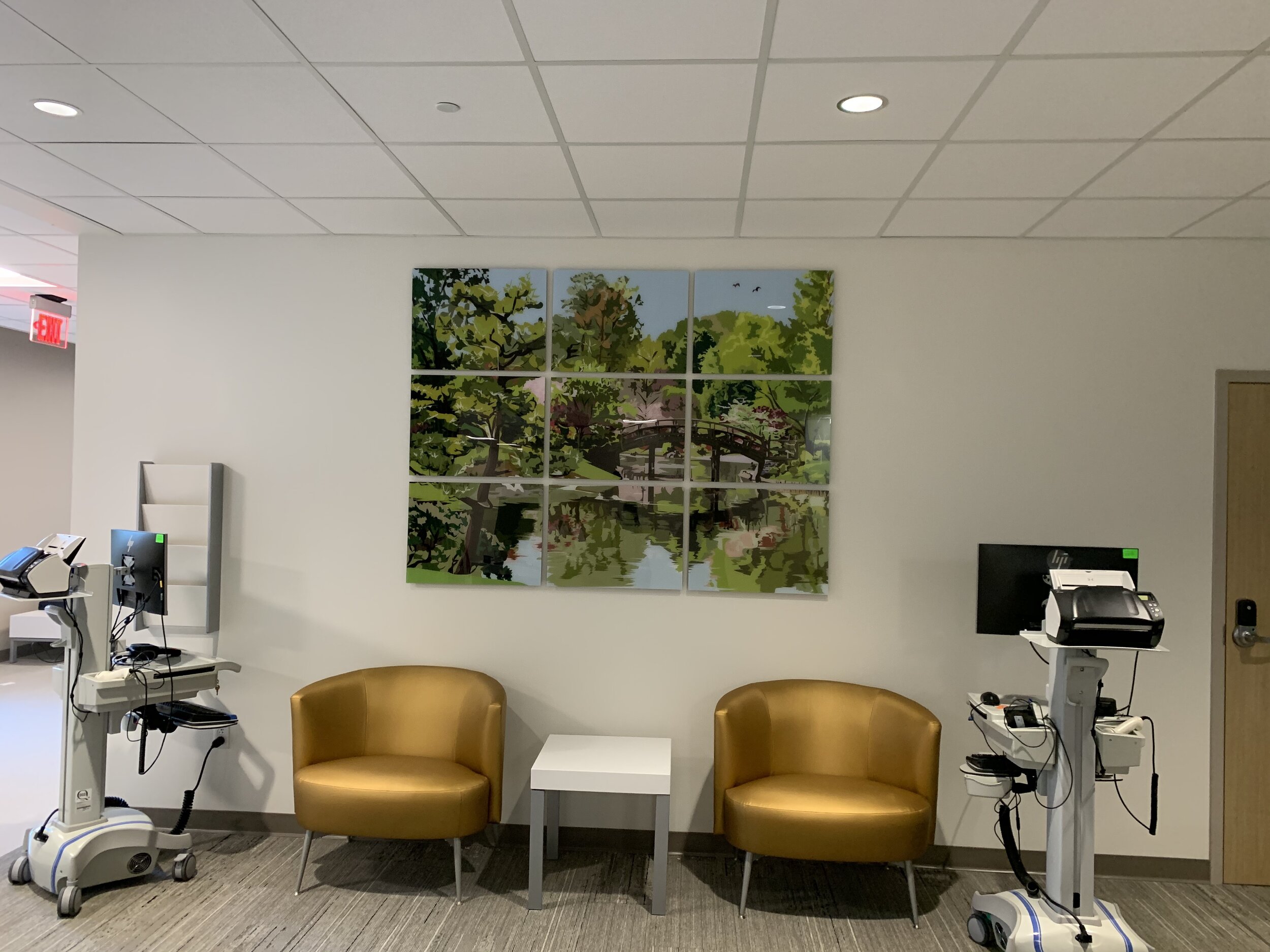
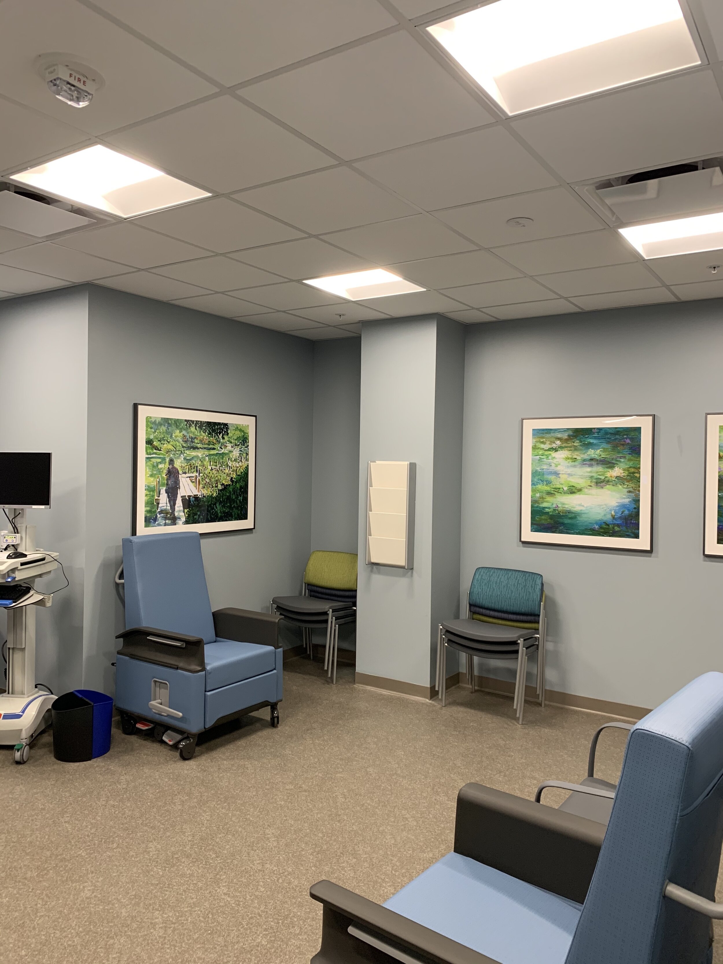
Much of the artwork was sourced locally and includes familiar sites like the neighborhood surround the hospital, the Missouri Botanical Gardens and the SLU campus. We were told there was a competition to submit employee photography and artwork to adorn the walls.
The various places used a local naming schema: Fleur-de-lis gift shop, Grand Cafe, Fox Park, Shaw and Tiffany Family Lounges. Who knows, with the countless hours you spend in hospitals visiting loved ones, maybe a person will Google Fox Park or Tiffany and discover a place they might want to live and explore.
The complex is designed to meet the needs of ~55,000 patients annually. There are RFID readers in the patient rooms so healthcare workers “sign in” before entering the room and their name and role are on hi-res displays to show the patient who just came into their room, what care is being administered and who to ask for help. Mind blowing.
There are spaces for visitors and interns and residents to learn and study or just check your phone while not being overly invasive of the patient’s private rooms.
This is a learning hospital, and the buildings include conference and lecture rooms for the students and employee continuous learning/training.
The OR and ER spaces are impressive and the organ transplant area flows to optimize the process from donor to recipient.
This place is a St. Louis treasure and will continue to make us a destination city for top notch, cutting edge health care.
Well done. And thanks for the tour SSM Health!


