We recently visited the newly renovated Arch grounds and posted a photo tour. We returned on a couple separate occasions to check out the new entrance, museum, gift shop, cafe and ticketing area.
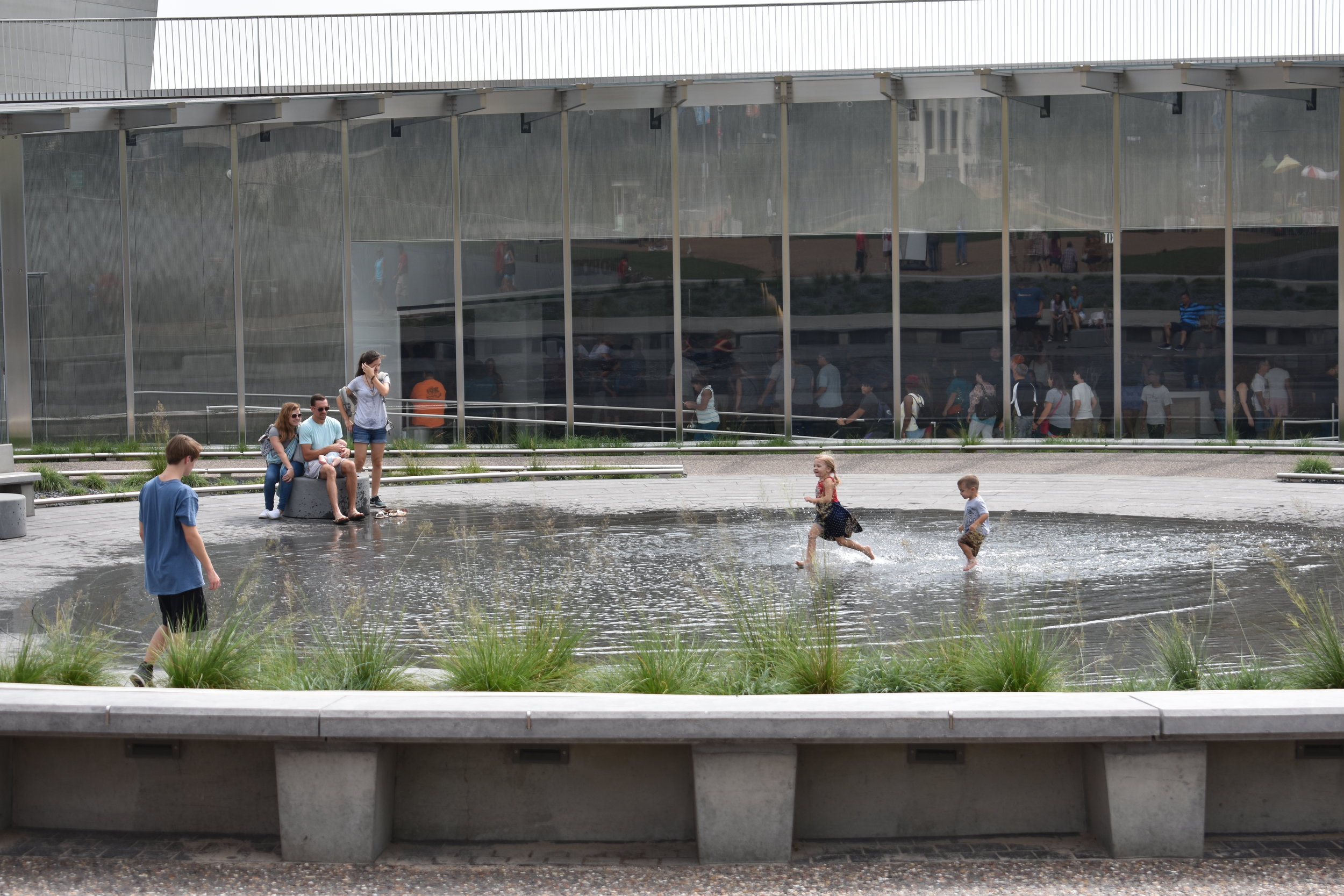
First, the Arch grounds and museum were packed on each of the three visits. It was a good scene with people riding Lime and Bird scooters, kids running around and splashing in the reflective pool and generally having fun seeing this American icon.
Although, I didn't see much carry over of crowds on Laclede's Landing. But the removal of the on-site parking lot on the north end of the Arch grounds is an improvement from the days when you could simply park on the grounds, walk in and back to you car, without ever entering the city.
The walk to the Arch entrance from N. 4th Street is a beautiful one with the new "lid" over the depressed section of the Interstates.
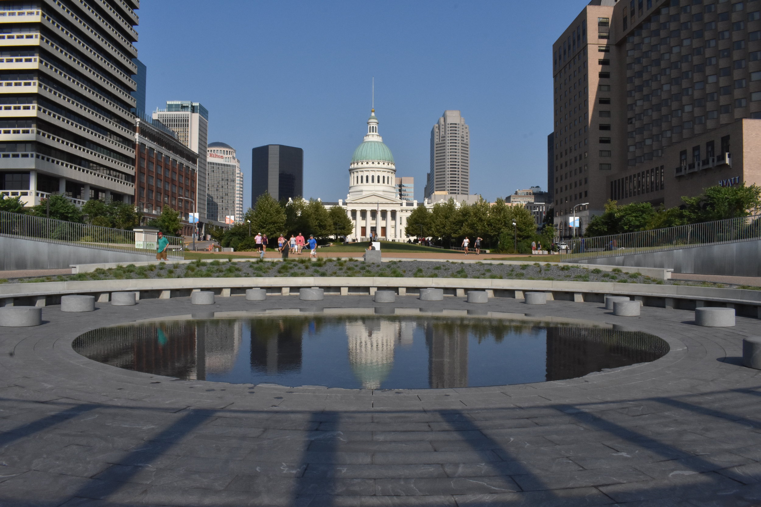
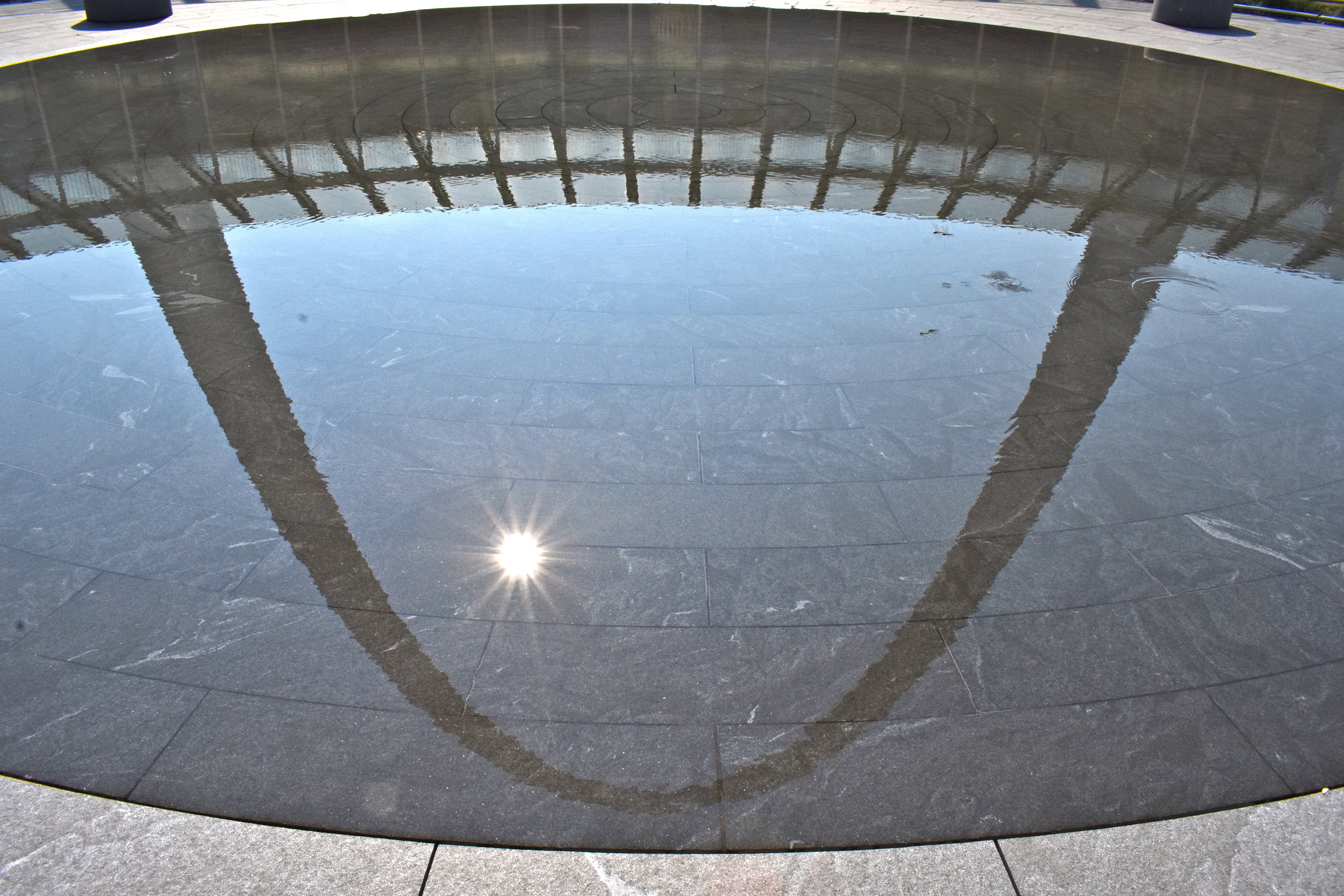
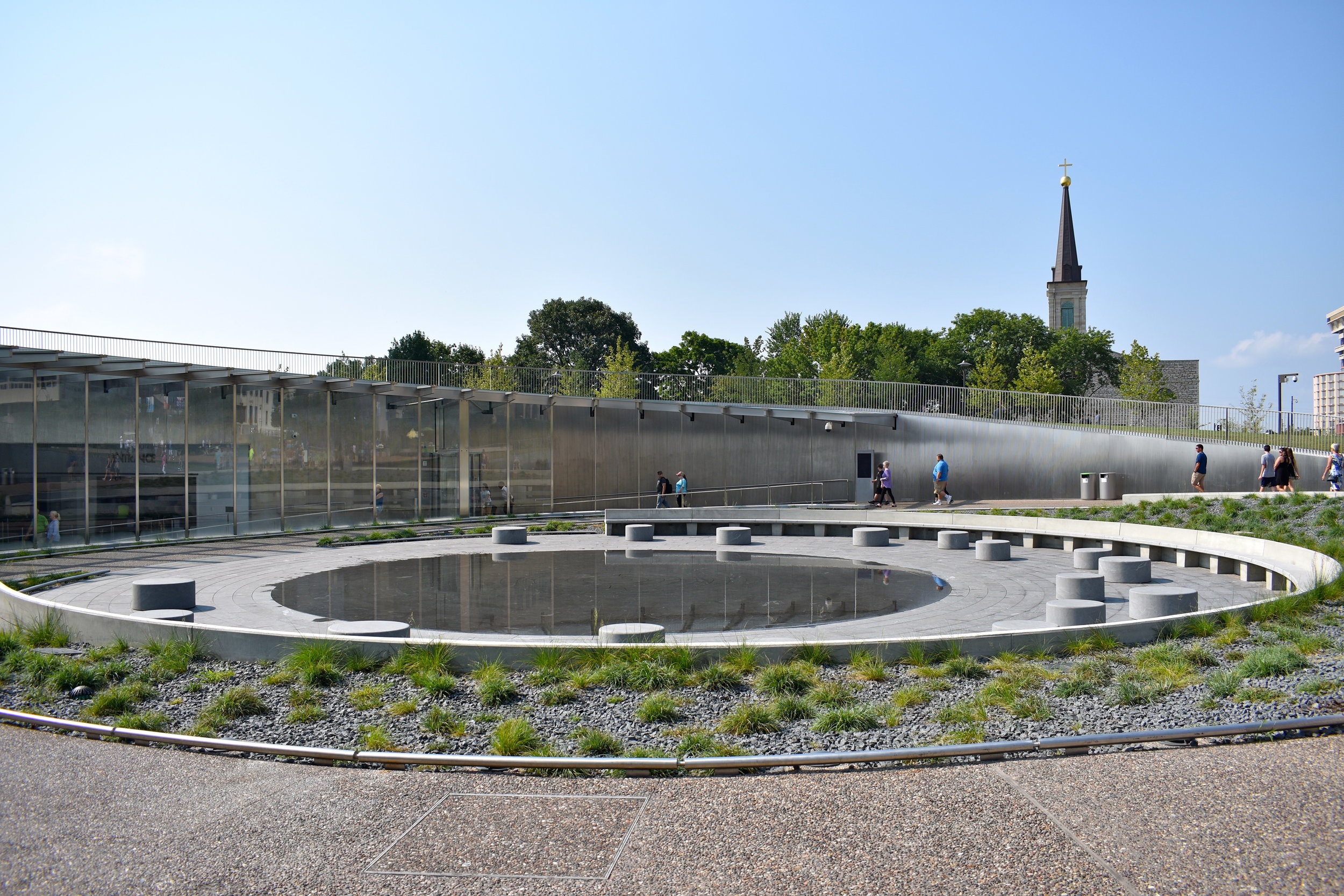
When you approach the entrance, there is a reflecting pool, placed smartly to get images of the Arch or the Old Courthouse in the water.
The thin layer of running water is a hit with young kids splashing around and running barefoot across the pool. There are plenty of handsome seating areas for adults to look over the kids and get organized before entering the Arch.
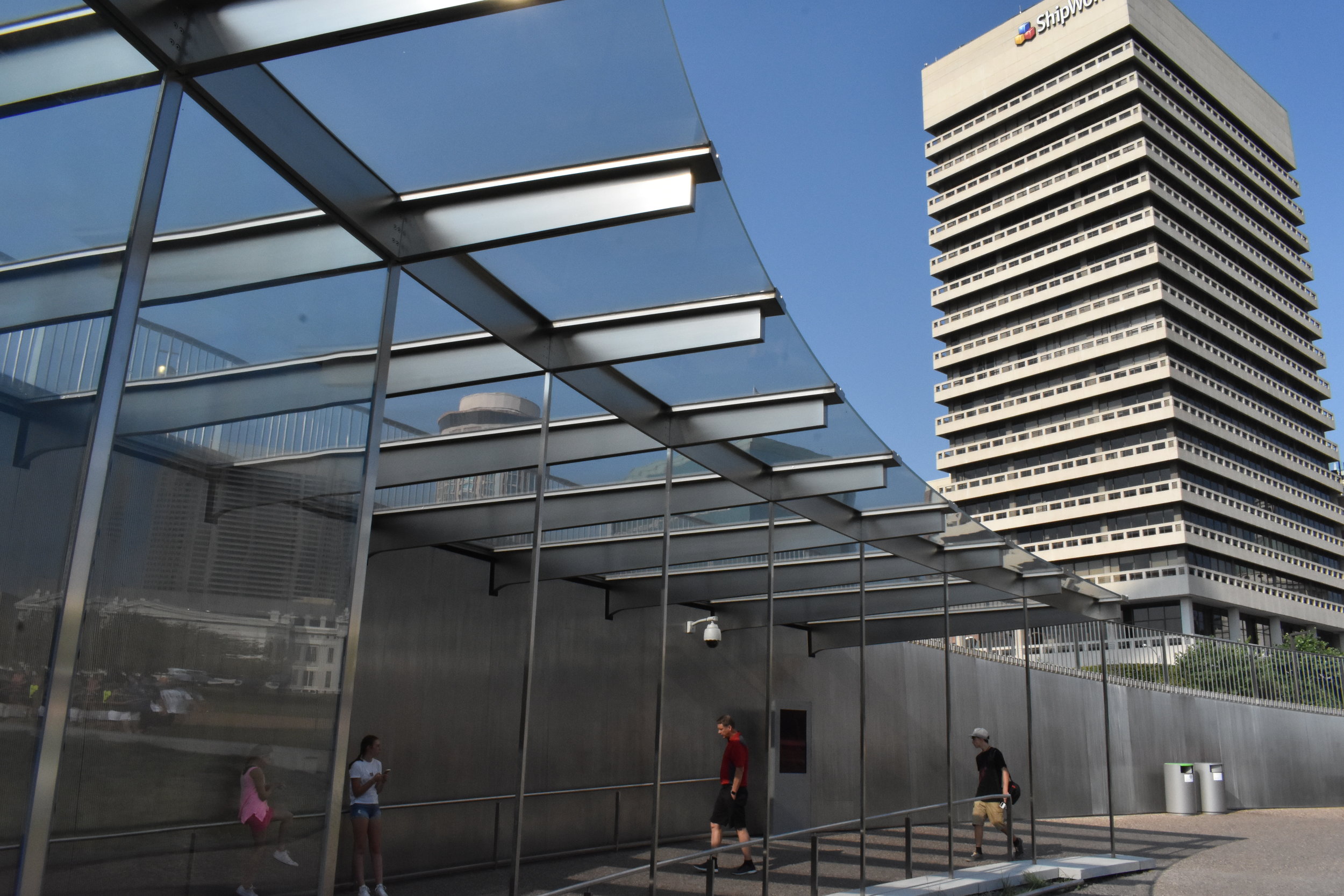
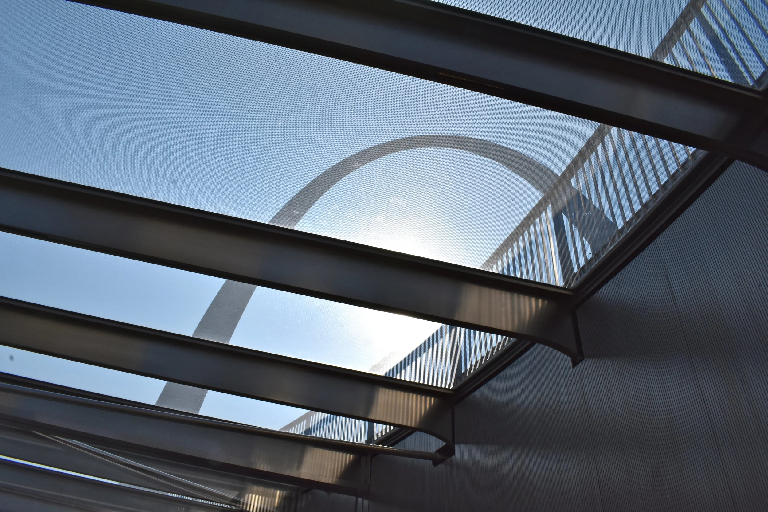
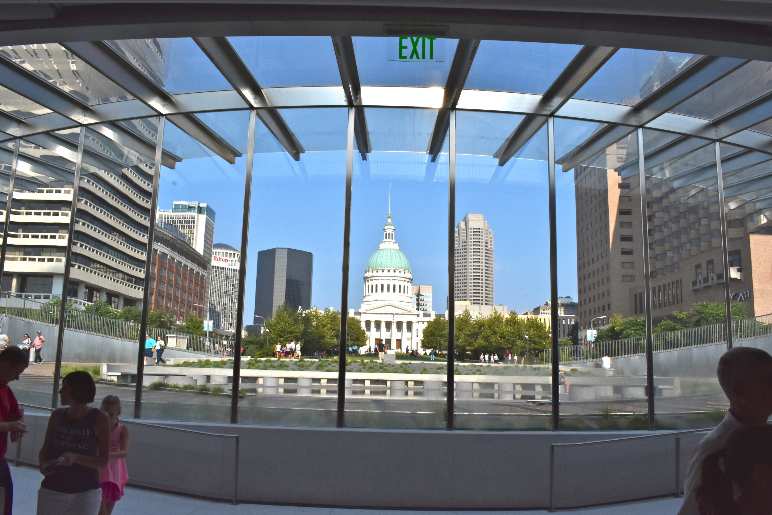
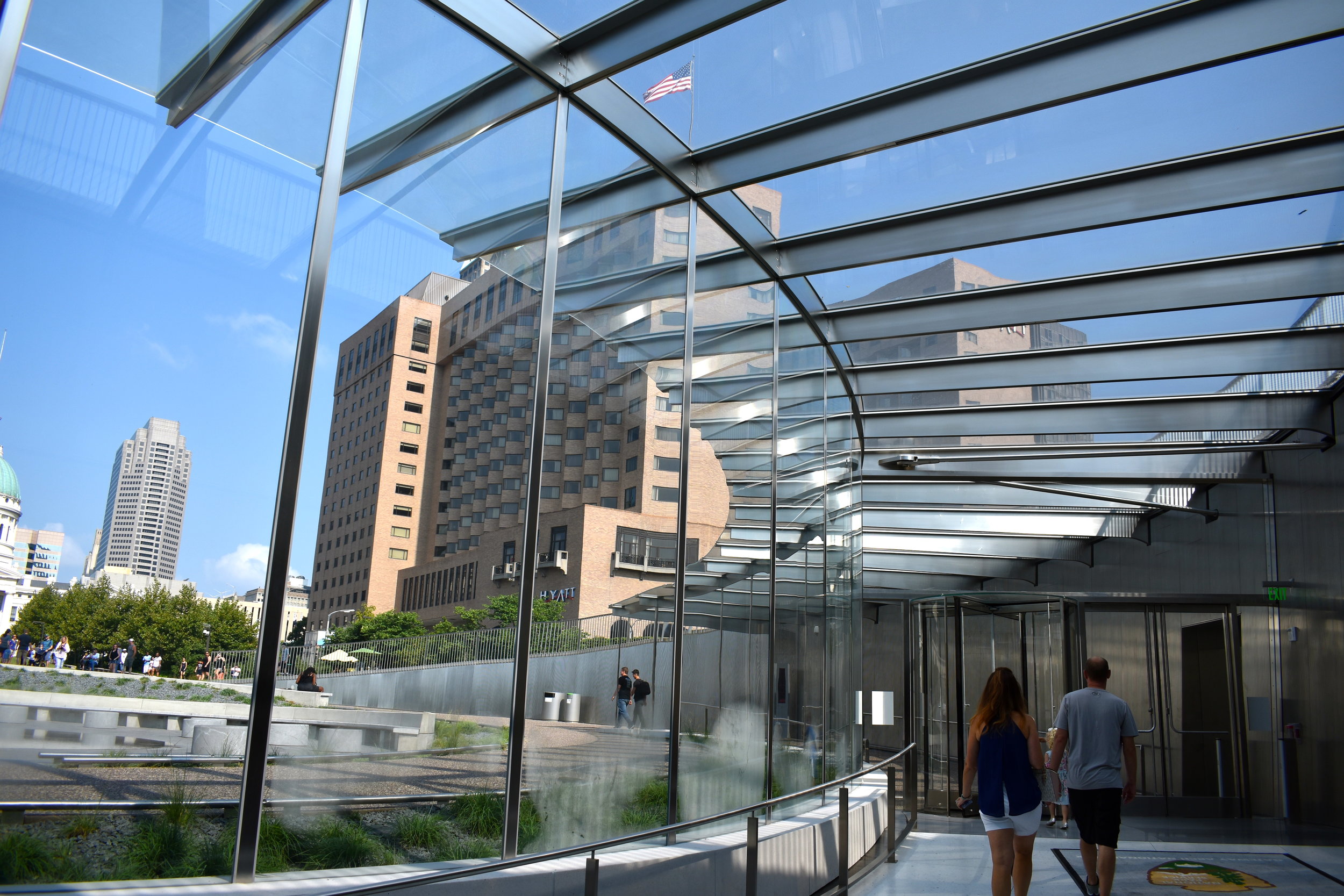
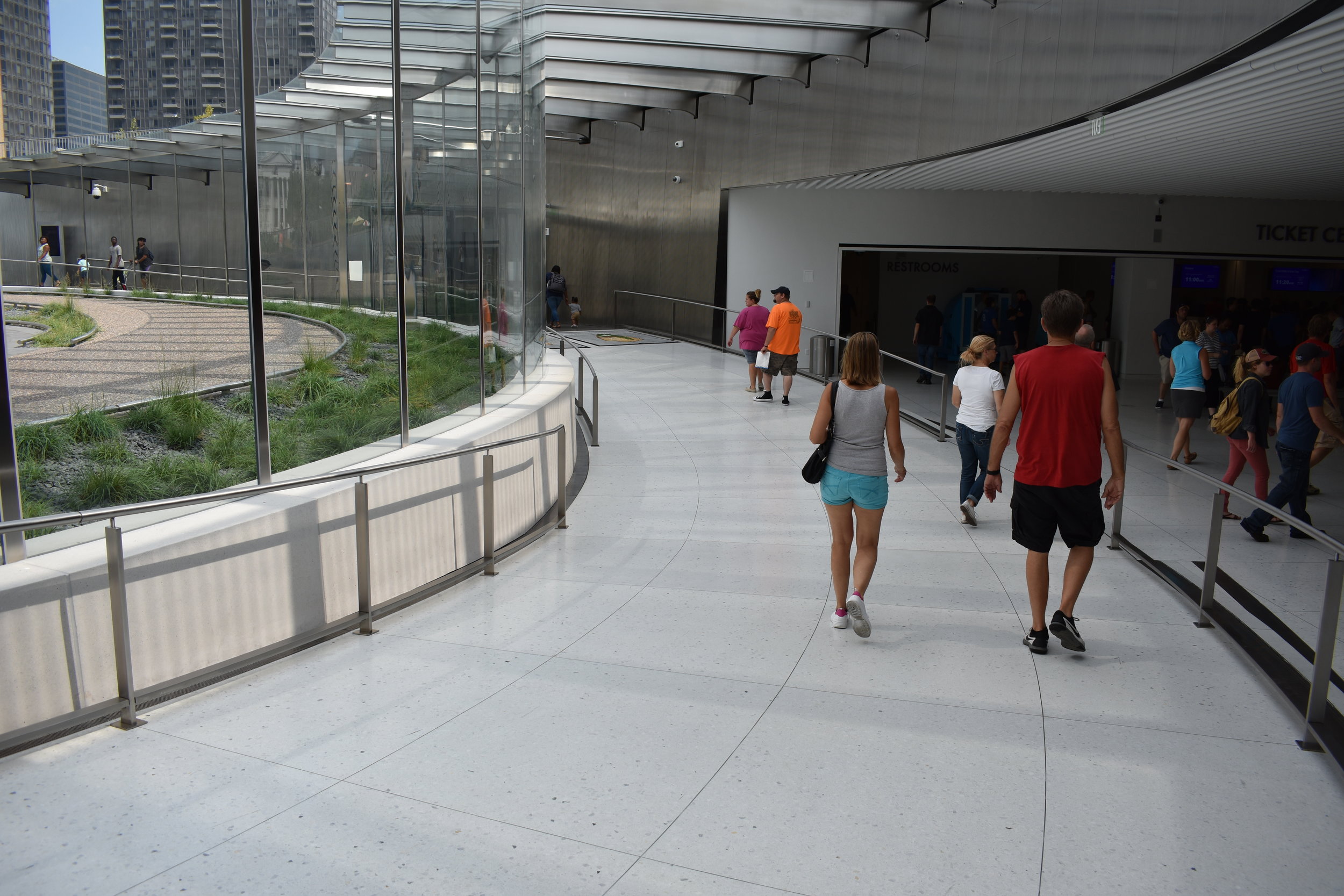
The actual entrance is sleek and elegant, it is a really nice complement to the Arch itself. We loved the entrance and the brightness from the natural light and white terrazzo floors. The Old Courthouse standing is in full view to the west.
The entrance has a ticketing area, a sample of the pods that take you up in the Arch to give you a feel for size just in case you can't comfortably fit, or predict the claustrophobia potential.
You have to wait in line and get through metal detectors and security to enter the museum, gift shop, snack bar, movie theater and the Arch rides and I overheard a couple conversations of visitors discussing where to get a beer after the tour; 4 Hands was on the itinerary. Another family was talking about going to Pi for pizza. So, the tourist spend does seem to be spilling over to other parts of Downtown.
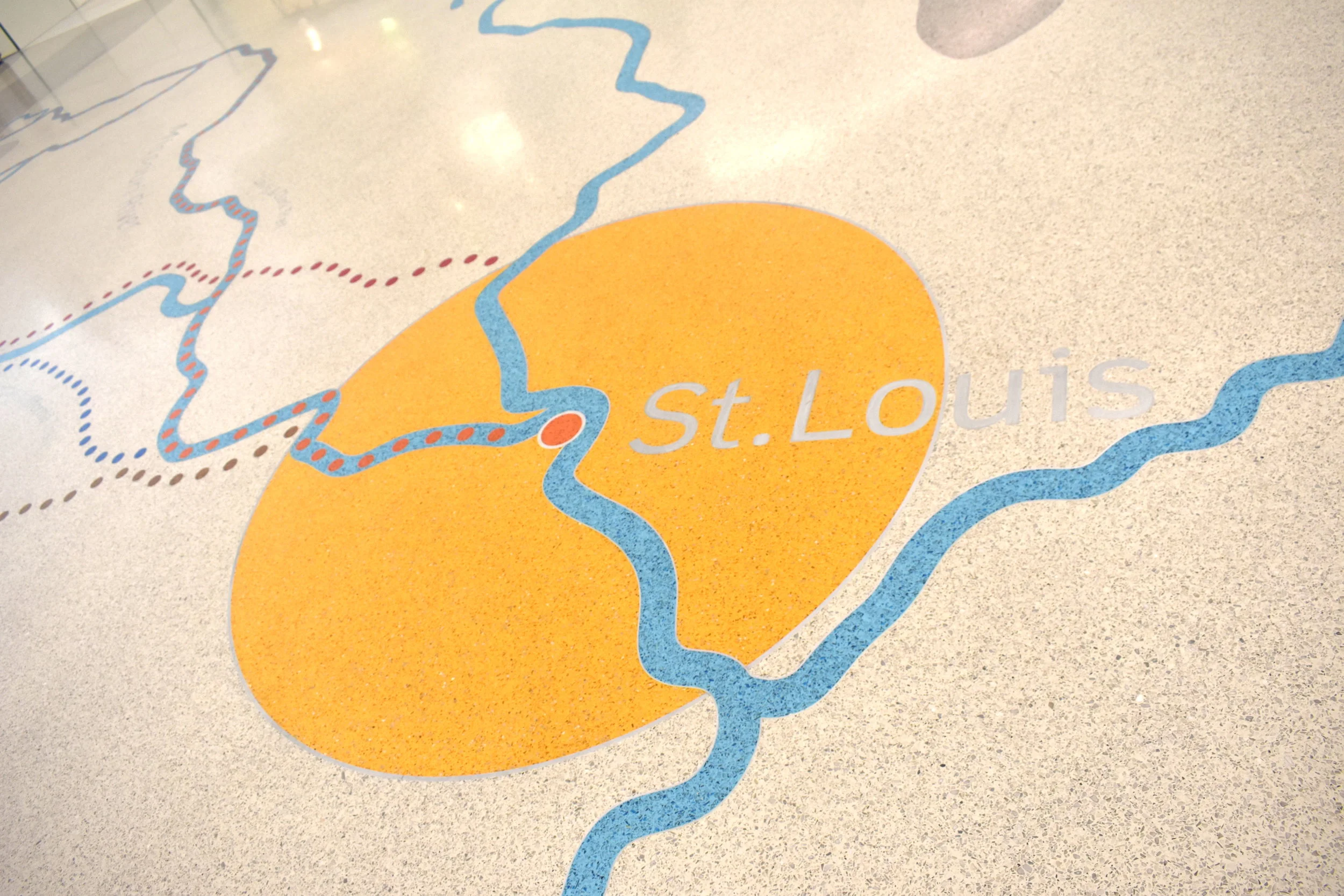
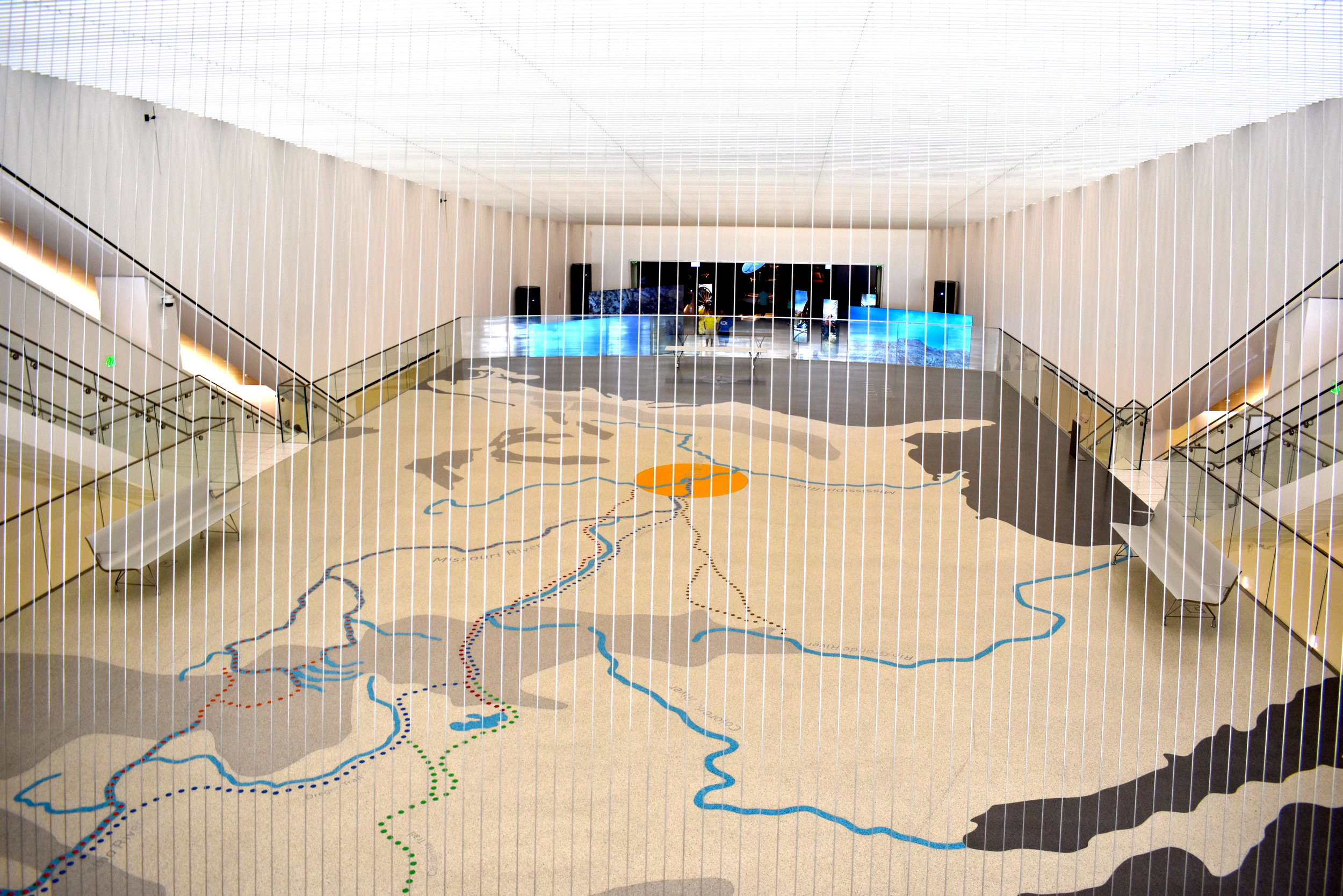
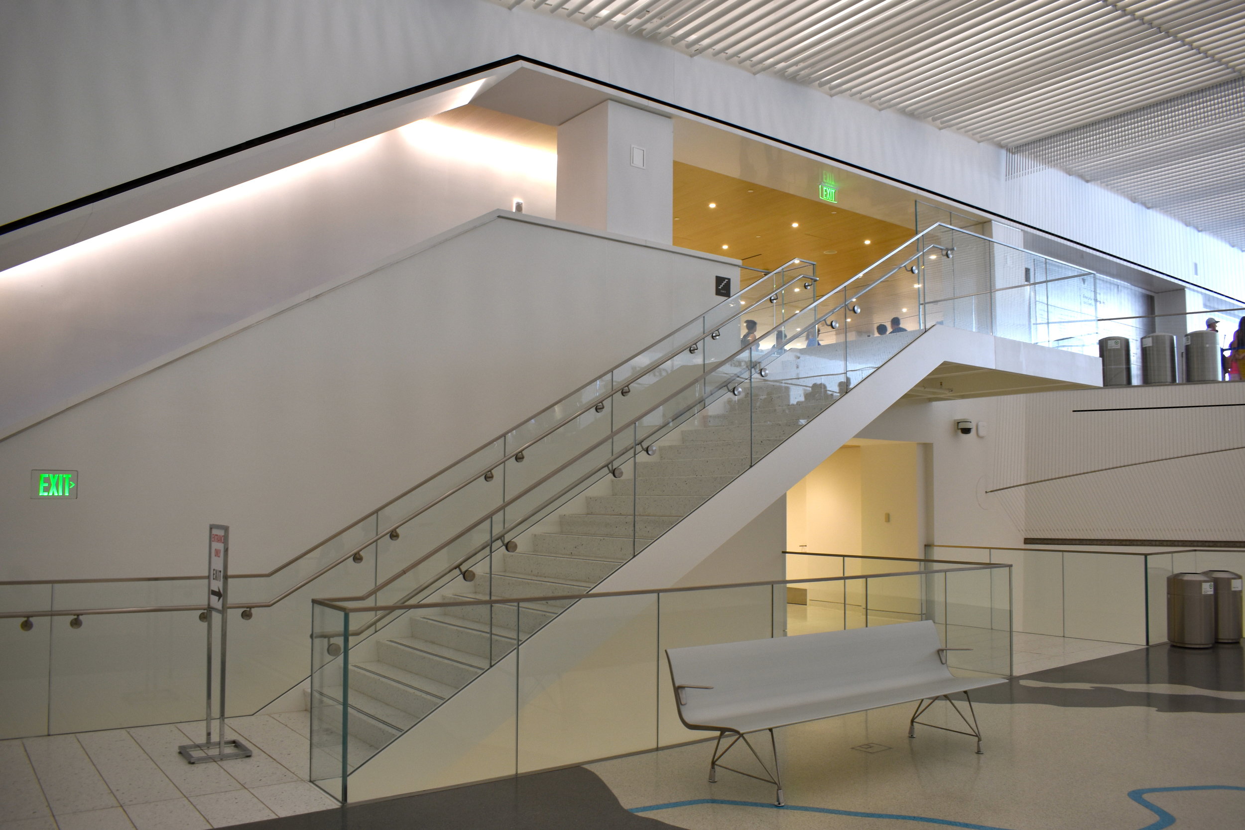
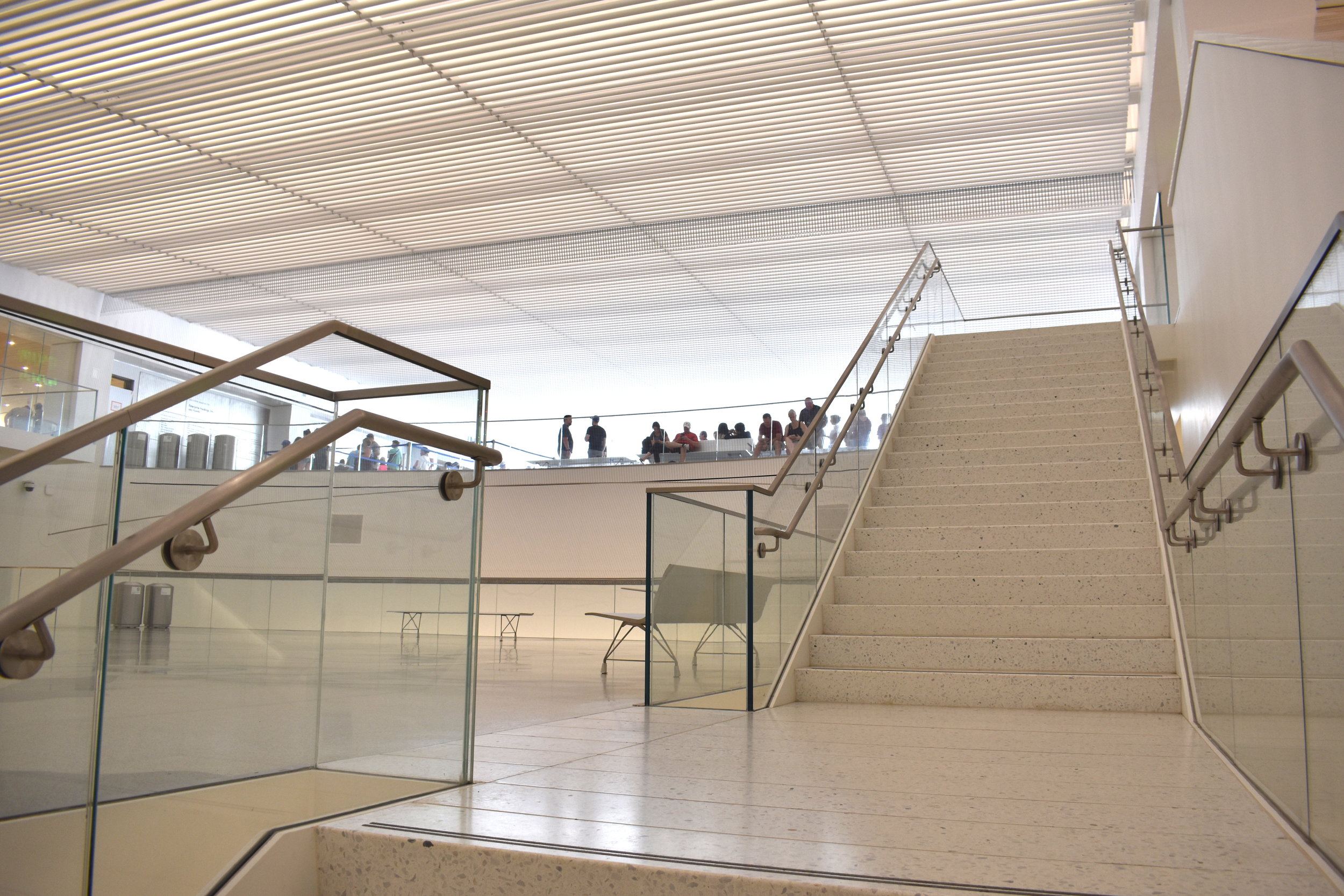
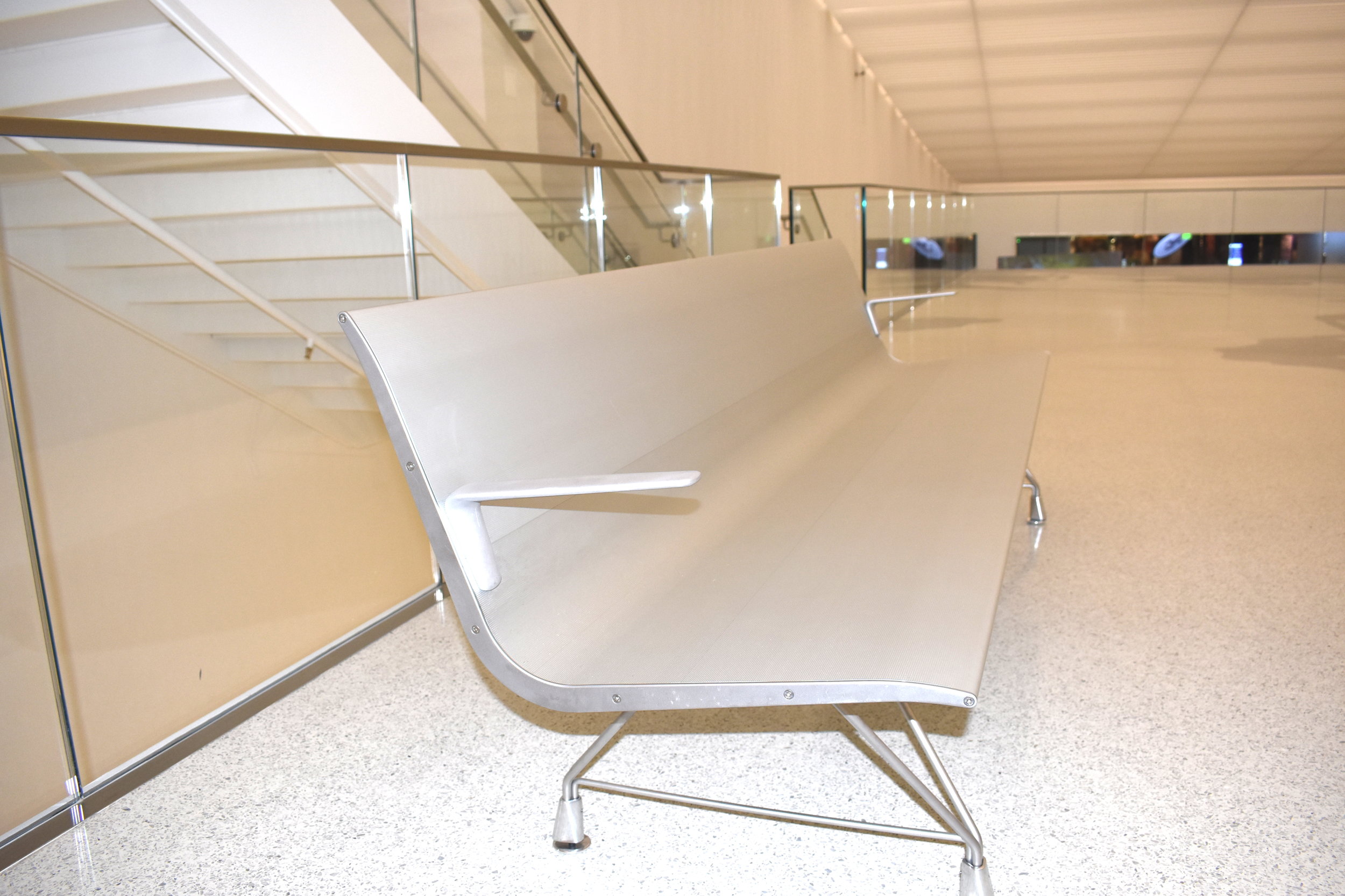
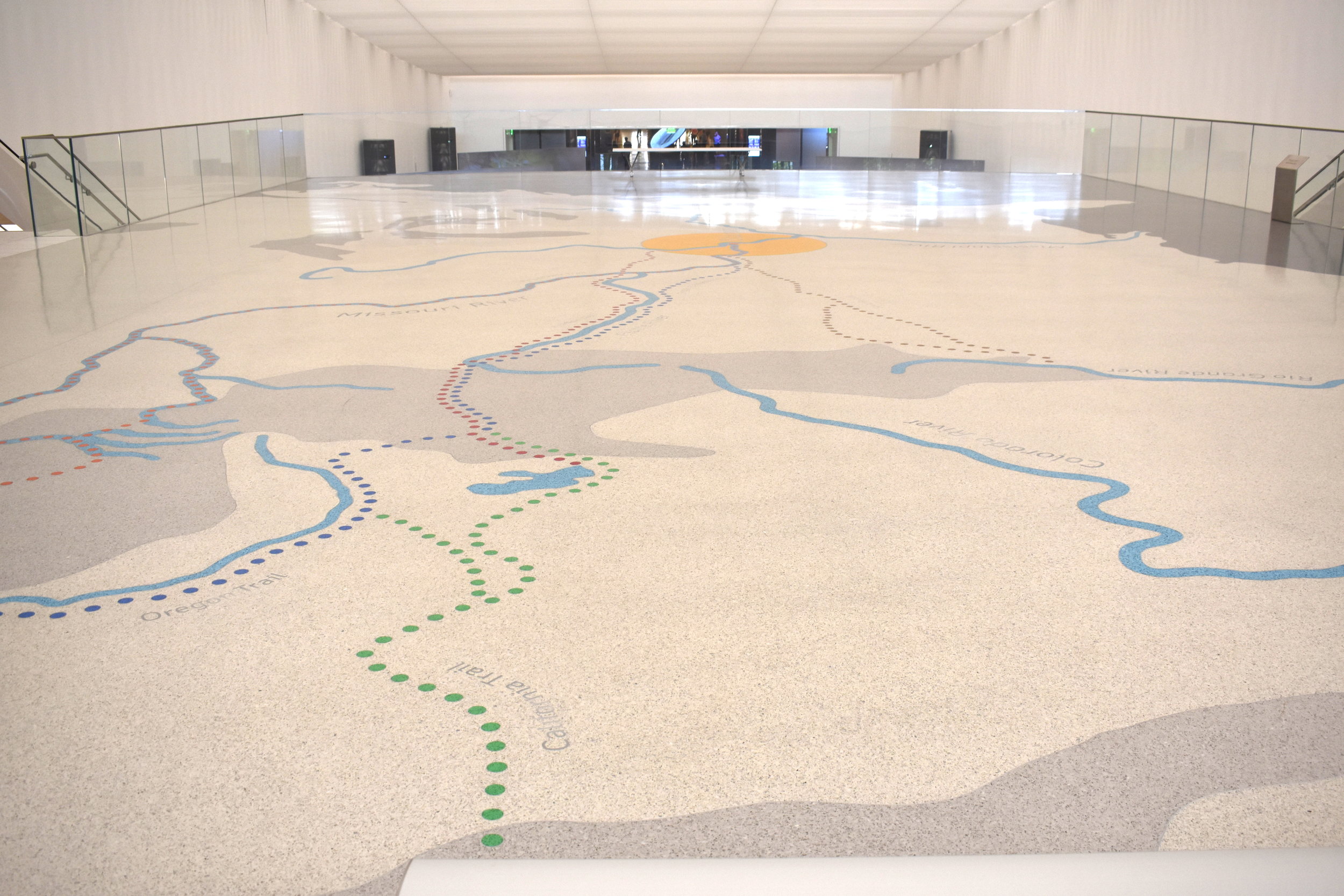
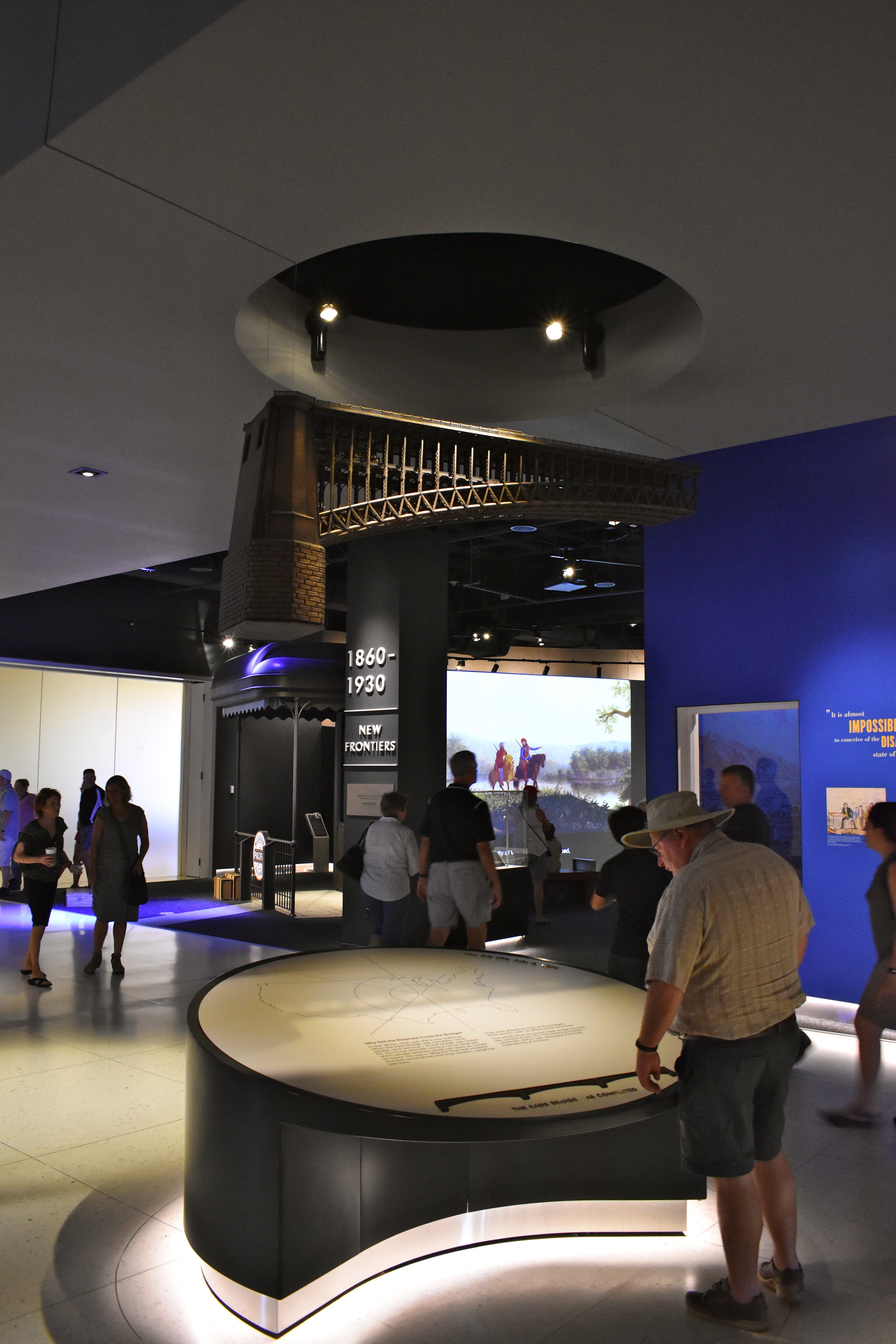
Once you get through security, you walk down some elegant, white stairs to a terrazzo tile map of the United States with St. Louis centered as the launching point for westward expansion with dotted lines mapping the several trails blazed. The seating is crisp, modern and metal to perhaps complement the Arch itself. It is beautifully done.
This entry point and second level are bright, open, clean and crisp...again, just like the Arch.
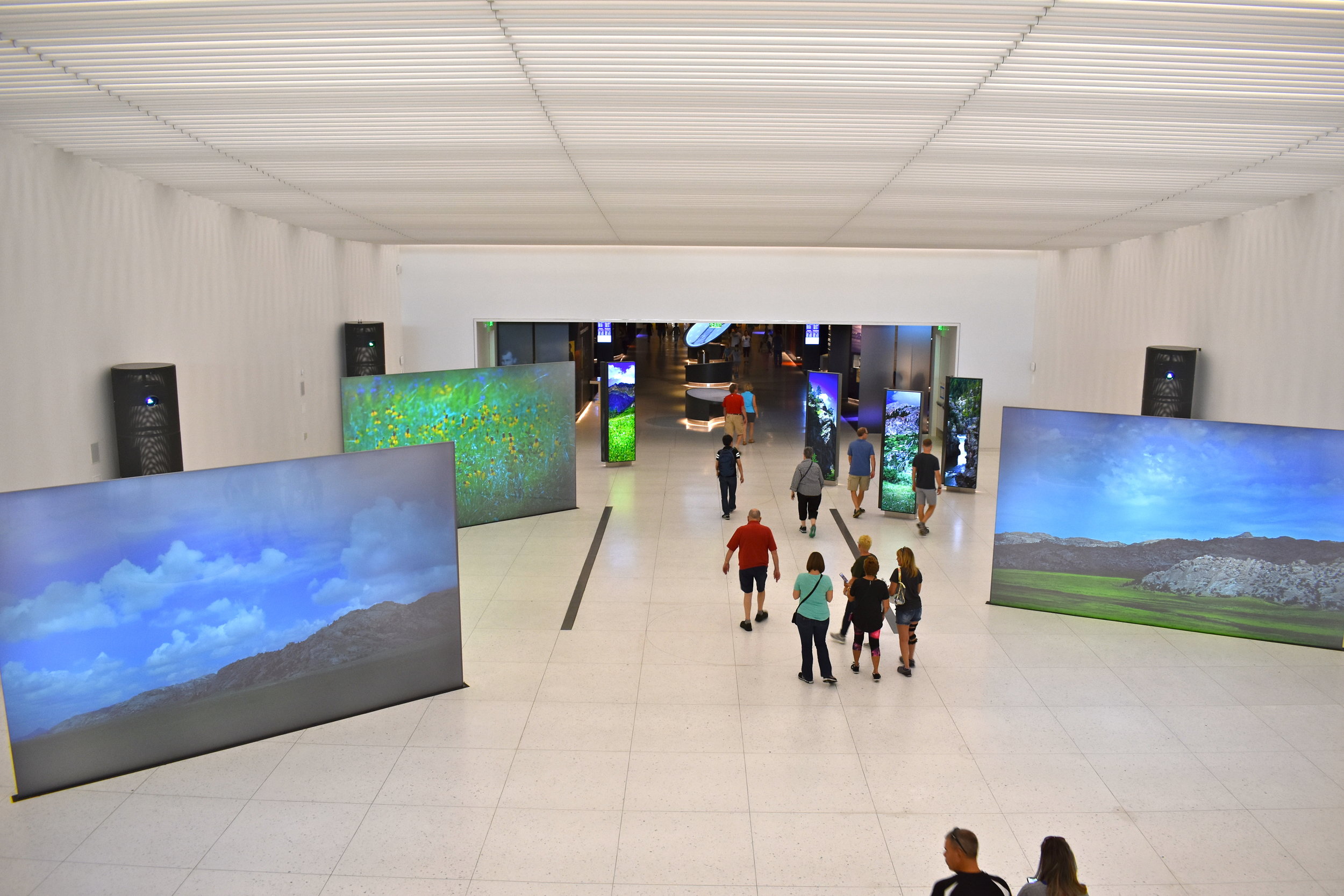
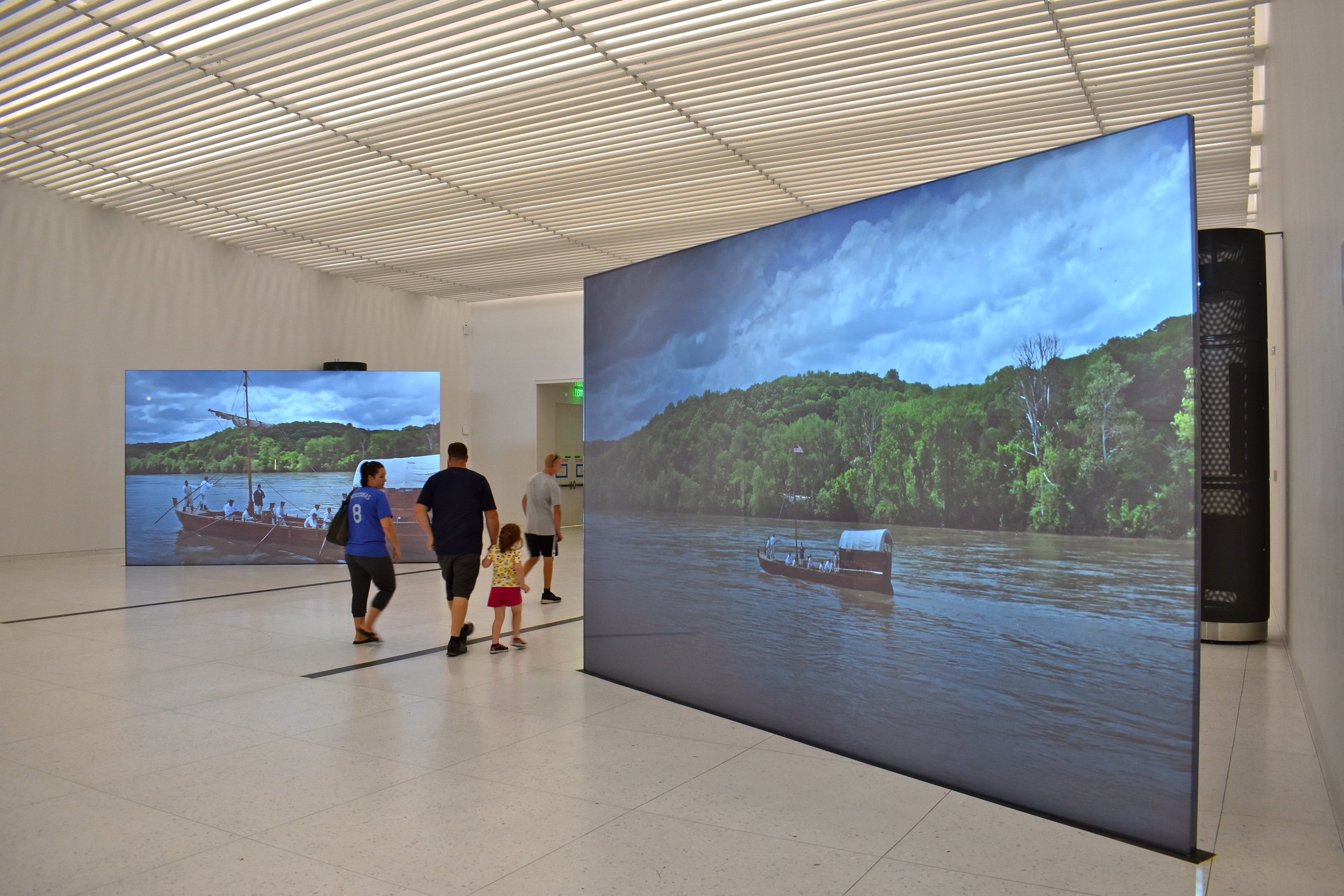
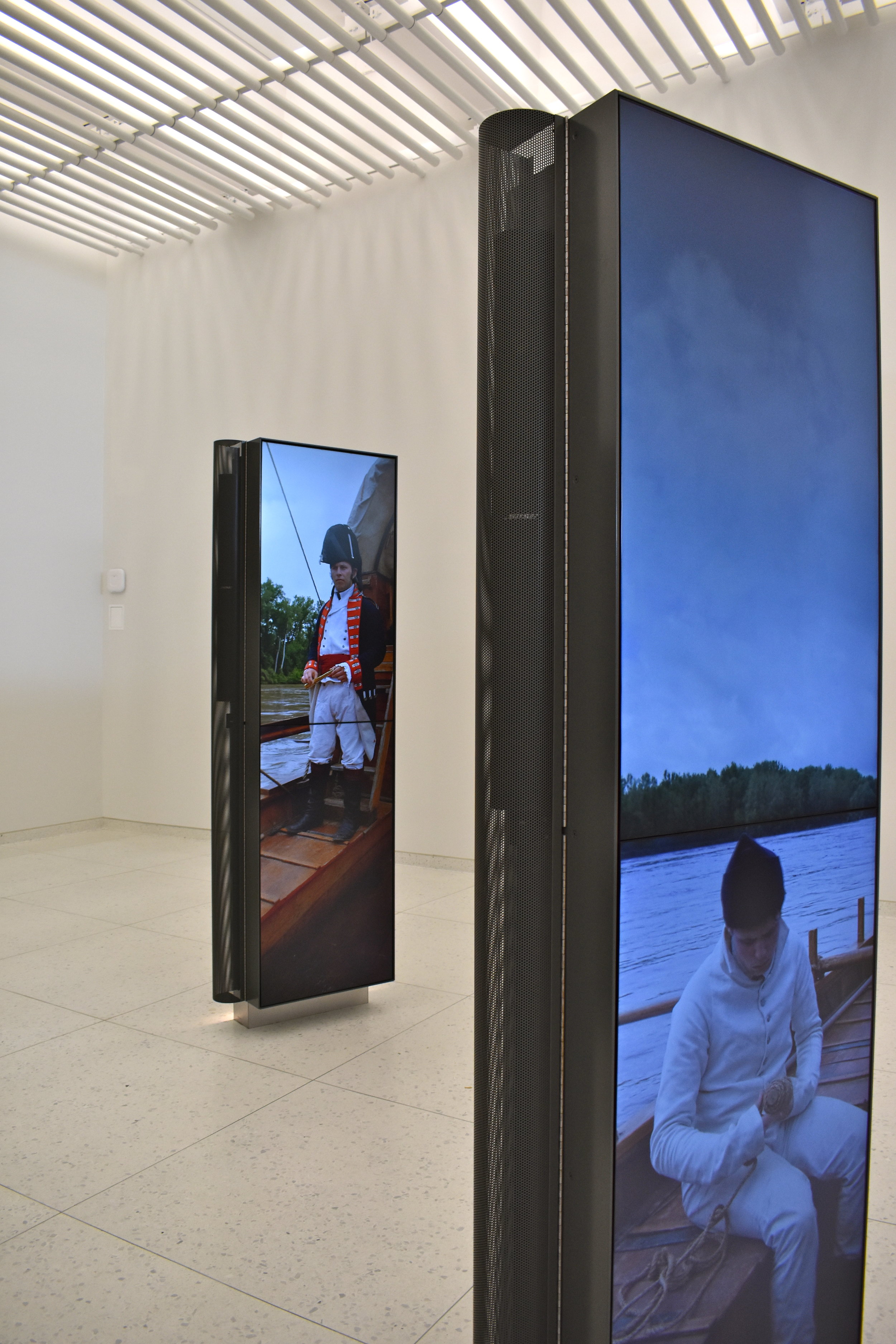
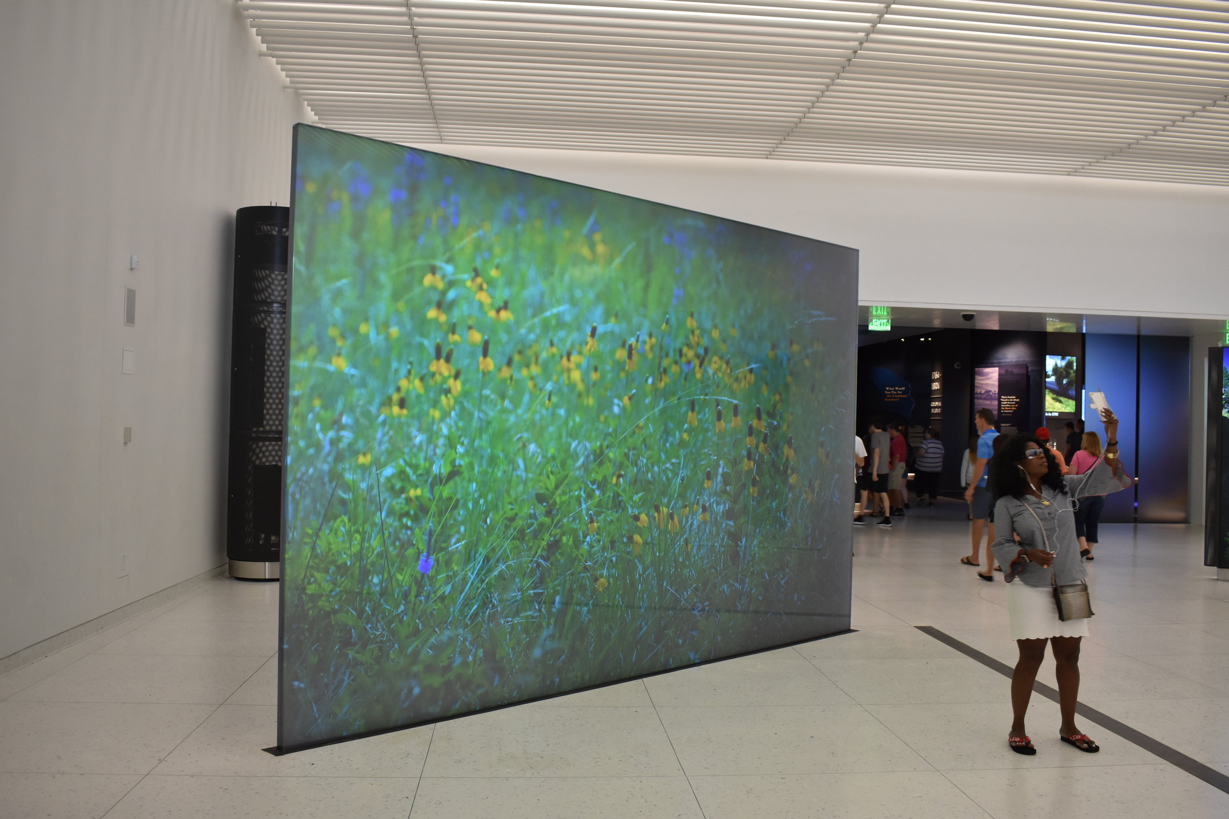
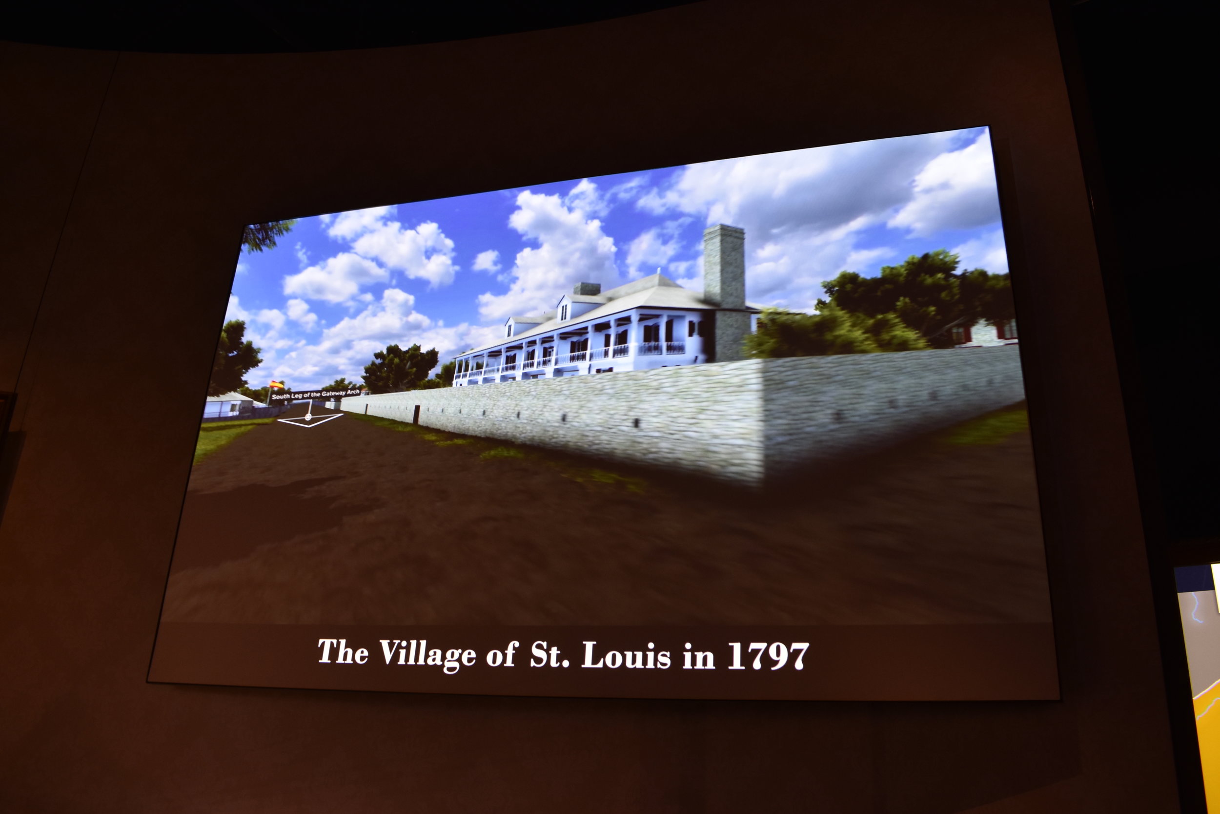
You can overlook the next floor down where there are several projection screens depicting scenes of early explorers and native scenes along the Mississippi River. They are simple, elegant and not overdone.
The museum passageway is dark, a stark contrast to the brightness of daylight and gleaming modernism of the Arch. We assumed the change in lighting was more for effects of the screens and exhibits, but it is psychological as well. It was somber.
Then you enter the museum itself.
The museum tagline on the official website says:
"See history differently. Trace the story of the Native Americans, explorers, pioneers, and rebels who made America possible. Featuring six themed exhibit areas, this innovative and interactive museum celebrates America’s pioneering spirit."
The six themes include:
1764 - 1804 - Colonial St. Louis
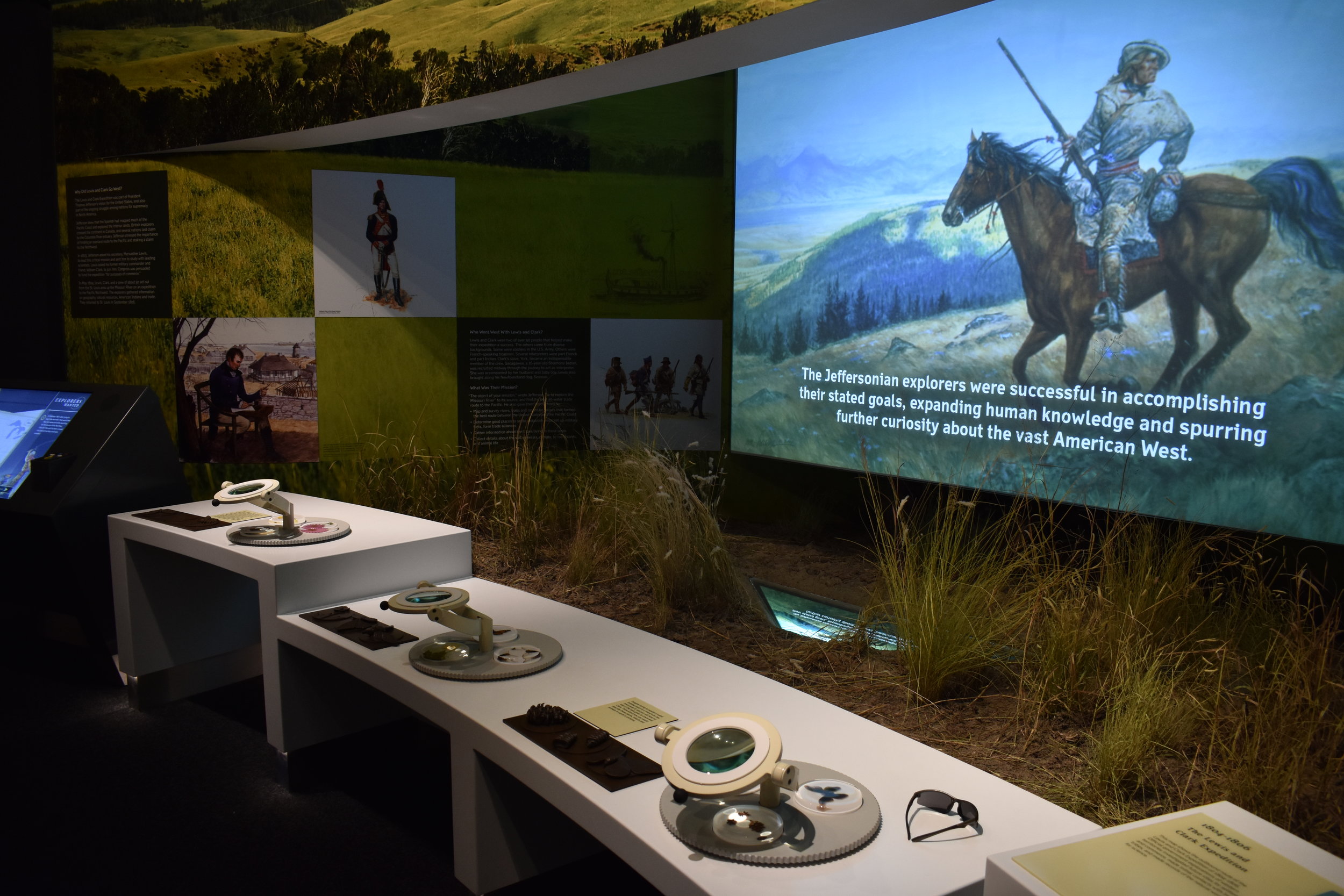
1804 - 1840 - Jefferson's Vision
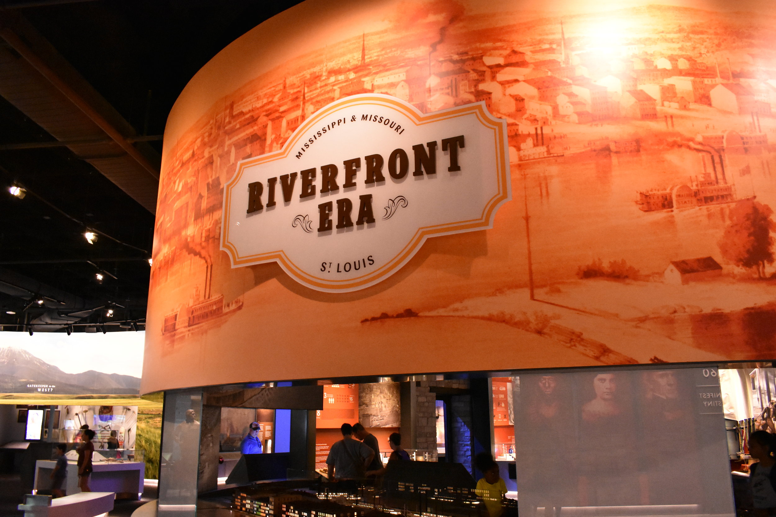
1838 - 1860 - Riverfront Era
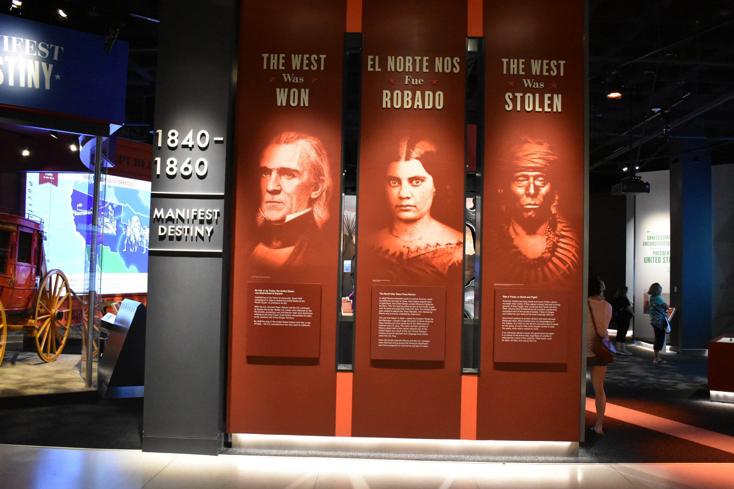
1840 - 1860 - Manifest Destiny
1860 - 1930 - New Frontiers
1930 - Today - Building the Arch
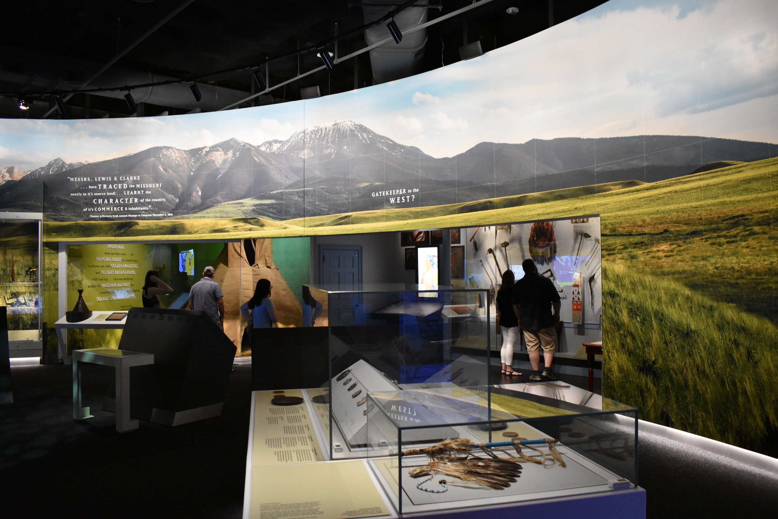
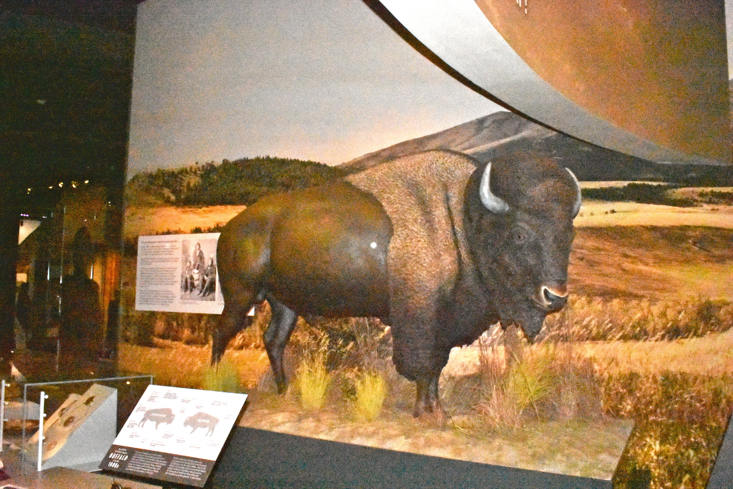
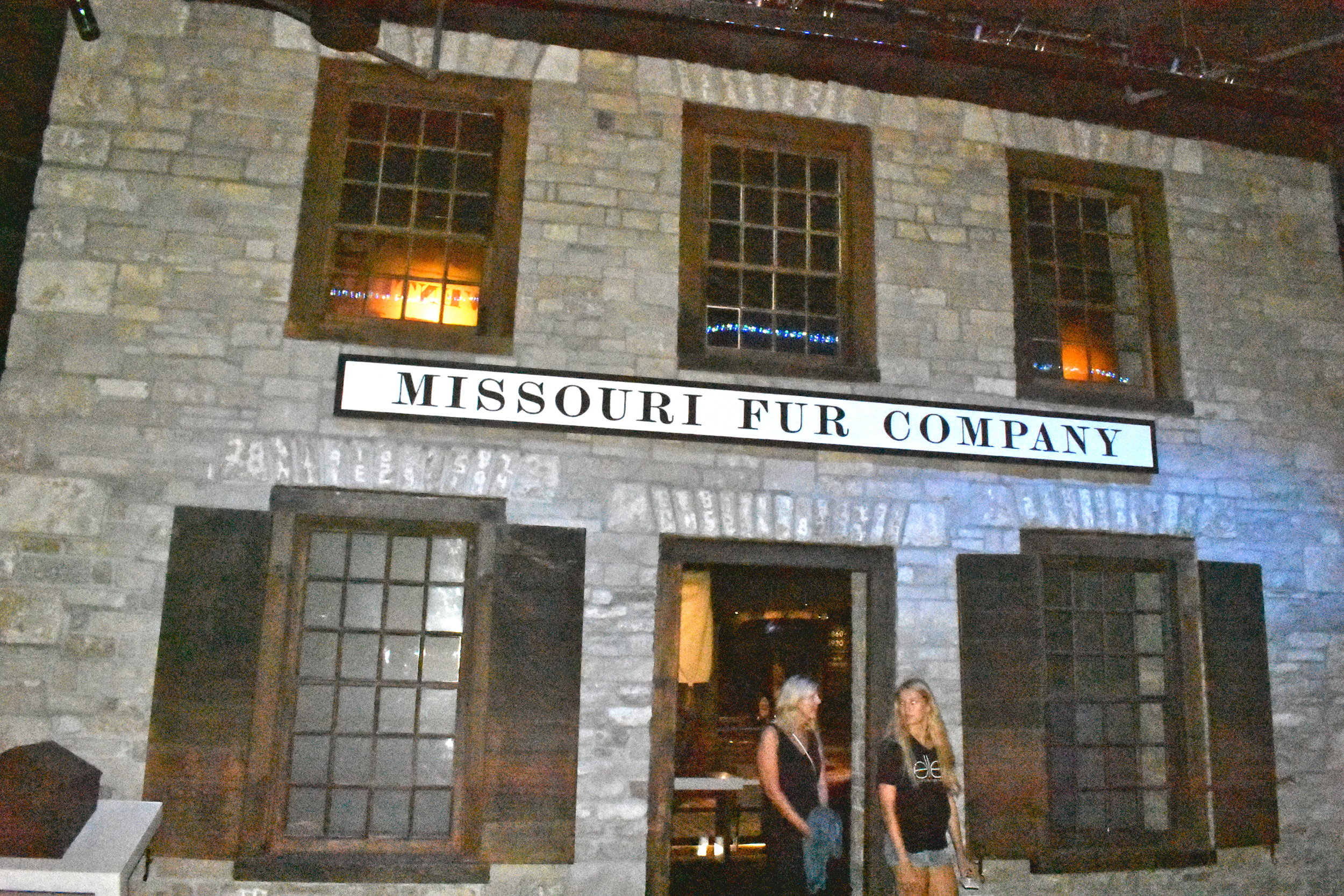
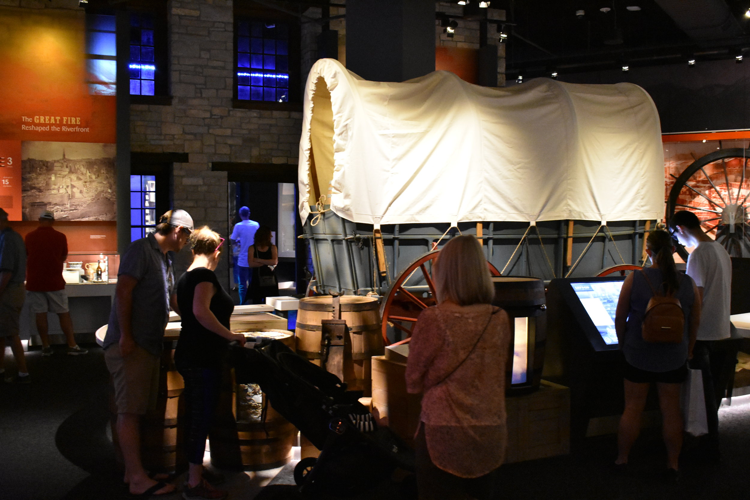
The museum is free of charge. It is small, but it packs a punch and uses some really creative and intelligent design to make points. Best of all, it is organized really well from the 18th Century through the mid-1960's when the Arch was completed.
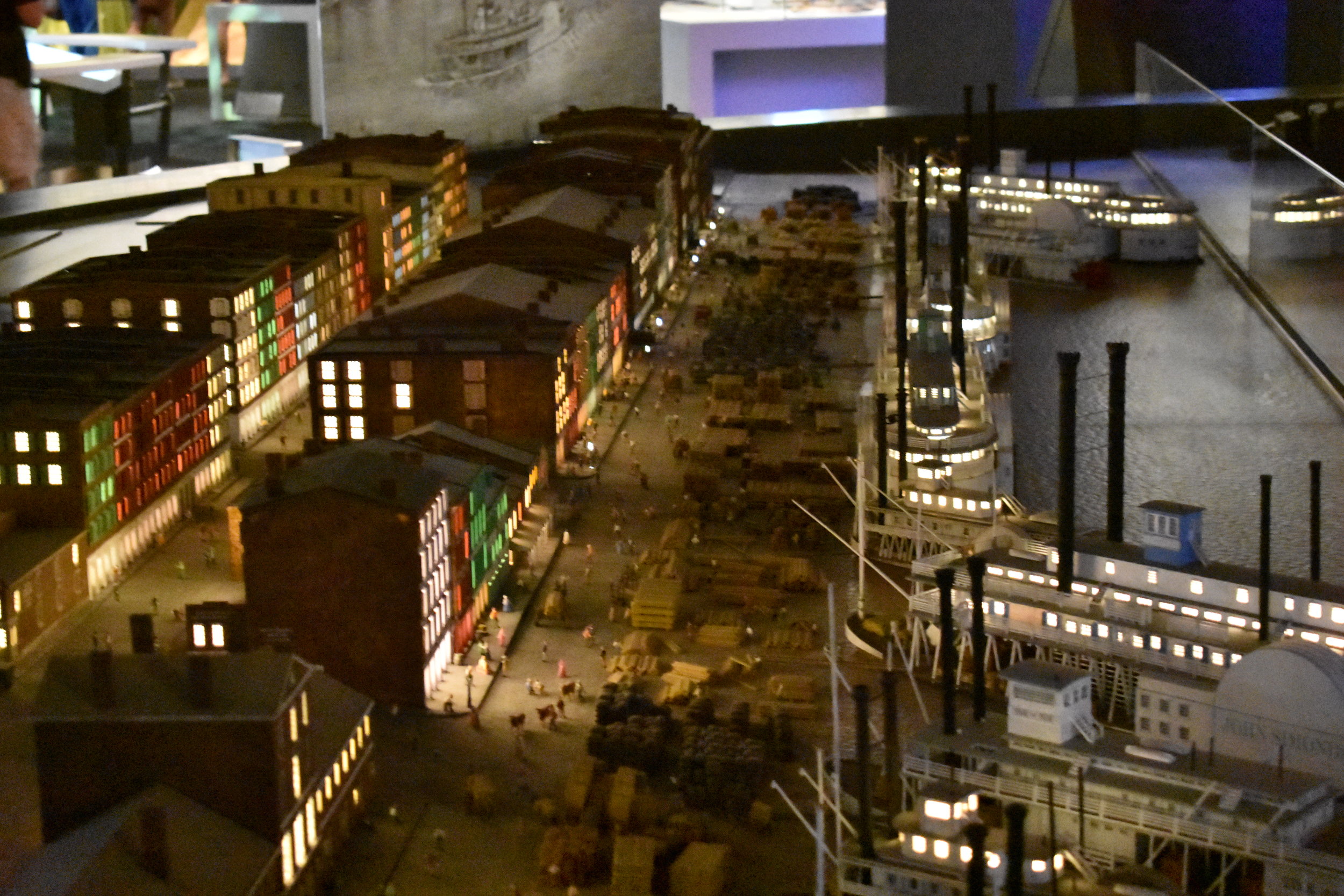
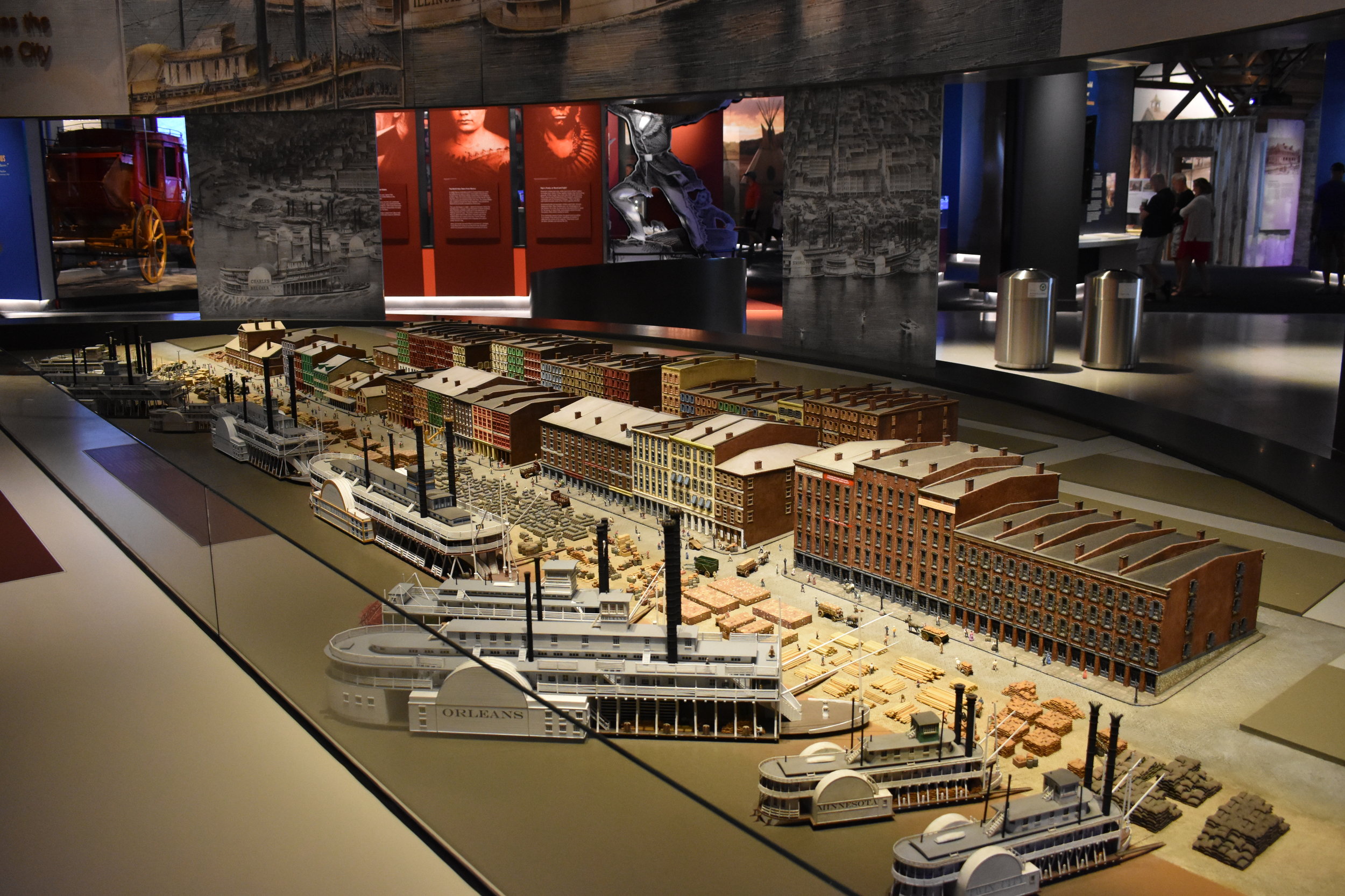
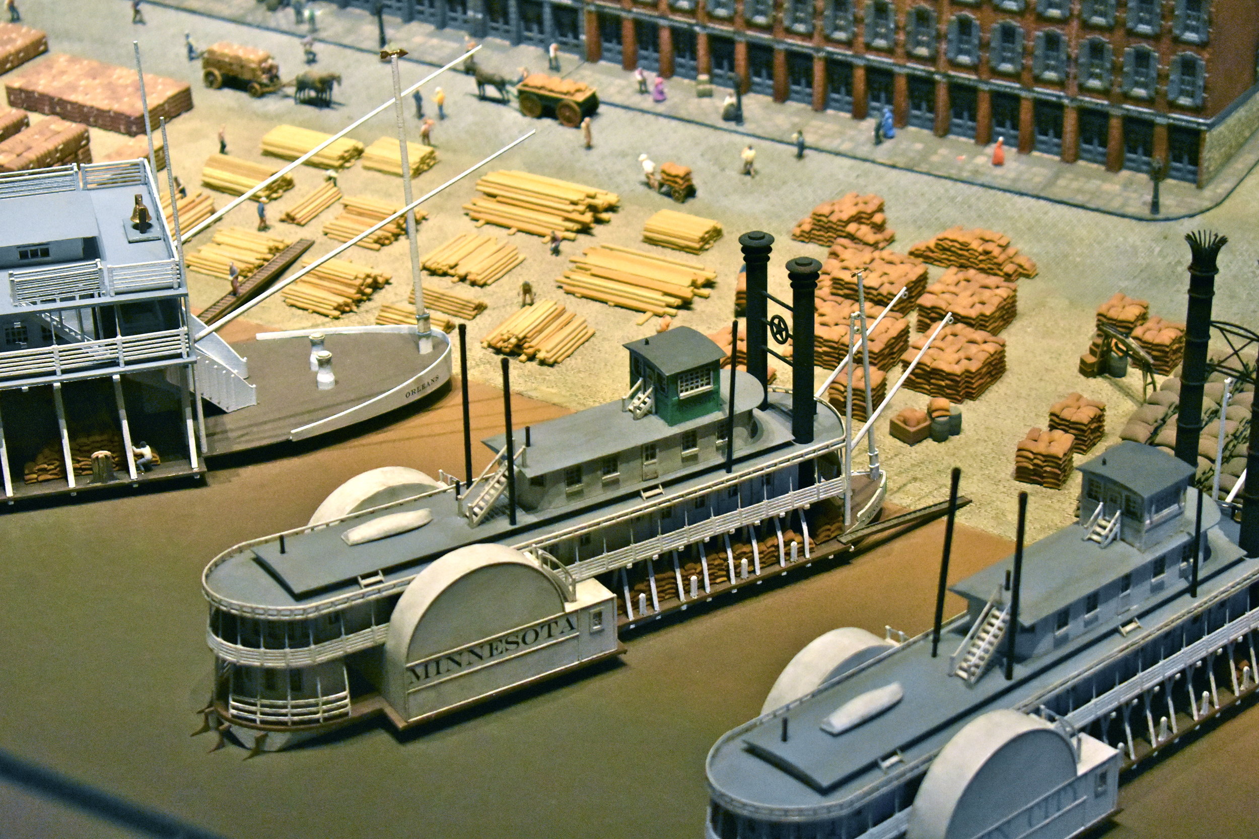
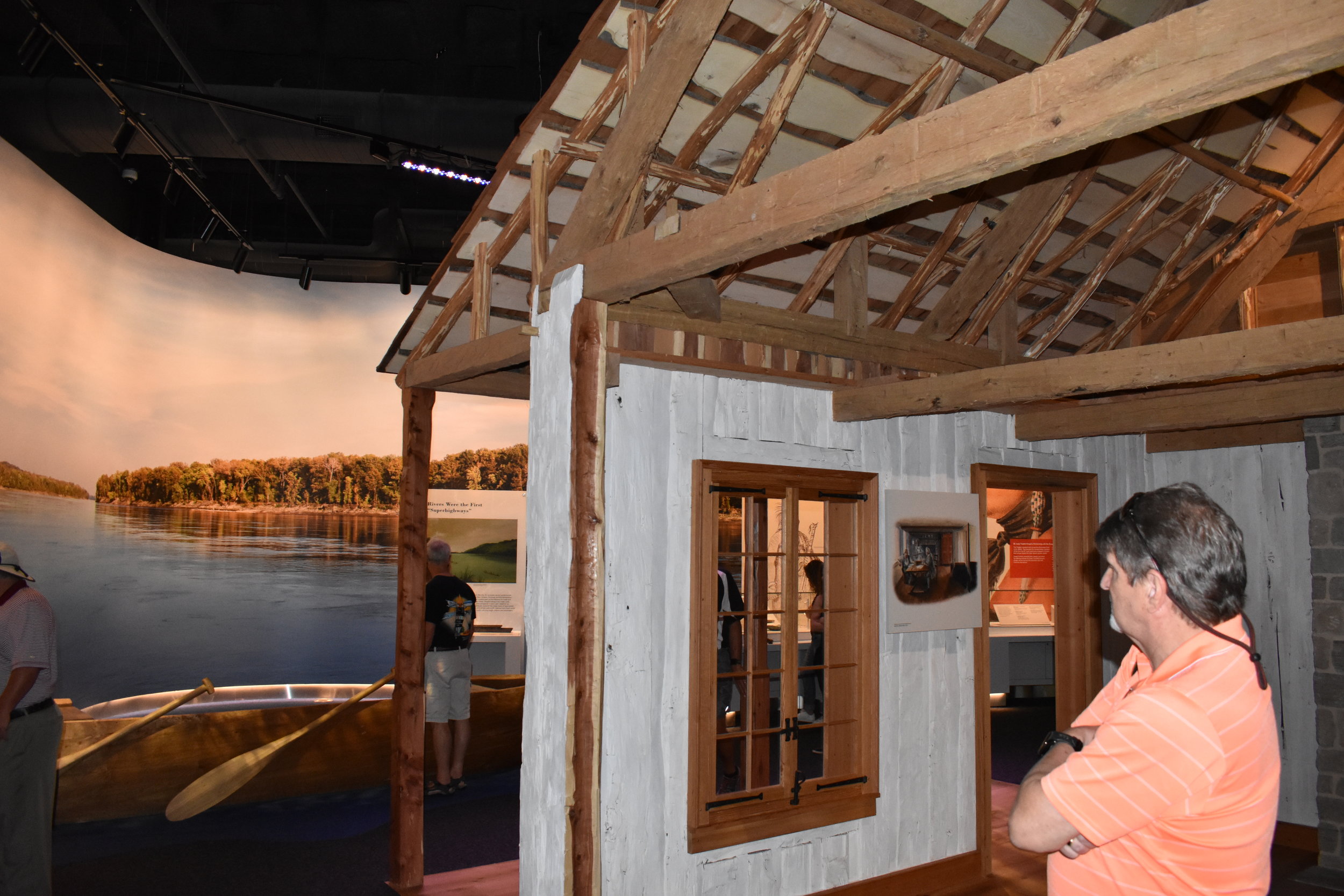
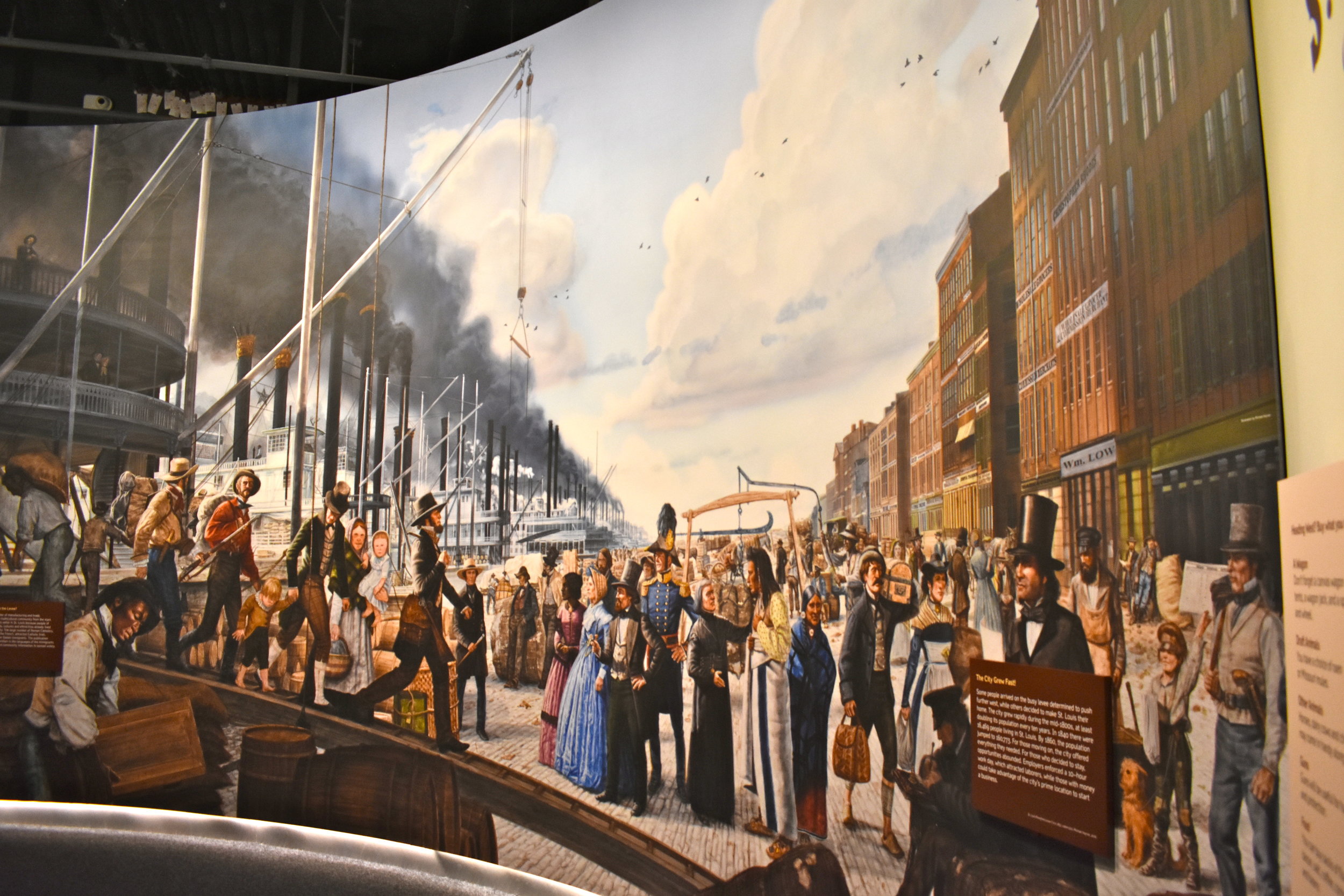
The thought that went into the content, delivery and presentation is amazing. The small size, in our opinion, was perfect for the overall experience. There were a lot of families, and kids have short attention spans. But, adults won't be disappointed...my better half is an unabashed fan and devotee of dioramas: the Riverfront section does not disappoint.
There were a lot of international visitors as well. The content was appropriate and staged well to give an overview of St. Louis' place in American history, and of course the Arch itself.
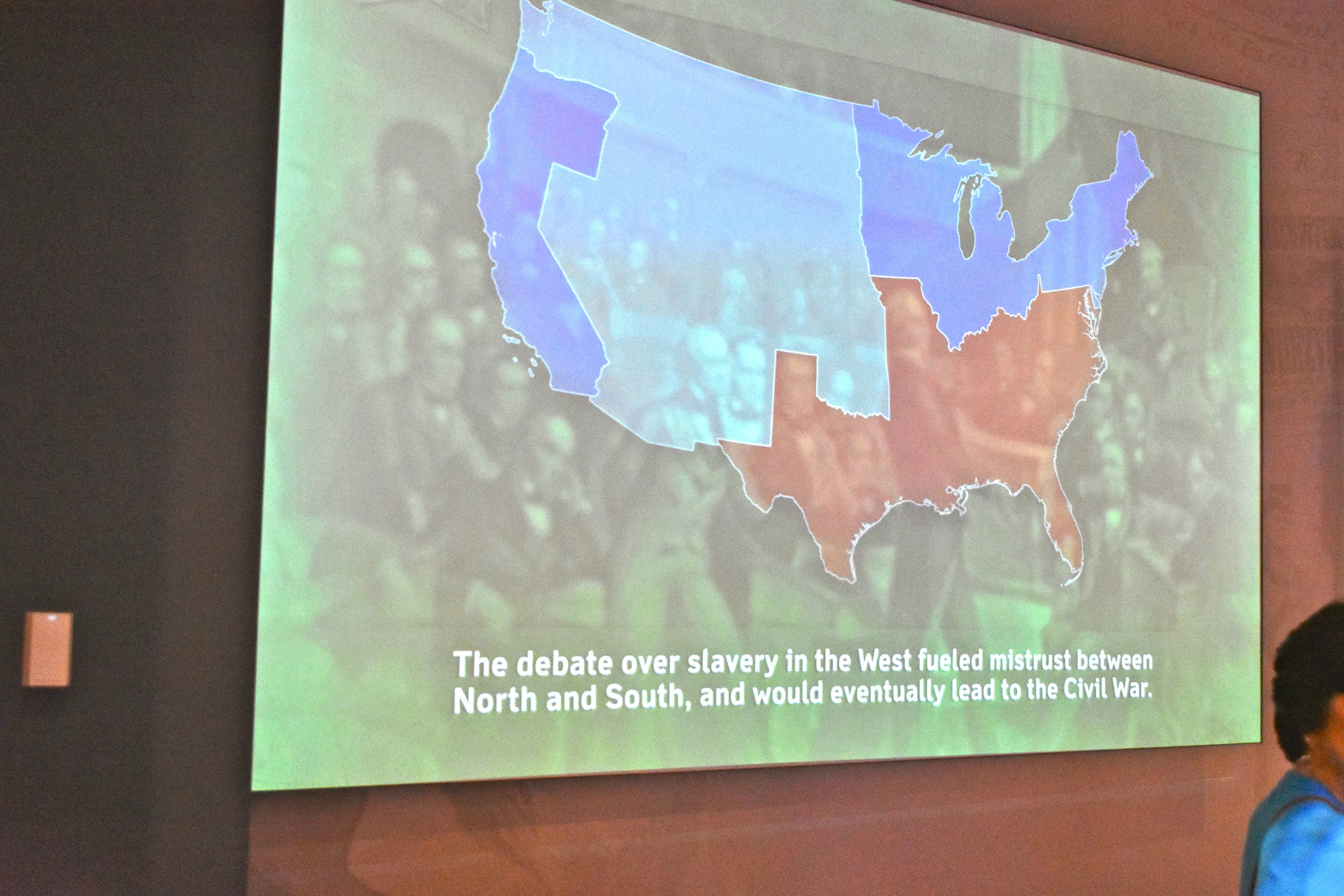
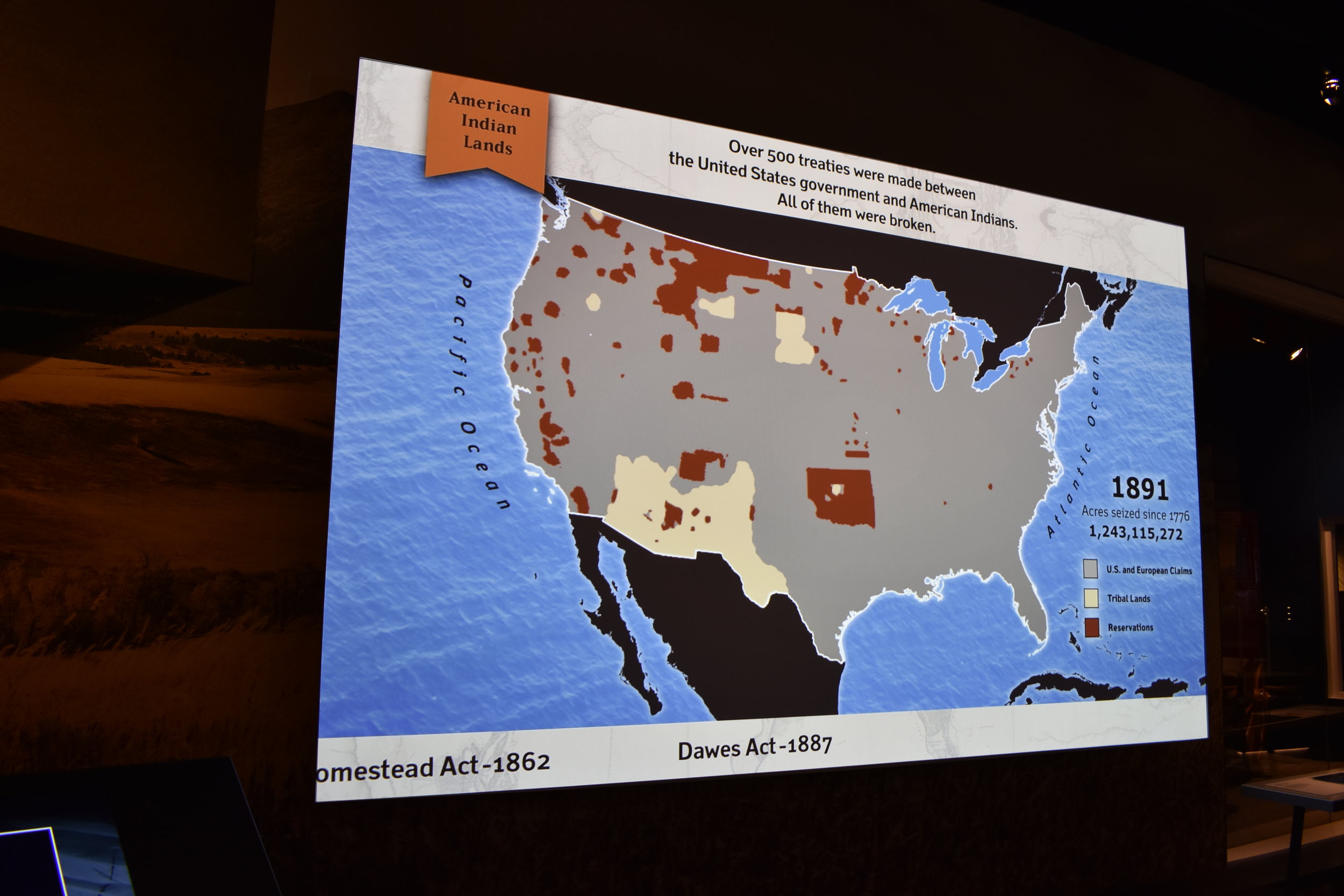
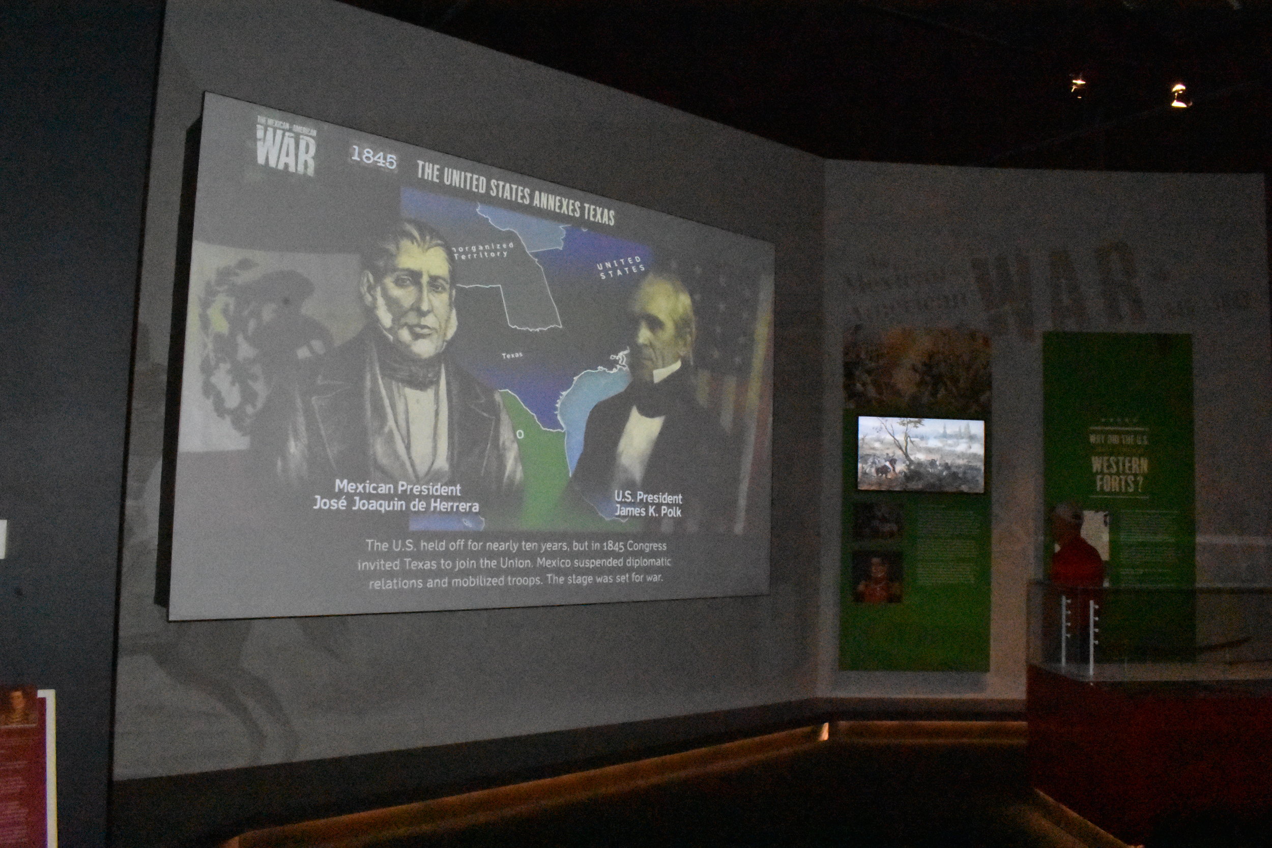
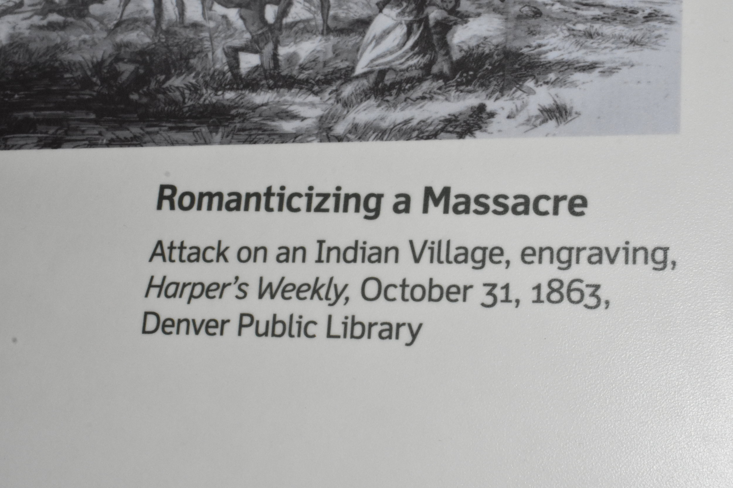
And as an American citizen educated in the 1970's and 1980's, I was pleased to see notable recognition of slavery's role in Western Expansion and the Civil War, and treatment of the Native Americans and Mexicans. The moral struggle is recognized and not glossed over, nor is there a lingering feeling of guilt or dread. As we tried to explain above, the change in lighting had a somber effect to appropriately take in reflection and critical thinking that was Western Expansion and Manifest Destiny. There were winners and losers and the museum made us think about it...once again.
Some examples:
You get a way more balanced and accurate account of Manifest Destiny and the settling of America.
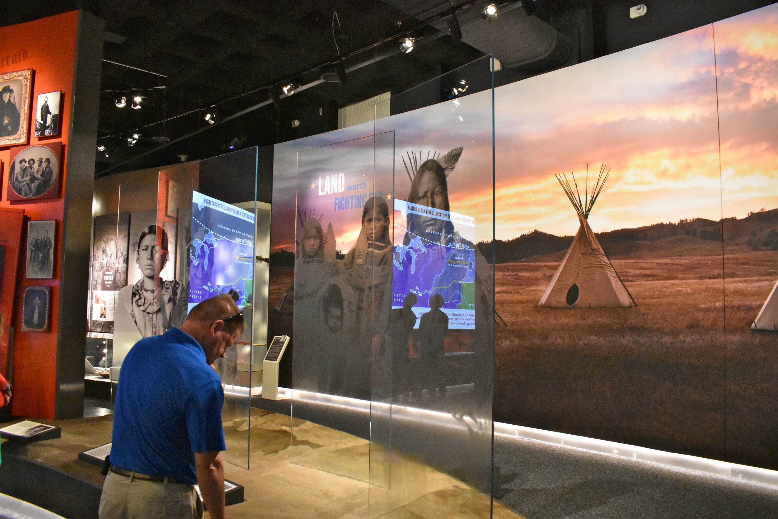
An especially catching display was a background wall mural of the Native American prairie communities with a foreground of opaque glass images of various tribes...like ghosts on the prairie, like they disappeared, like they were wiped out. Or, proud and strong and everlasting like a ghost that stays with this time and place forever. You decide. Either way, it is beautifully done. Your reflections show right next to the images of Native Americans and you can't help but reflect and you see yourself right there in their place. Them then, you now...together.
Stunning.
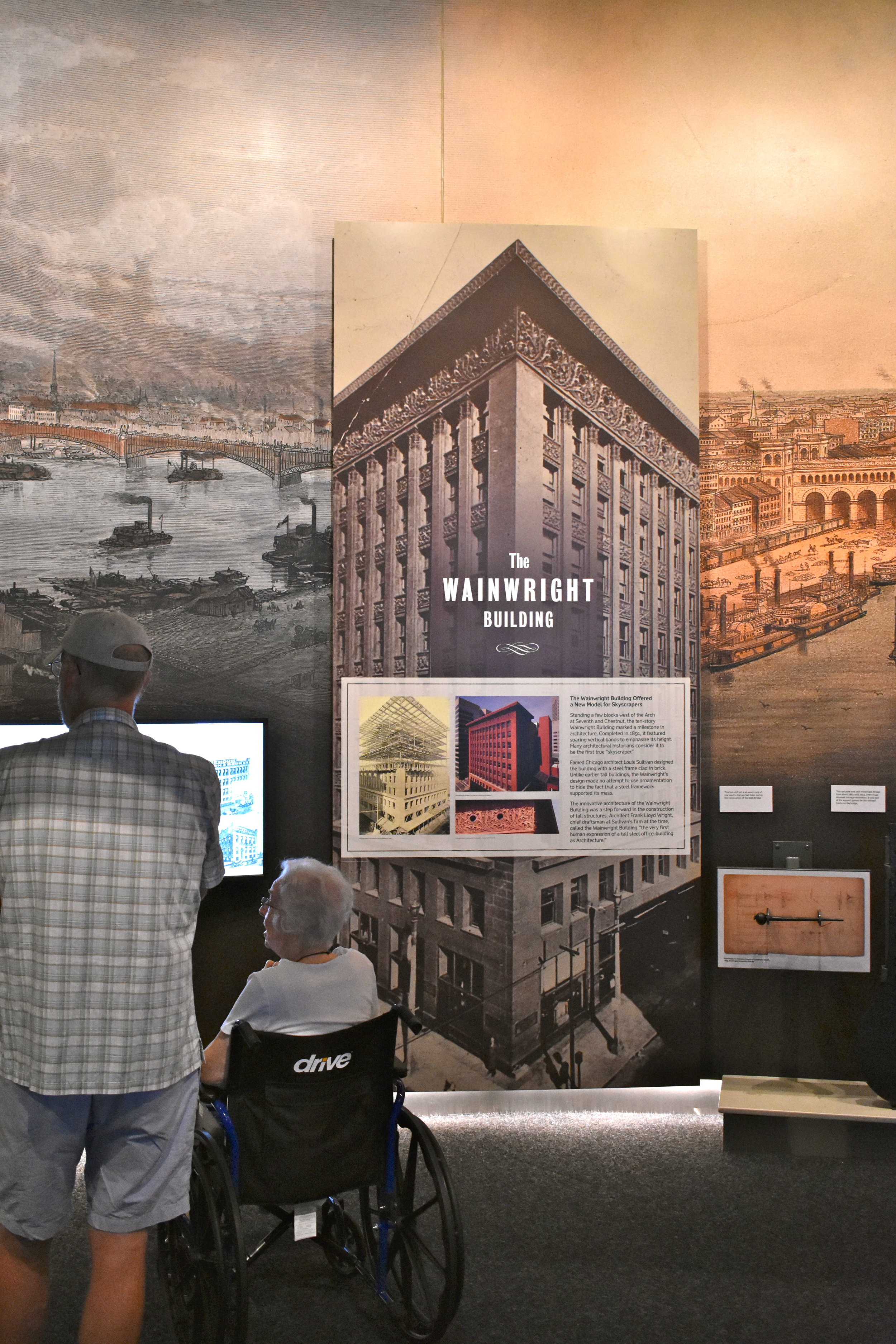
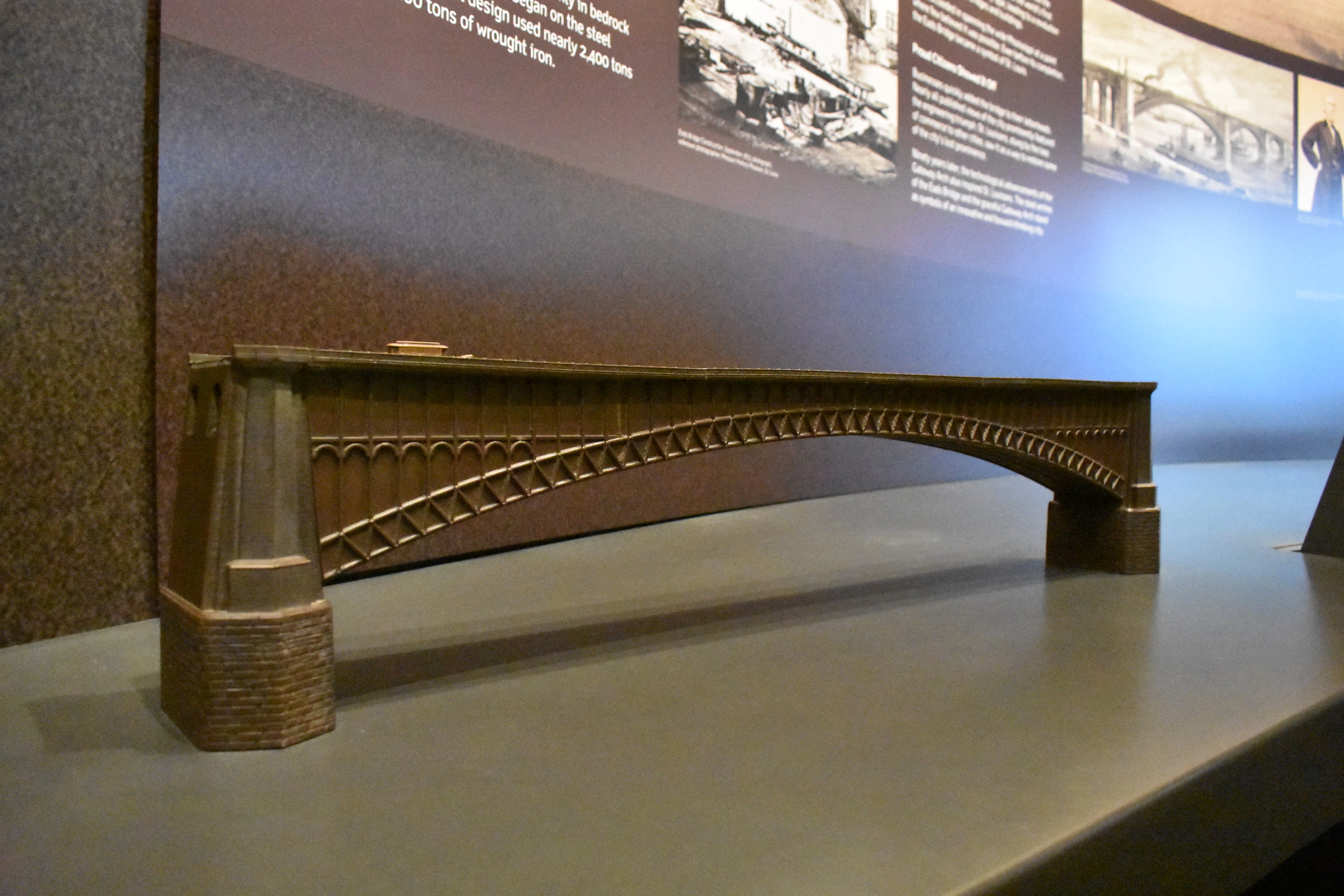
There was satisfactory attention to our architecture and music (ragtime), and the Eads bridge was made the star that it truly is. Form and function at its best.
The diorama of the riverfront is pretty cool, my wife LOVED it. Hang around and eventually it turns from daylight to evening views.
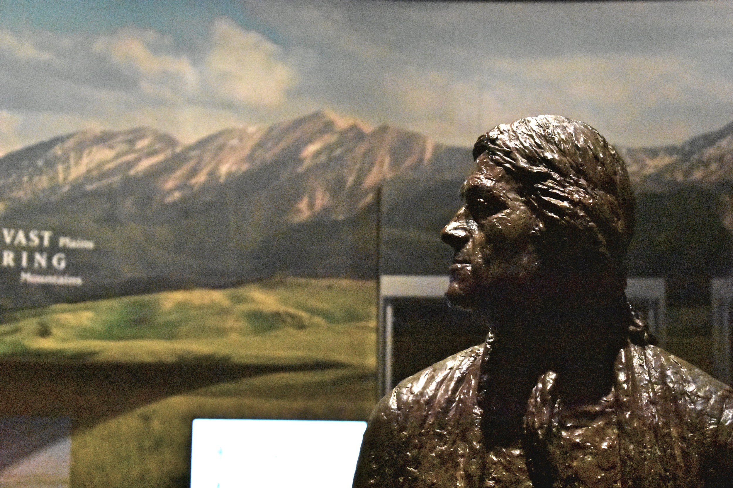
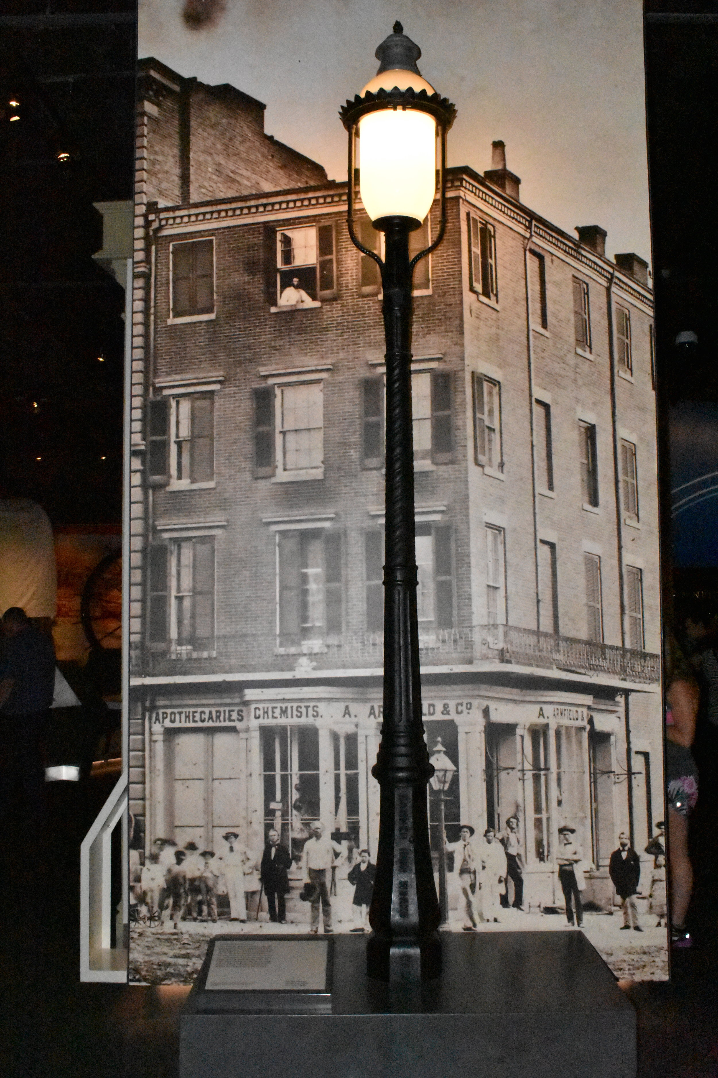
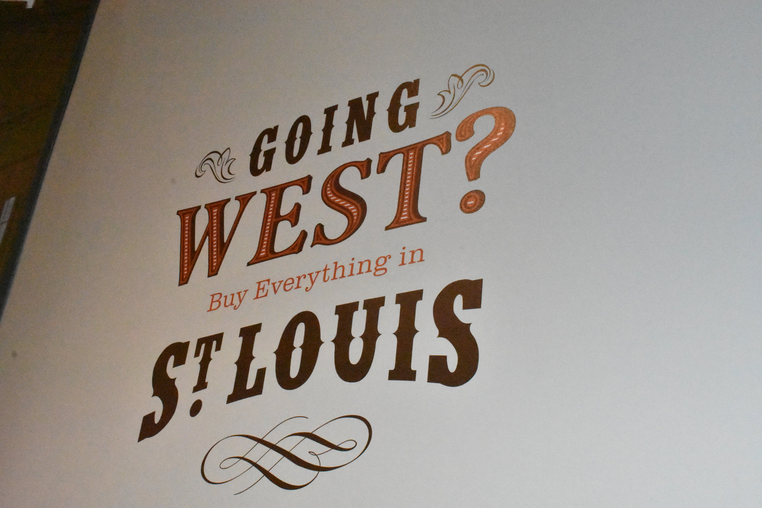
Here is a photo carousel of several images for you to flip through some of the other elements covered in the museum:
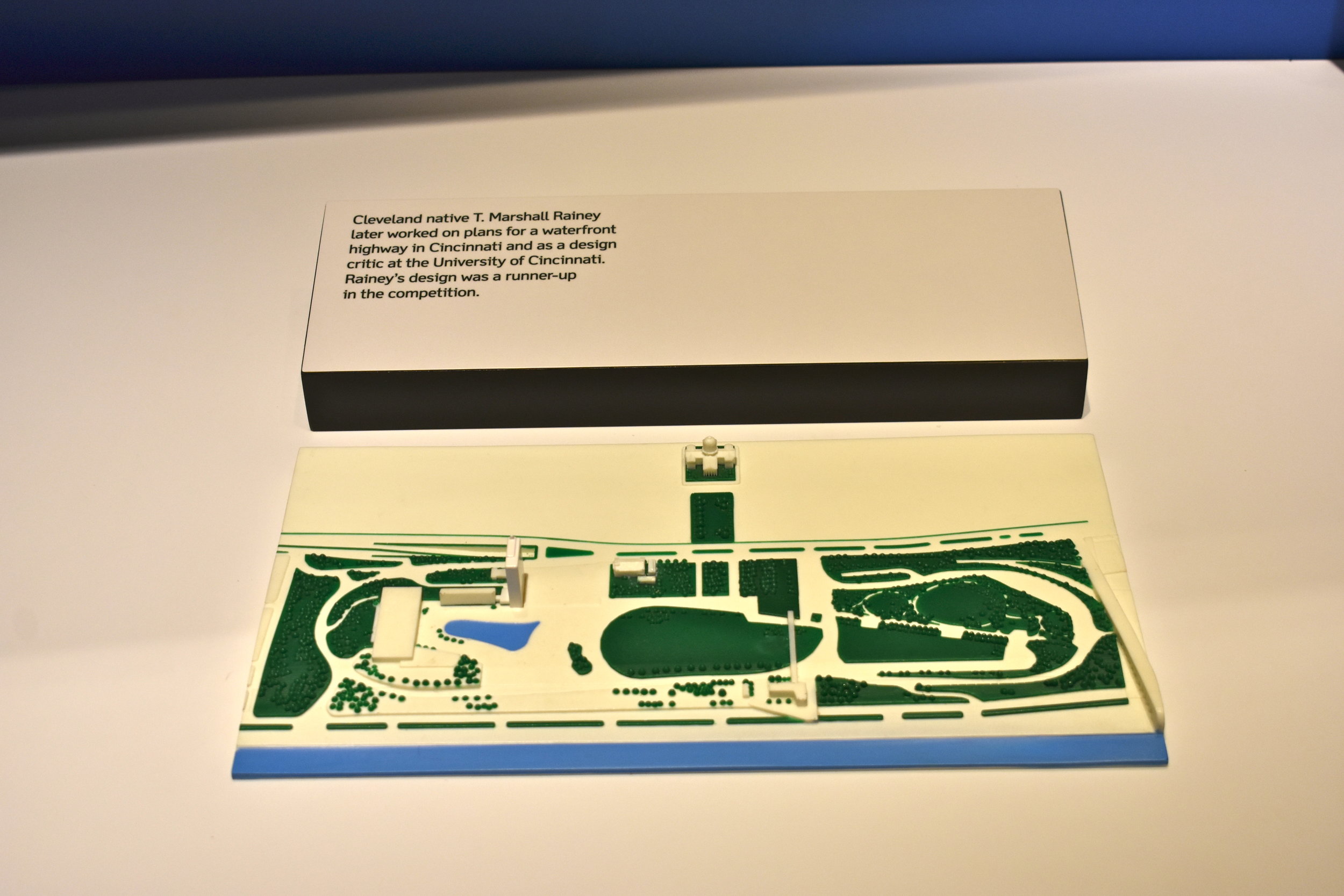
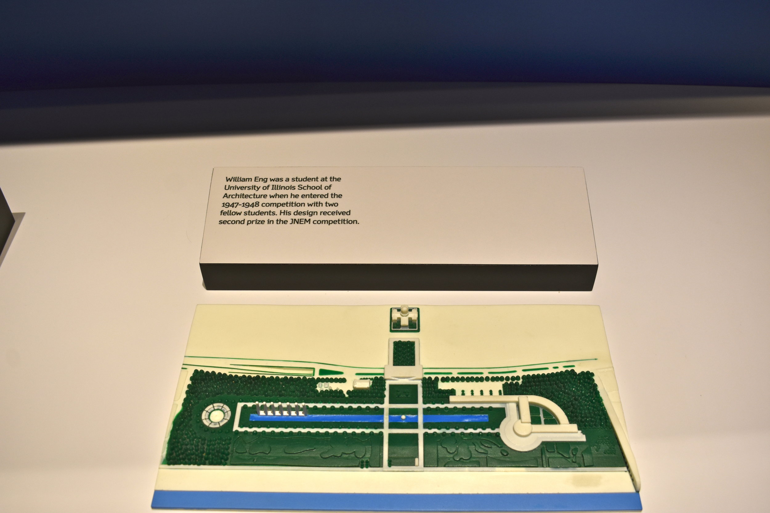
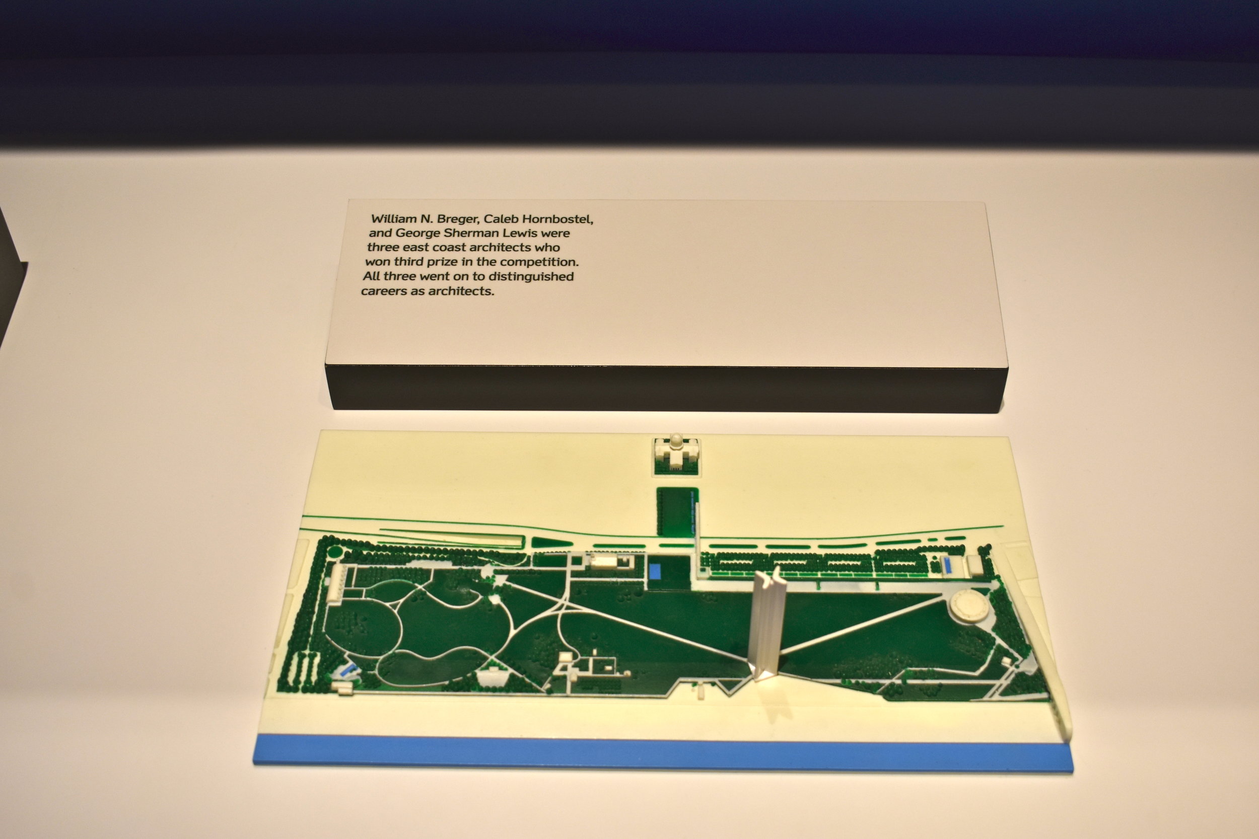
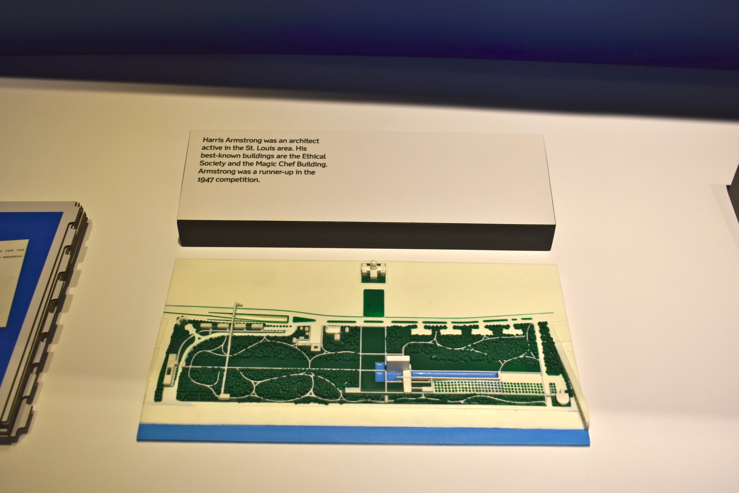
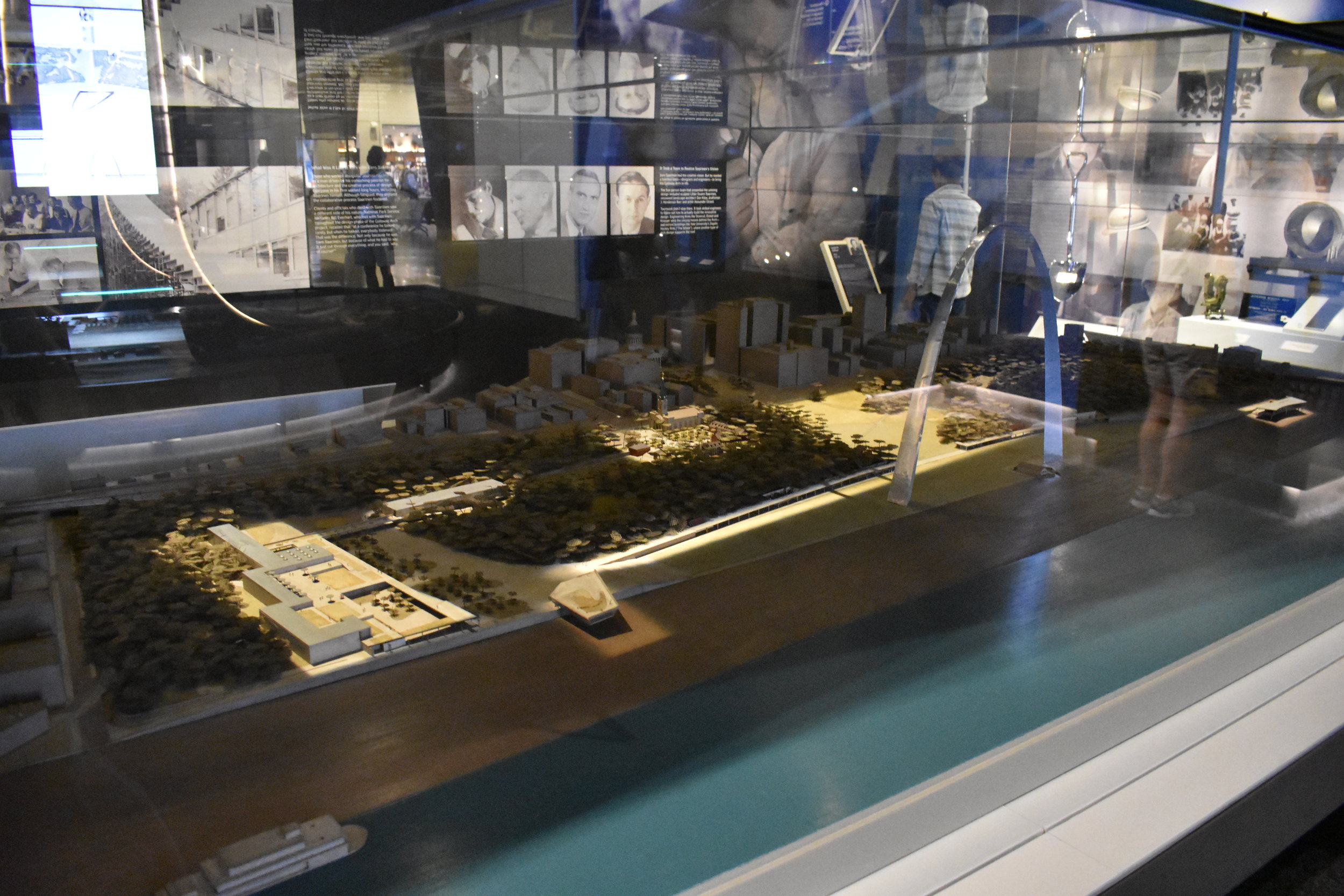
One of our favorite installments in the Arch section of the museum were 3-D dioramas of the competing entries in the original design competition that was eventually won by Saarinen and team.
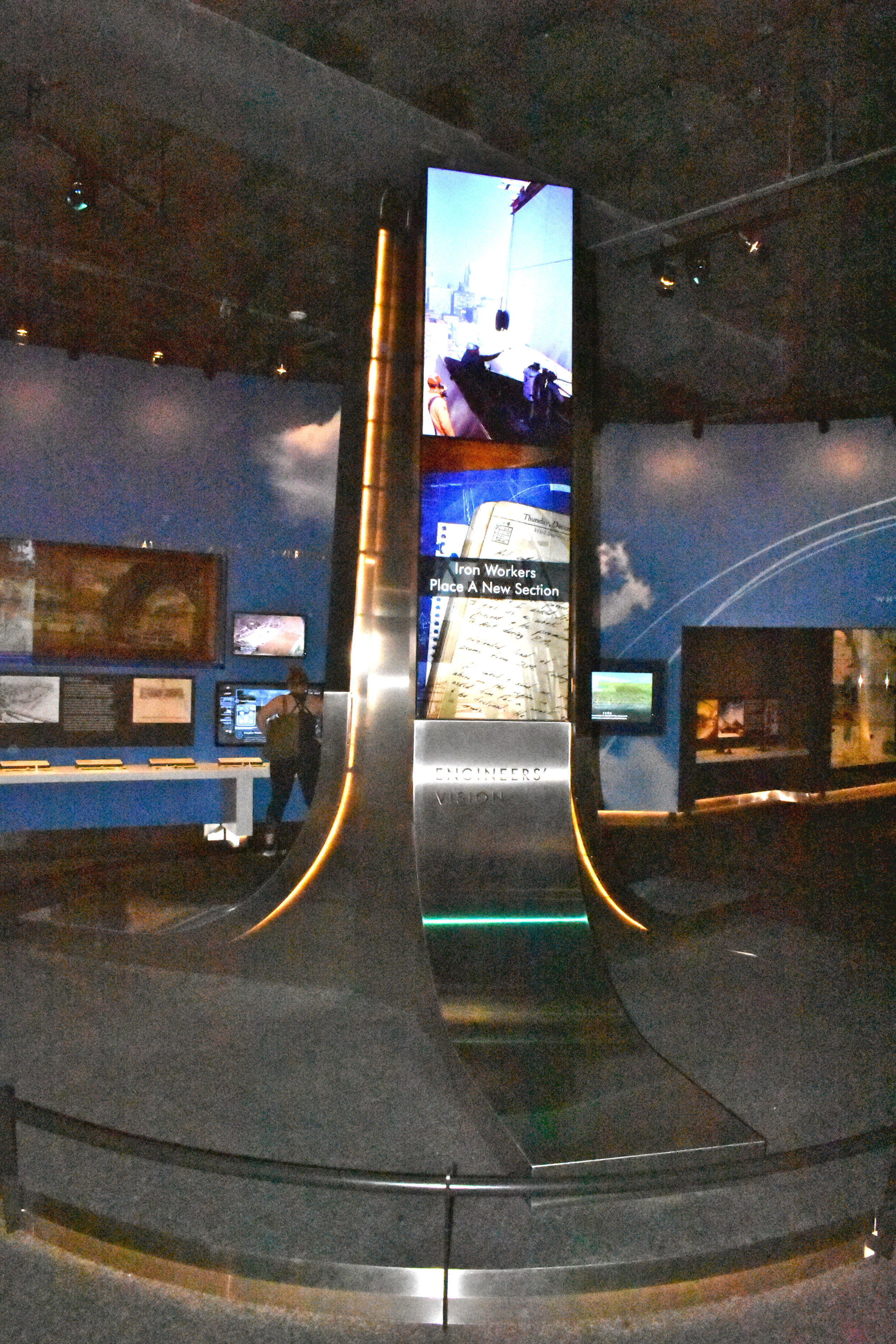
There's also some love given the the unique engineering required and executed to get people to the top.
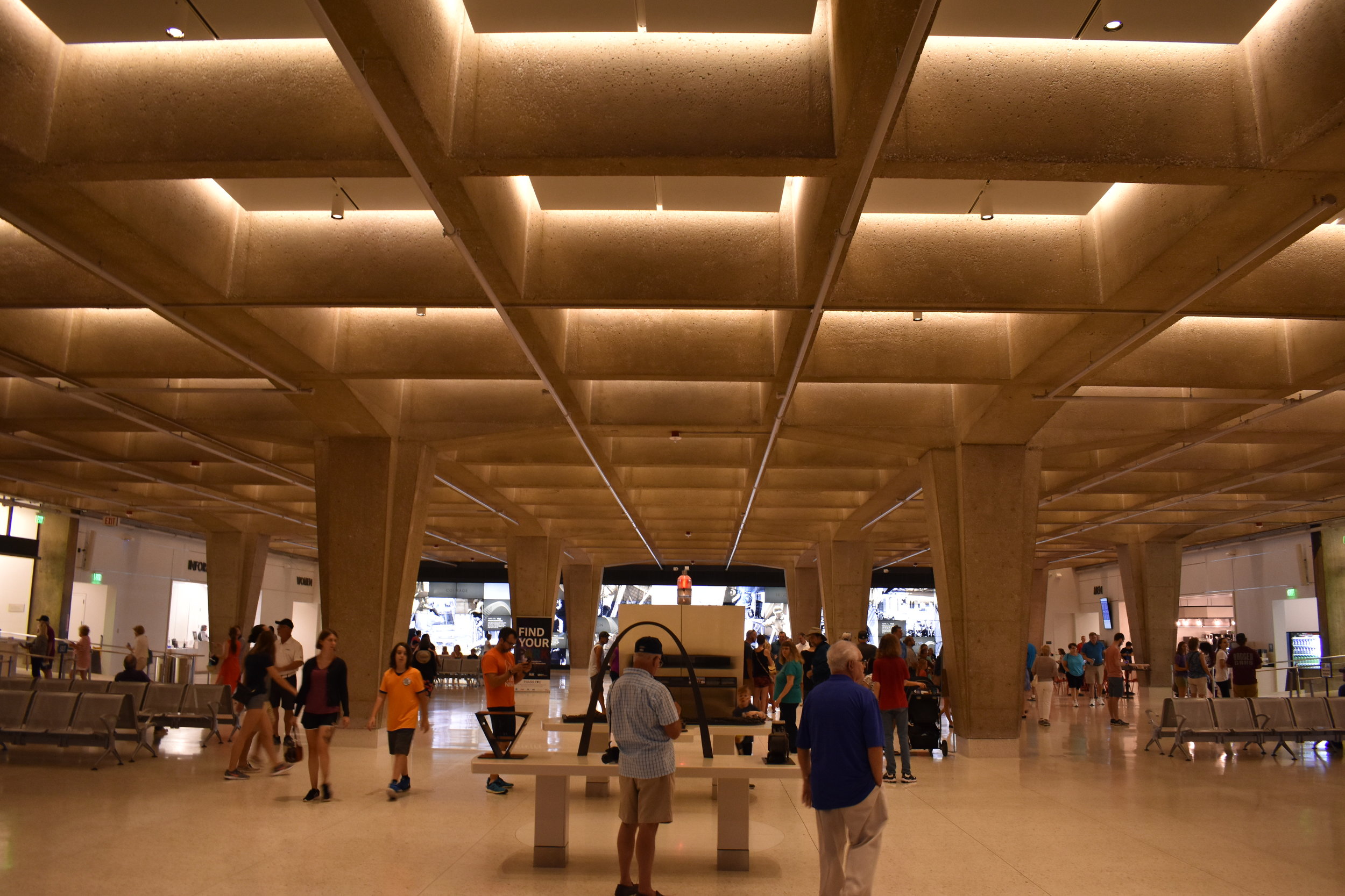
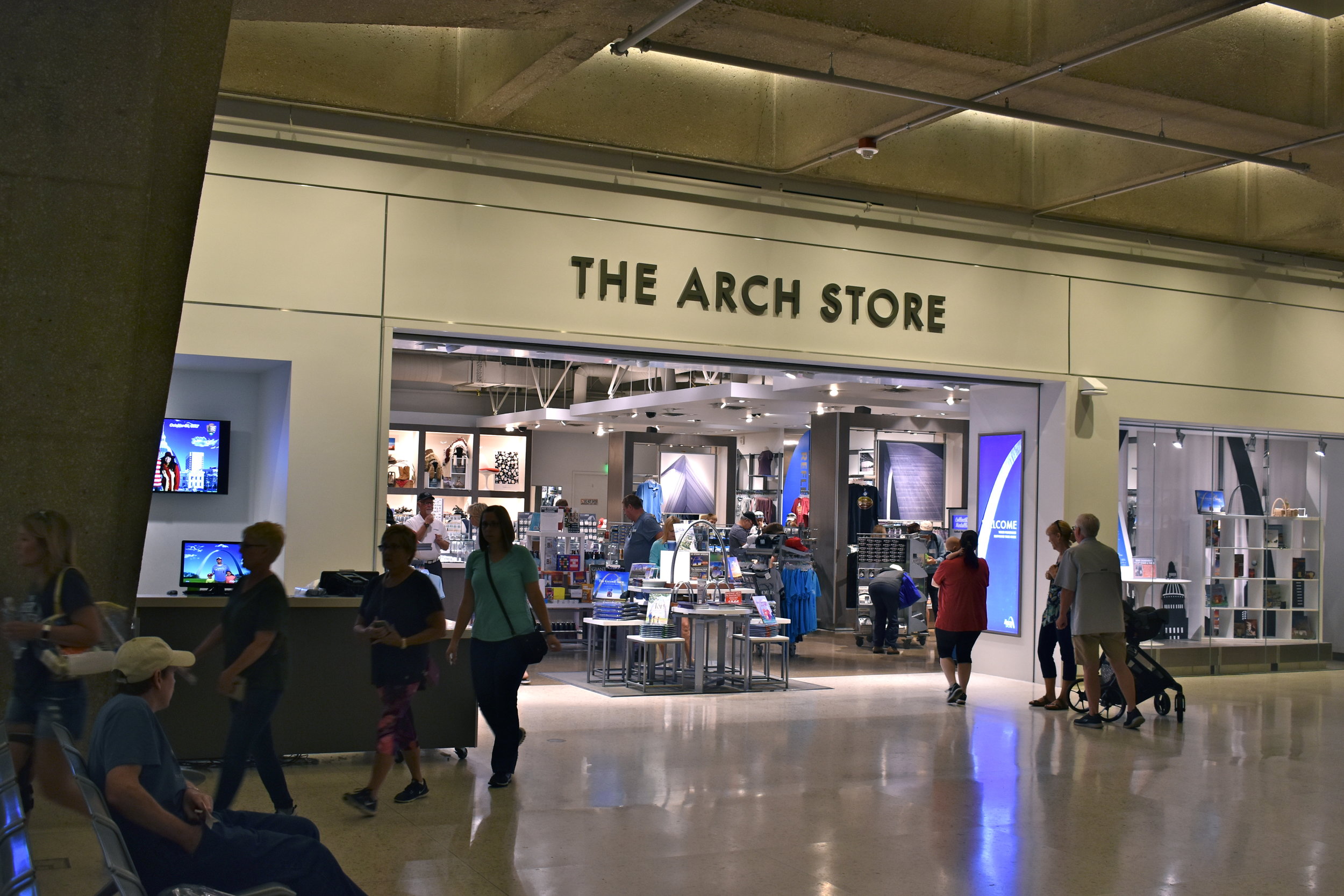
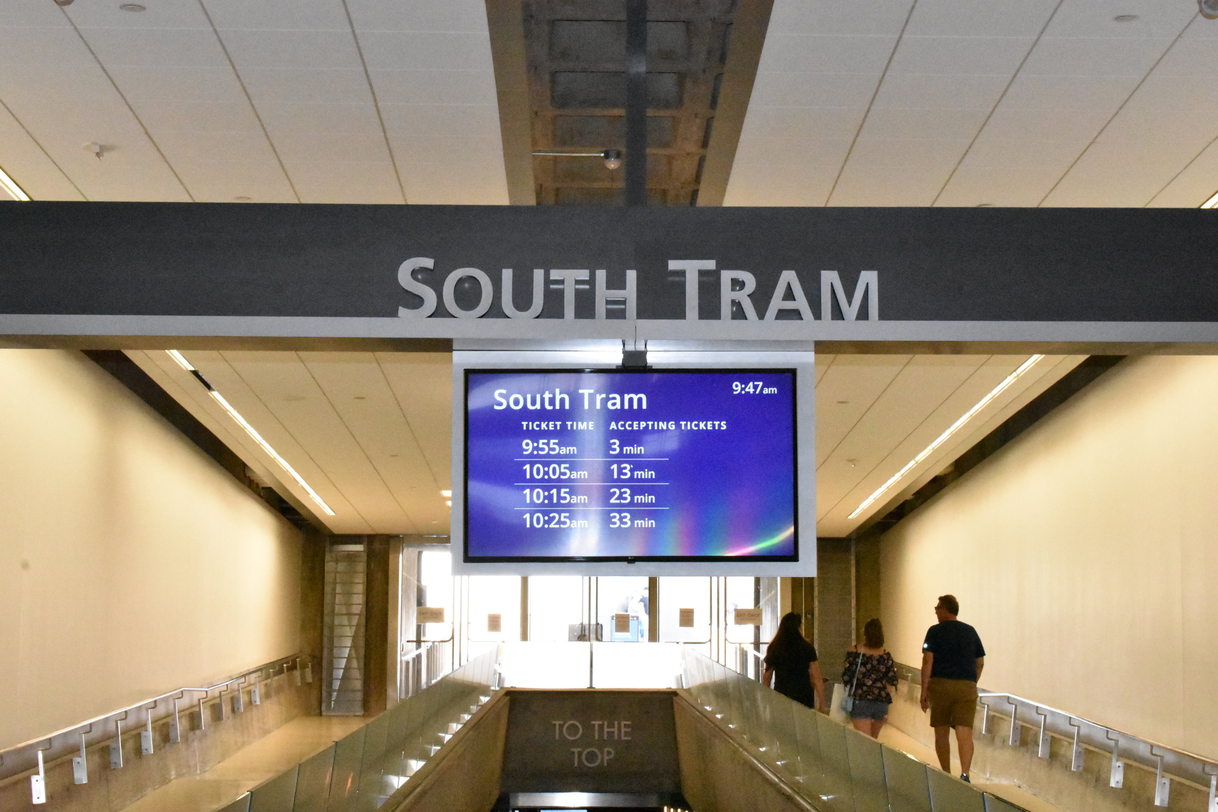
Exiting the museum, you enter the space familiar to those who've visited the Arch before, but it too has been redone. There is a small movie theater, a gift shop, snack bar and ticketing areas to enter the trams up to the Arch.
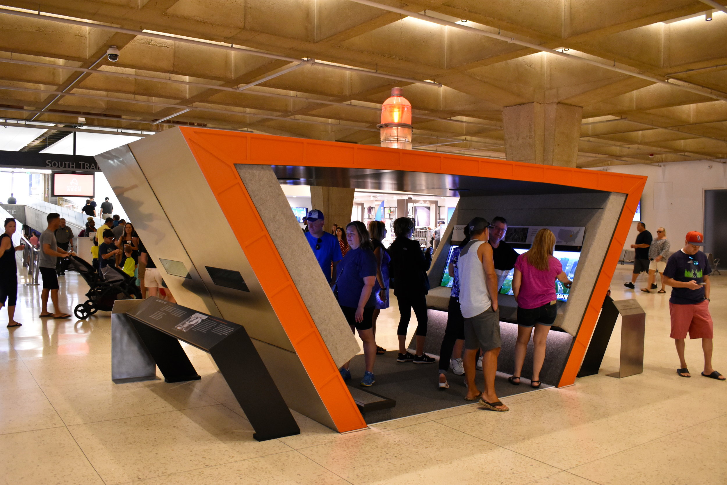
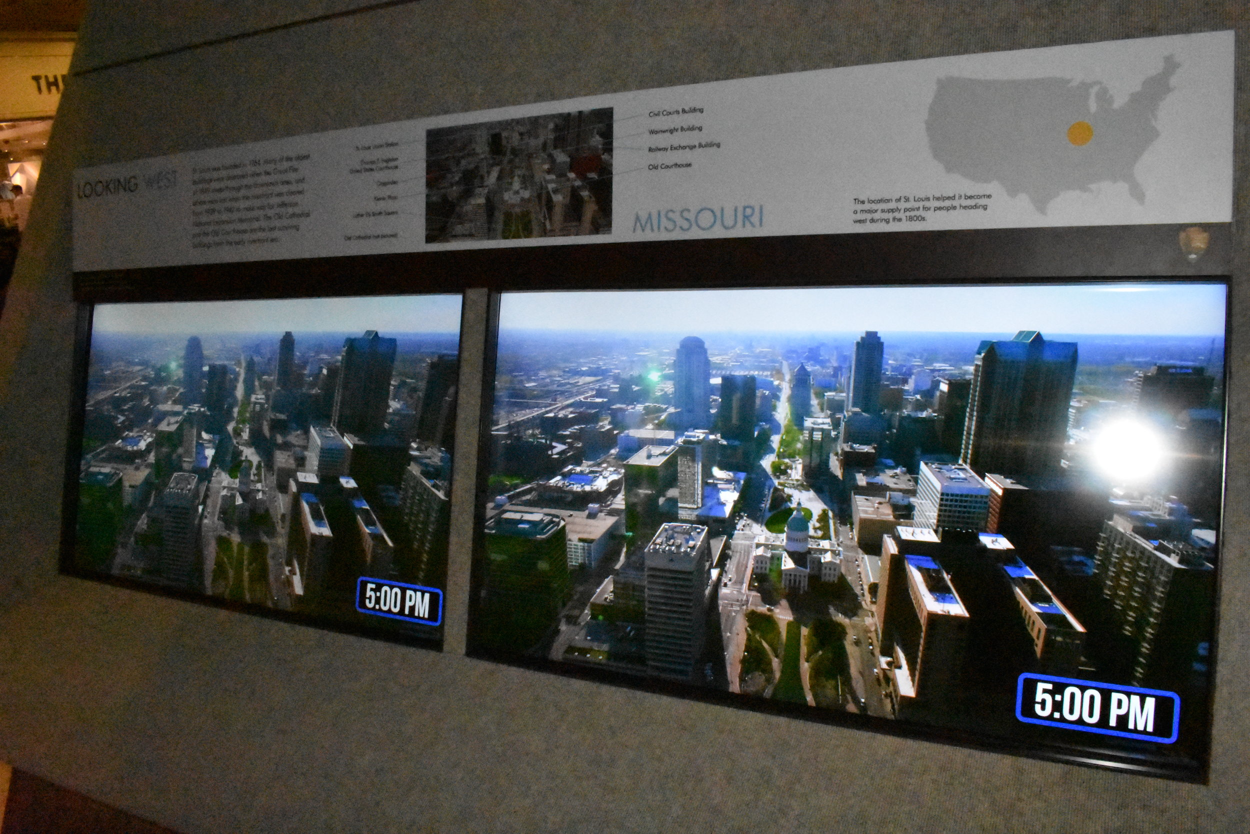
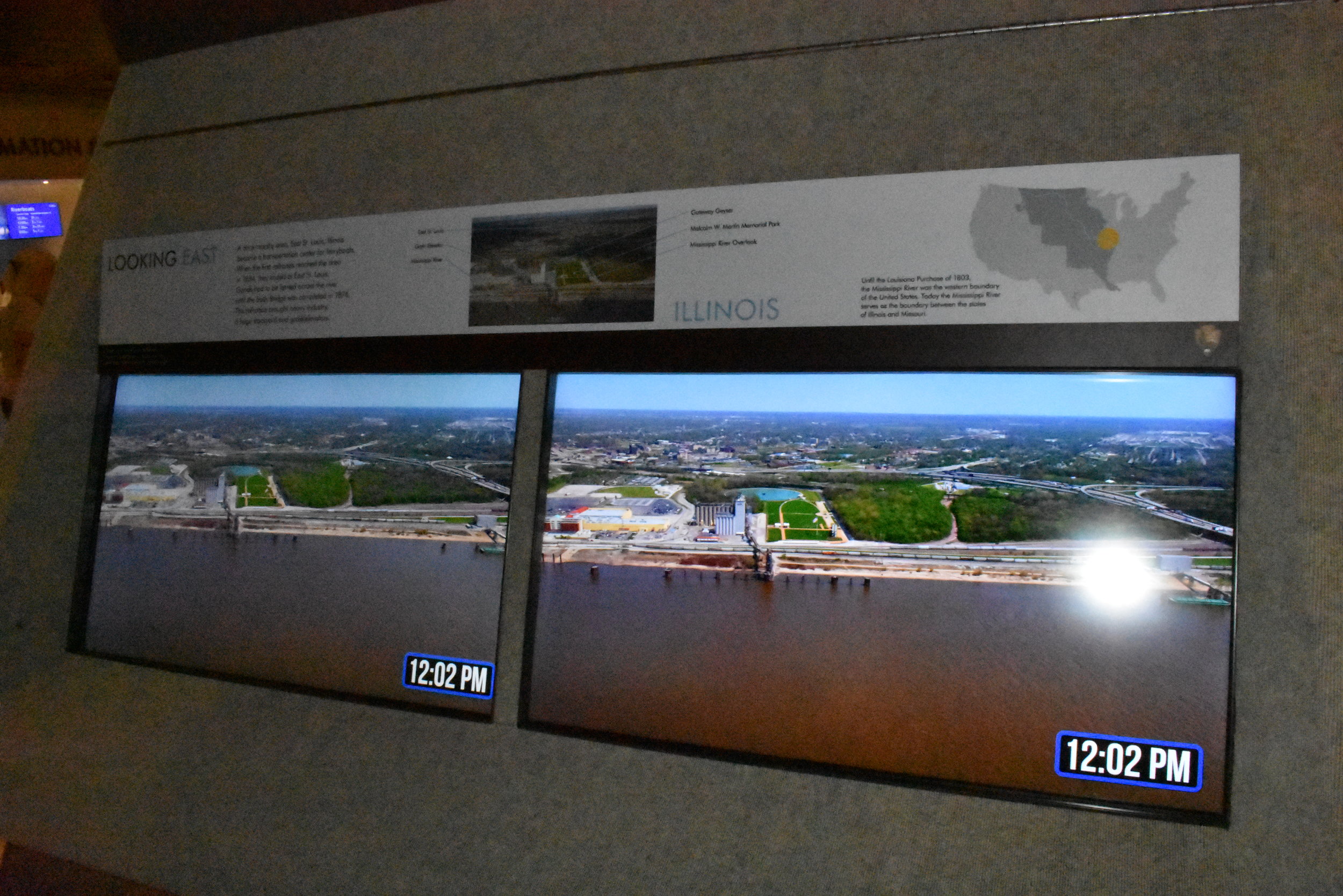
If you are unable to go to the top, there is a display that mimics the final section of Arch with camera views of St. Louis to the west and East St. Louis, IL to the east.
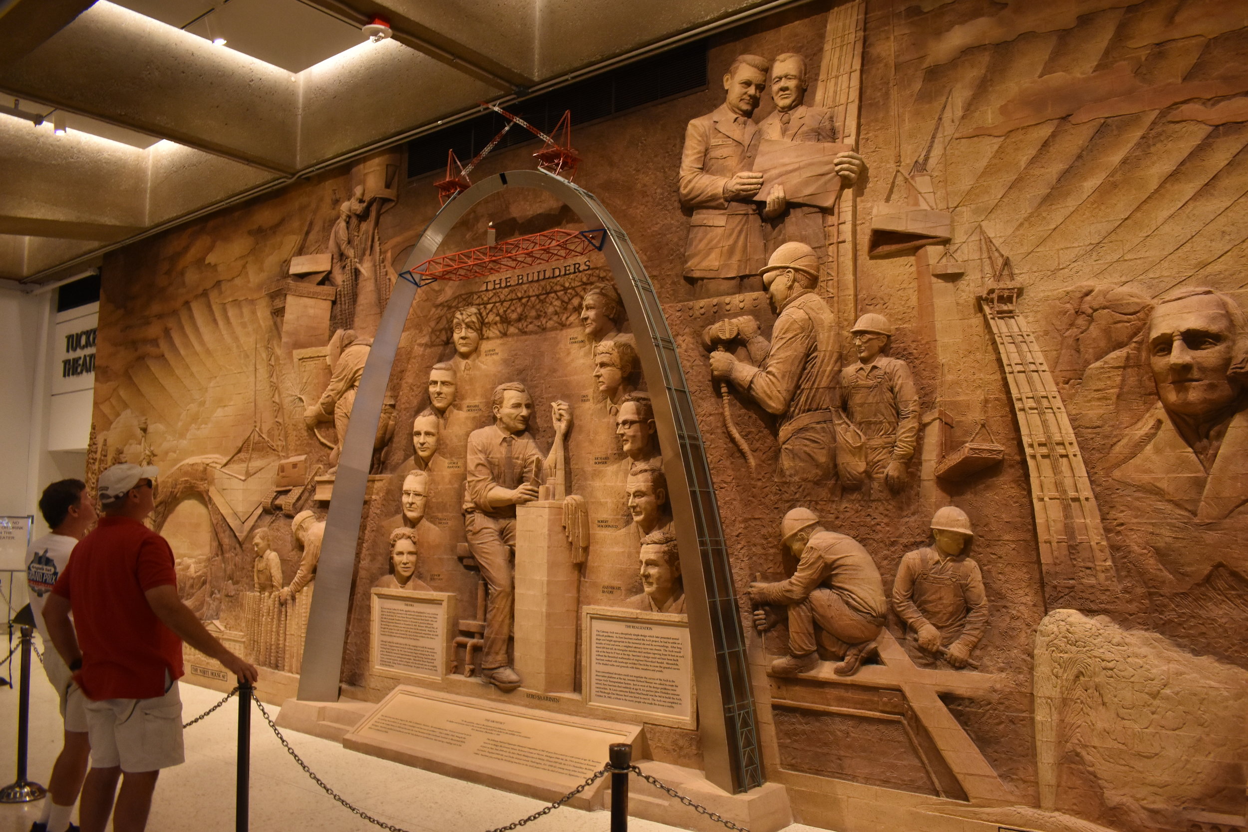
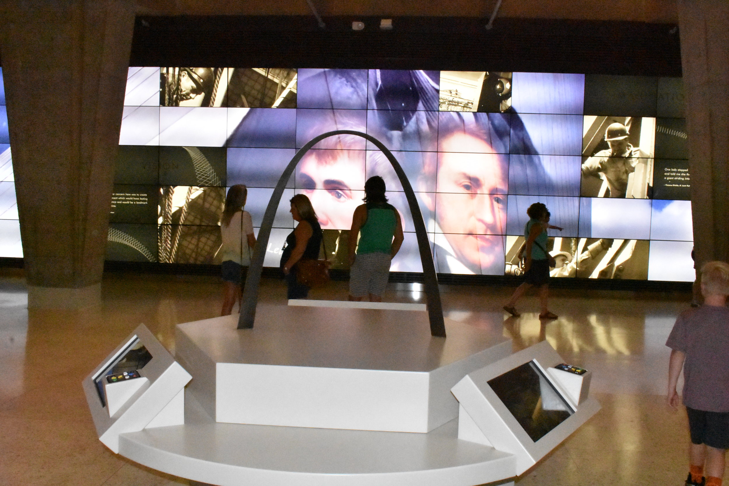
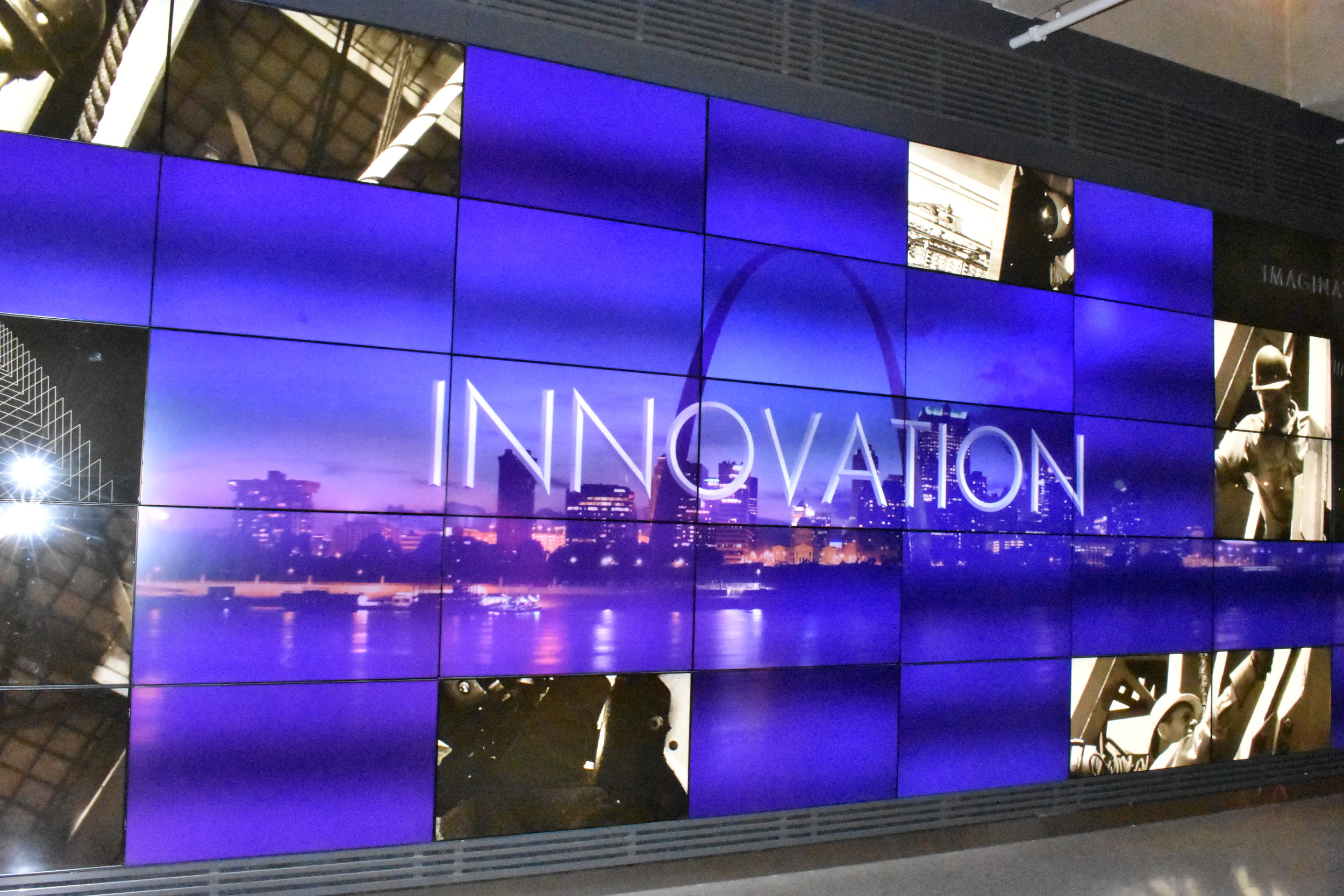
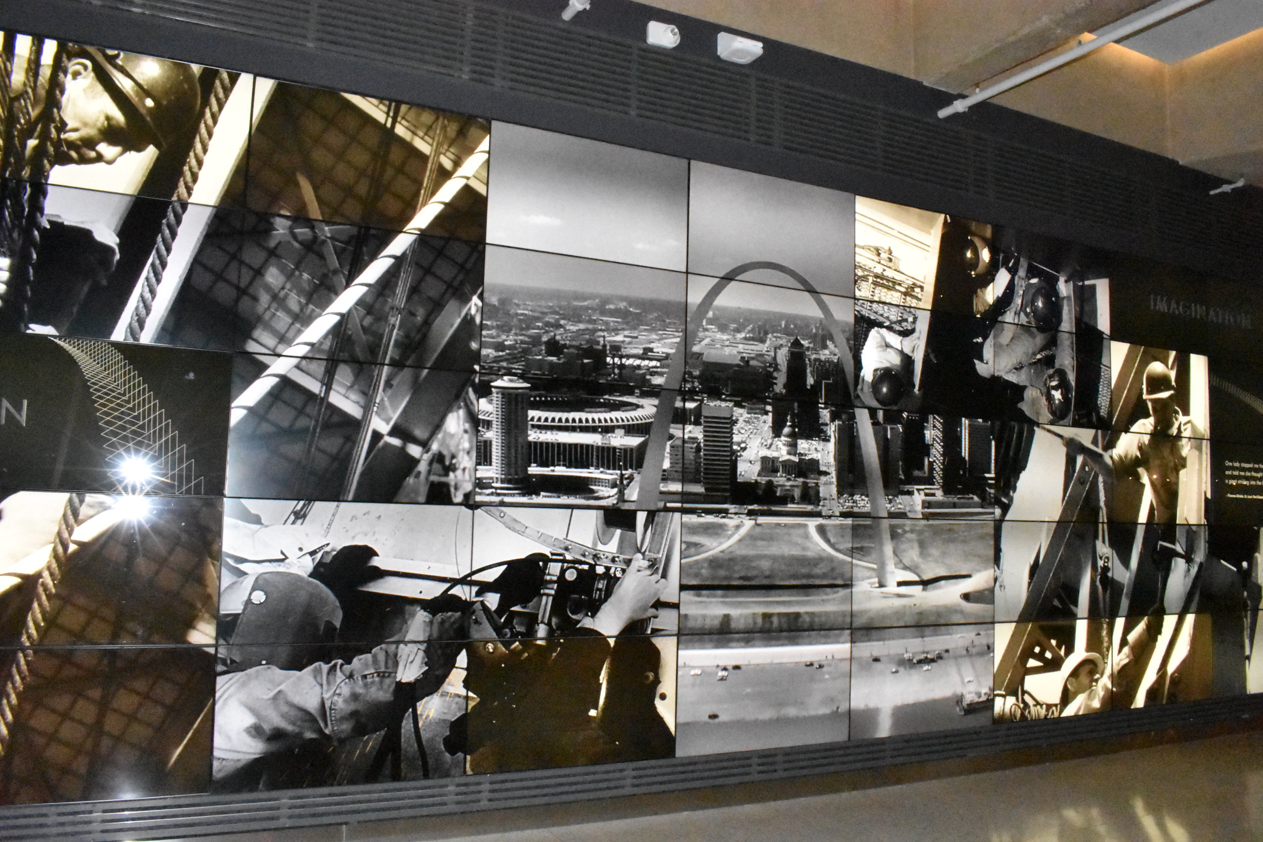
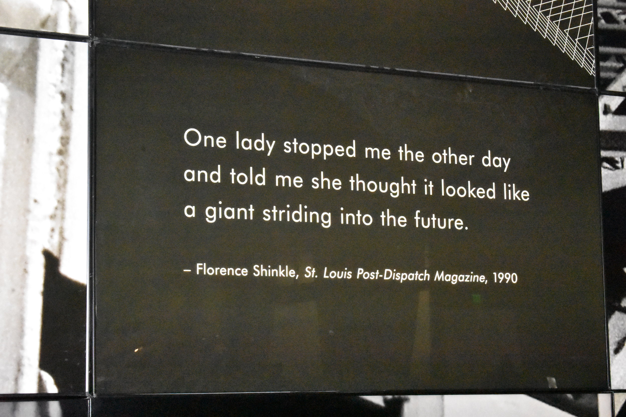
There is an impressive video wall that cycles through history of the Arch construction with quotes from those who built it, enabled the public facets of the project and just everyday citizen quotes on the landmark.
Overall, a quality experience, one we'd recommend...and it's short enough to not overwhelm. It recognizes our past good or bad, and allows you to balance the various perspectives. It makes you think...and celebrate the accomplishments of those like James Eads, Scott Joplin and Eero Saarinen who left their marks on St. Louis.
It invites the story from all angles, and that is what a good museum can do when it's done well...share multiple sides of history's accounts.
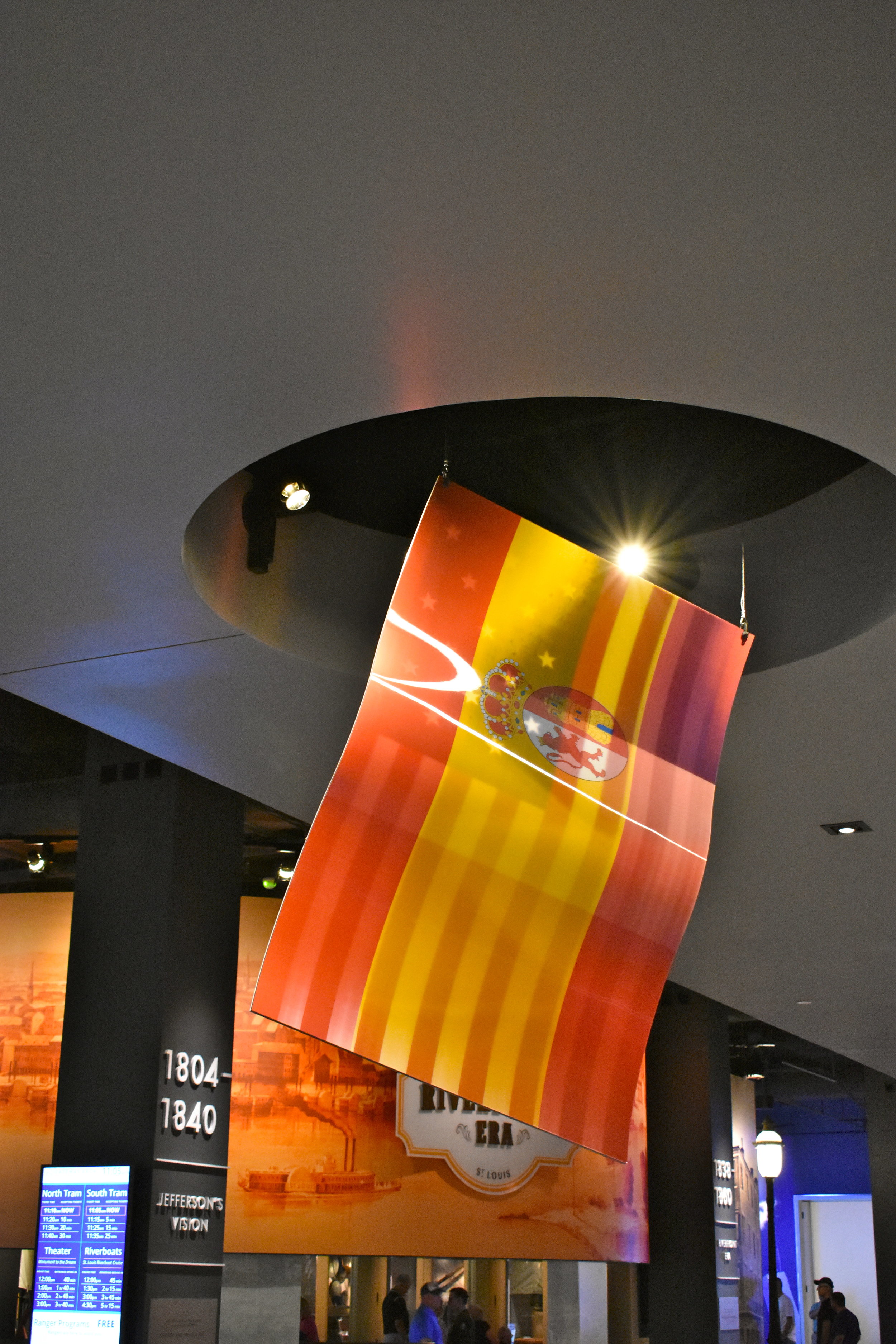
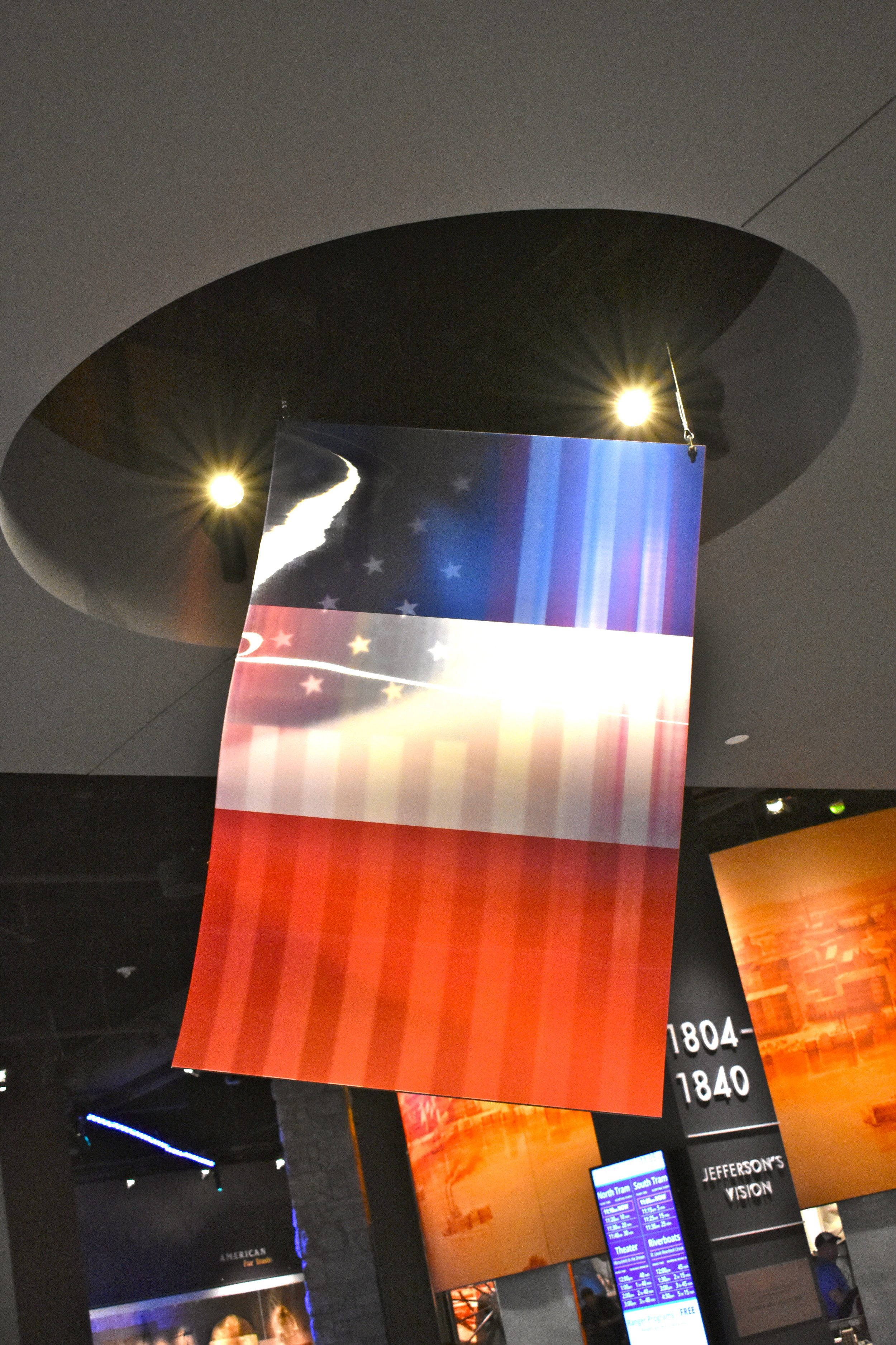
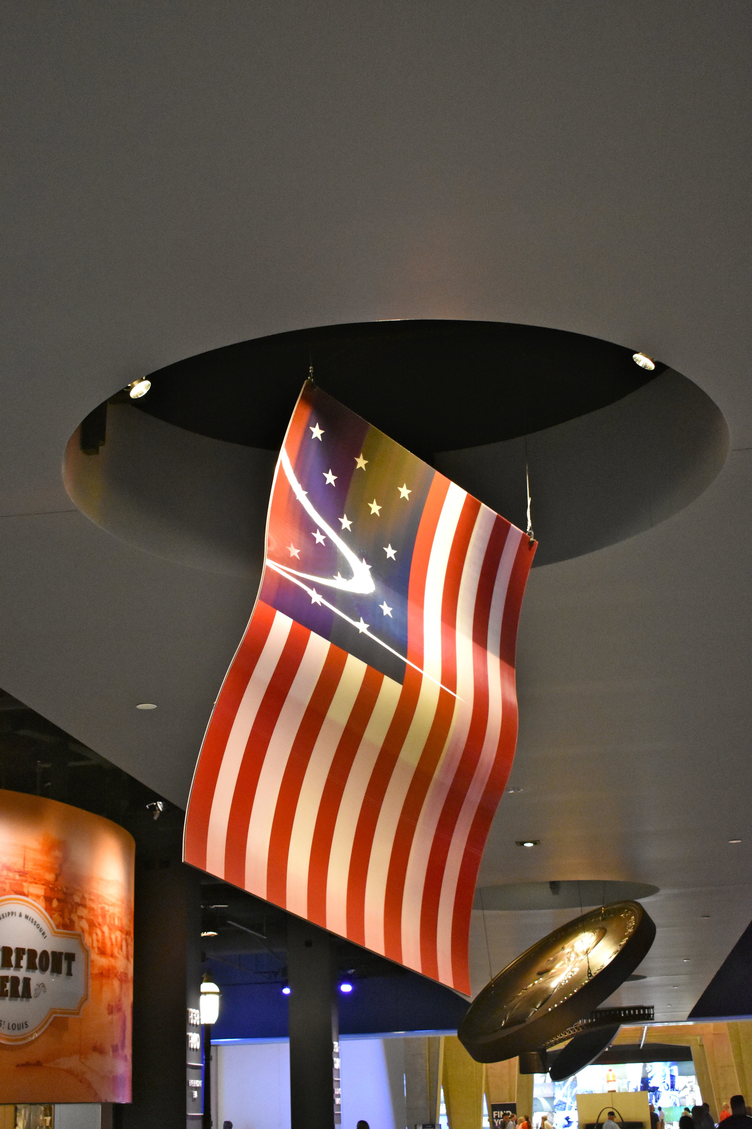
Yet another sophisticated example of balance and presentation is a hologram flag that (depending on your angle) cycles through the Spanish, French and early American flags.
We walked away impressed. We hope you enjoy it too.

