On Saturday, June 29, I took part of my family to visit the new east building expansion of the St. Louis Art Museum (SLAM). This $160M expansion had us pretty excited as the SLAM is a national treasure...and we've missed the collections that were not on display during the construction.
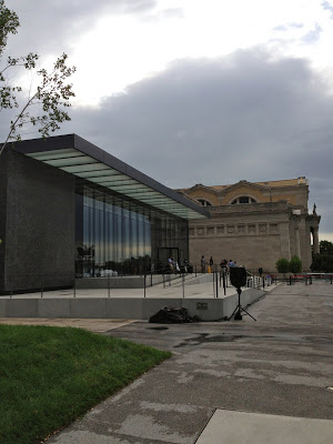
If you have followed the Grand Opening as I have, you've probably read what the pundits are saying. Largely a mixed bag of tempered praise to mild disapproval.
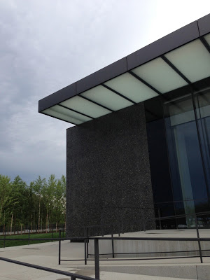
Anyhow, this is my take as a casual observer of the building itself and the galleries within.

Not unlike the recent $70M renovation of the Central Library, I was anxious to see this historic addition.
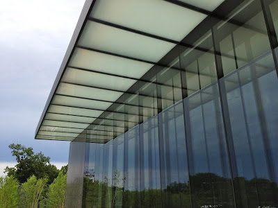
Now to me, art, architecture, writing and music are all about feel. It's amazingly powerful to get a feel from a song or a painting or a book or a building. I'm a simpleton, but the feel of a place can change a so-so experience into a great one. Yet, buildings have soul only if the things within them have soul. I feel the venue usually affects the performance or showing...the general experience overall.
When I walked into the recently renovated Central Library...I got the
rush of pride and excitement and awe
. THIS is why I live in St. Louis...this is why I'll continue to brag about this city...we just pulled off something amazing and unforgettable at that library. I just want to BE in that space it. I drove home and insisted that my family go see it and we were all in awe together, ages 6-42.
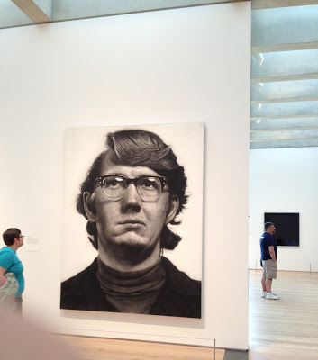
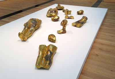
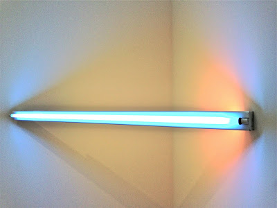
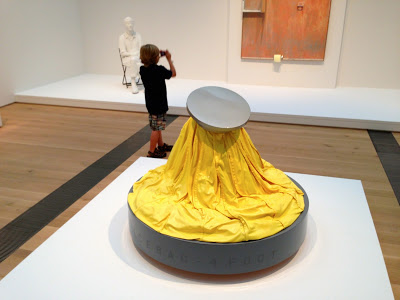
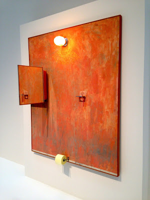
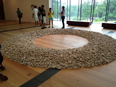
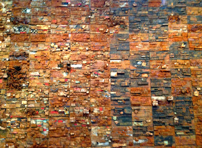
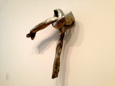
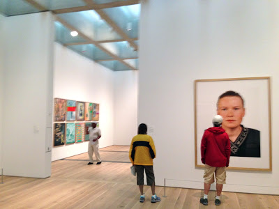
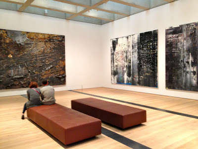
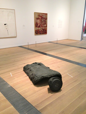
Upon first visit, this new building does not make me feel the same way. Although, some of the artwork I've never seen before certainly did. My wife and kids were excited about the works on the walls or in the middle of the floors, but they didn't say anything about the building...nothing, they just wanted to talk about the art. They are usually vocal about the place too, not today.
Maybe that's the point...the expansion was not meant to compete with the 1904
Beaux Arts gem to the north. This expansion seems to respect the original. And I think that's all it takes to understand why it isn't really a blow your mind kind of expansion.
I walked away not underwhelmed, not overwhelmed...just happy to live in St. Louis and enjoy an art museum whenever I want...for free. Happy to see new installations that my kids will have as part of their up-bringing...mixed with the old classics from my fond memories. Happy that we once welcomed
to live and work here and be appreciated here forever.
Most of all, I've got to give props for the...get ready St. Louis...underground parking lot!!! No, we don't have a disgusting parking lot mucking up our old classic stock a la the Park Pacific.
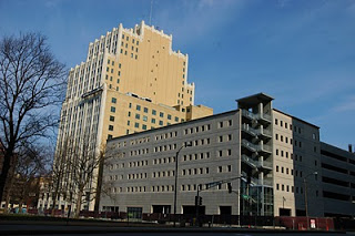
WTF
Underground parking! $15.00...a reasonable fee for those who don't want to walk; after all, admission is free.


The landscape is awesome as well. The structured use of various species of birch is PERFECT for my liking as we are a river city and these elegant riverside, bluff natives are oft painted in European and American art. They'll look good in the winter too.
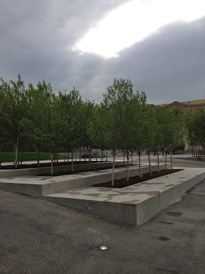


7 year old liked the view in this room

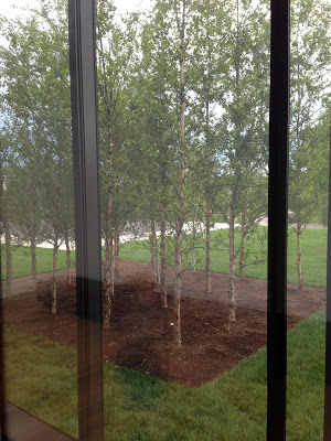

The pundits are calling the addition "quiet and reserved". Gaudy, revolutionary or bold are certainly not words that came to my mind, so I guess I agree. Sleek and modern are the words I would use to describe the feeling I got. The space made me happier from the inside than the out, which I guess is the point.
So that's my humble 2 cents.
Now let's see what the pundits have to say.
From
:
David Chipperfield’s design for the more than 200,000-square-foot East Building presents a contemporary counterpart to the Museum’s neo-classical 1904 Main Building. Awarded LEED Gold status by the U.S. Green Building Council, the design organically links the two buildings, and a new Grand Stair provides a seamless transition between the main and the lower-level galleries and visitor amenities. Museum visitors may use the fully accessible new entrance to the East Building or the existing Sculpture Hall entrance to the Main Building, where the original floor plan has been restored as part of the expansion project.
The façade of the East Building features floor-to-ceiling windows and 23 monumental panels of dark polished concrete, with highlights of Missouri river aggregates. Inside the galleries, innovative coffered ceilings made of light concrete provide abundant but controlled natural light, supplemented with artificial illumination which is managed by a computerized sensor system that automatically adjusts to changing light levels throughout the day. Wide-plank white oak floors and stainless steel floor vents are designed to provide a distraction-free setting for the works of art.
From
:
Improving the quality of visitors’ experience, modernising the original building and marrying new and old were key parts of the project. Brent Benjamin (director SLAM) praises Chipperfield’s “deep respect” for the Gilbert building and his sensitivity to its setting, a park bigger than New York’s Central Park. The extension, which is built into a hillside, is largely underground. Clad in polished concrete panels that incorporate Missouri River stones, the wing features views of the surrounding park, a restaurant and provides facilities museum visitors now expect, including a car park. Another first for the museum is a “real coat check”, Benjamin says. He praises the “wonderfully quiet and reserved” setting for art that the architect has created in the new wing. The galleries have distinctive coffered ceiling but are otherwise pristine white cubes.
From
:
Known for his rigorous design approach, Chipperfield was appointed unanimously by Museum commissioners in 2005 to design an expansion to SLAM. No stranger to merging old and new, Chipperfield received the prestigious Mies van der Rohe Award in 2011 for his restoration of the Neues Museum in Berlin. But unlike his other cultural projects in the U.S.—for the Figge Art Museum in Davenport, Iowa, and Alaska’s Anchorage Museum expansion—that feature predominantly glass facades, the St. Louis project, in what is perhaps its boldest design statement, is defined by dark, massive panels of polished concrete that contrast sharply with the light-colored masonry of the existing Beaux Arts structure.
The other defining feature of the one-story “pavilion in the park,” as Chipperfield calls it, is the 4’-deep concrete coffered ceiling containing skylights that provide daylight to almost all of the new building’s 21 galleries. Used primarily to display modern and contemporary art, the flexible galleries accommodate temporary walls and feature under-floor air distribution and hidden building services. HOK served as architect-of-record, working with Chipperfield’s office to achieve LEED Gold accreditation. Paris-based Landscape Architect Michel Desvigne is designing the museum campus, including a future sculpture garden, in phases.
The 211,000-square-foot addition—more than half of which comprises below-grade parking for 300 cars—increases the museum’s total gallery space by 30 percent. It also allowed for the renovation and reinstallation of 68 galleries in the Cass Gilbert building. Chipperfield’s intervention there was minimal, save for a new Grand Stair in the main entry leading to that structure’s lower level.
Chipperfield’s project is marked by deference to an illustrious past, both architectural and symbolic, but it is clearly a building of its time. It remains to be seen if his elegant restraint will bring the increased recognition this world-class institution in an oft-overlooked American city seeks.
Just like the Central Library's new addition, I was in awe of how the north entry connects the old and new with just a small strip of glass. This addition marries the old and new in another imaginative way, with a stone sculpture called "Stone Sea" by British sculptor Andy Goldsworthy.
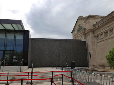
The connection from the exterior

sculpture between old and new sections

Here's what
Fox 4 News in Kansas City had to say
:
There are no rules set in stone when trying to connect the present with the past. But British sculptor Andy Goldsworthy might have set the bar with his piece — Stone Sea.
“Which is literally as he says eloquently, To draw fluidity from static stone.” said Tricia Paik, assistant curator of modern & contemporary art at the St. Louis Art Museum. “So you have this whole sea of arches, 25 arches weighing 300 tons. Not the weight of water of course and he’s given an extraordinary gift to the city of St. Louis with this project.”
A project the St. Louis Art Museum commissioned as a permanent way to bridge David Chipperfeild’s new East building with the Cass Gilbert designed Main building.
“We rest, St. Louis and the Midwest rests on a bed of rock of limestone,” Paik said. “This is a stone of marine origin. So many centuries in the prehistoric era this was once a sea an inland shallow sea.”
This is a rare inside look at this marriage of something new with something old. These stone arches are the same bedrock used to build the 1904 original building.
“We had a wonderful art critic come in and he gave a very great word to describe which Andy loved which is episodic,” Paik explained. “You experience it in moments and you actually experience it throughout our new expanded campus.”
Most will experience the installation from indoors or looking down from this outdoor courtyard. Over time Mother Nature will change the complexion of these arches.
“It’s a work that’s responding to nature,” Paik said. “From the sun, rain, darkened clouds, it’s going to be brightly lit on some days, shadow as we are here right now. So it’s going to be something that will change with time.
Anyhow, art is subjective and beauty is in the eye of the beholder; and I think this is a beautiful addition to Forest Park and St. Louis.
Do you agree?

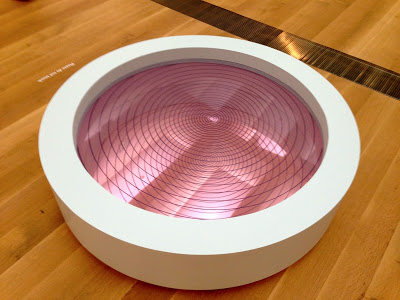


7 years old: we are not two we are one

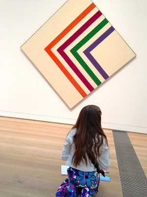
9 years old: painting the painting



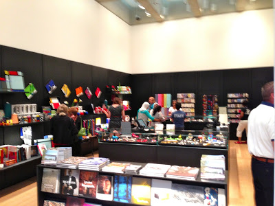
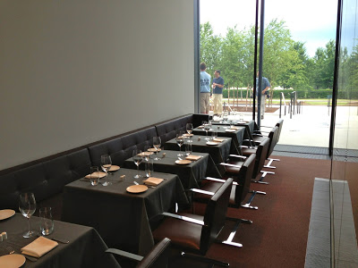
There is also an information desk, coat check, gift shop, snack shop and full restaurant.
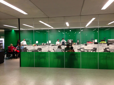
light snacks available

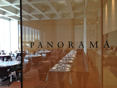
fine dining upstairs

What's your take?

