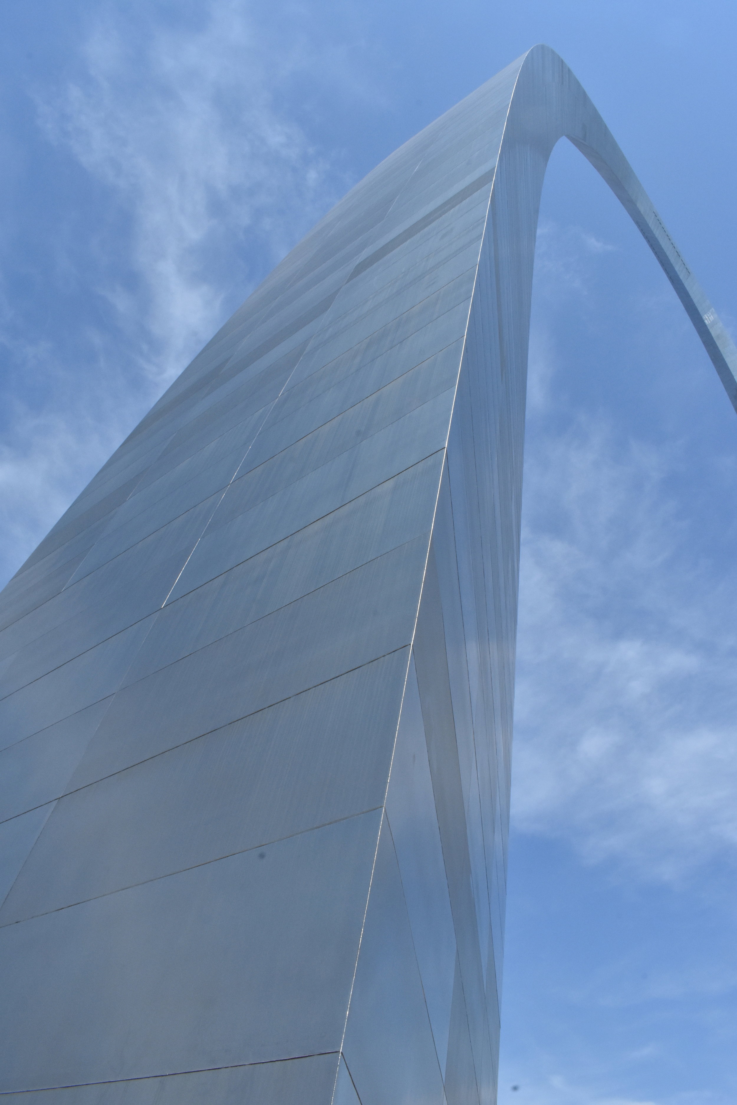
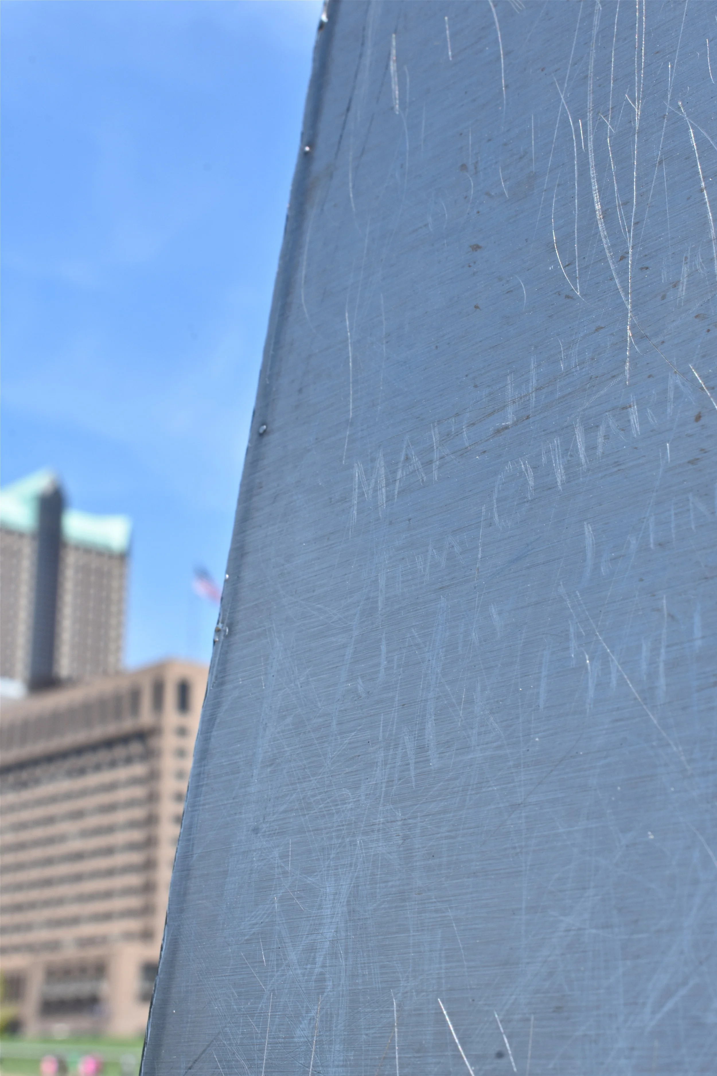
When it comes to the $380M remake of the most iconic site in our fair city, much will be written and many thoughts & photos shared.
So, why not join in?
I made my first visit to the newly renovated Arch grounds on a hot Sunday morning and the place was teeming with tourists and visitors. So many so, that I dared not enter the museum. I'll cover that in a "Part 2" post.
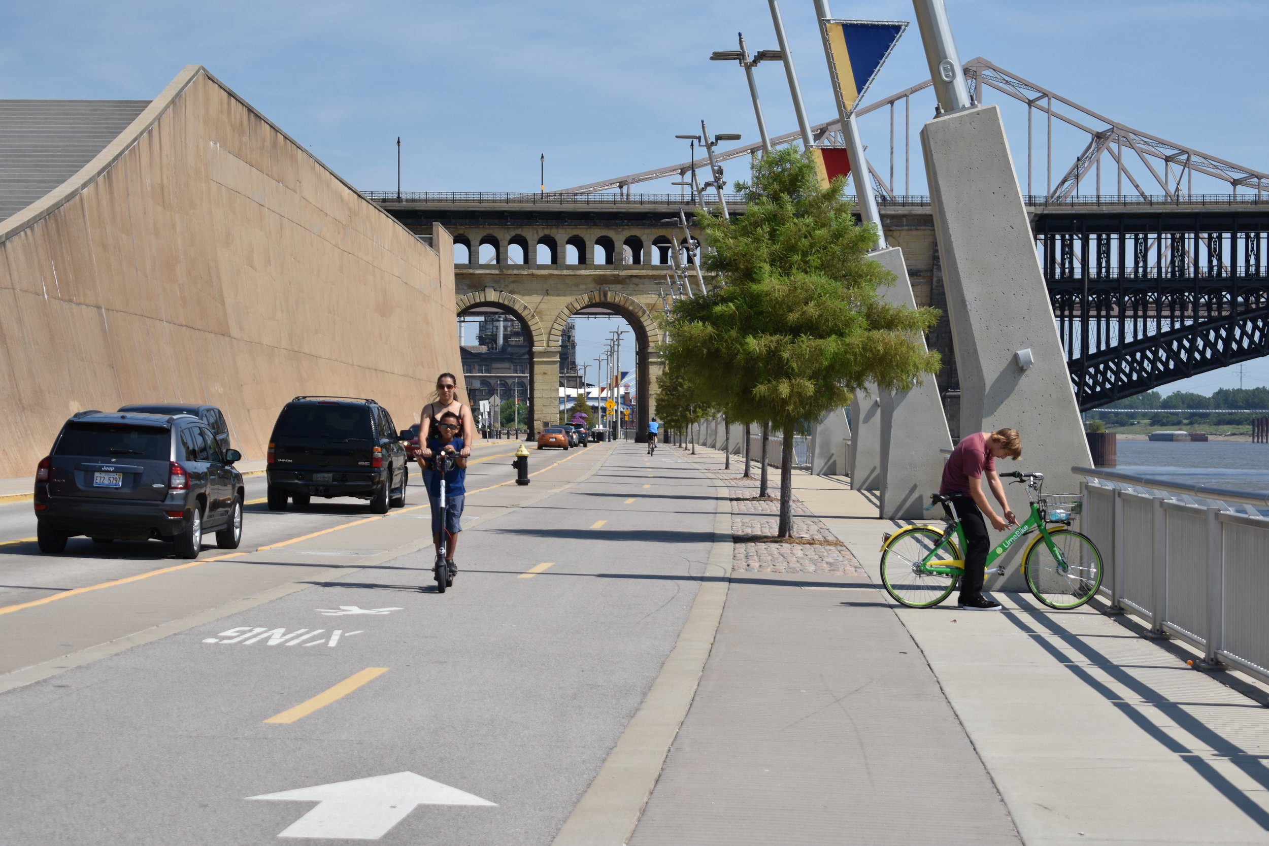
Speaking of tourists, many are now getting around on LimeBikes, Lime-S scooters and Bird Scooters. They're everywhere and they look like a lot of fun. People seem joyful when riding them and the Arch grounds are a perfect spot to get your sea legs riding one.
I'm going to keep the commentary to a minimum, adding some occasional thoughts to provide some context and explain the in-person vibe I walked away with.
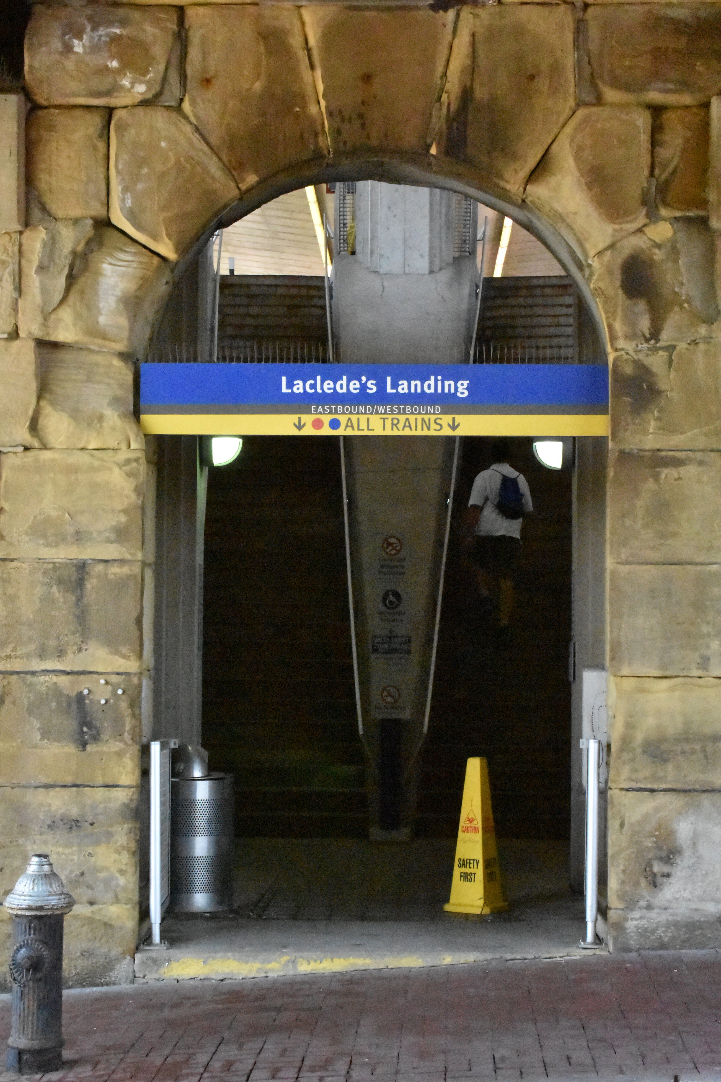
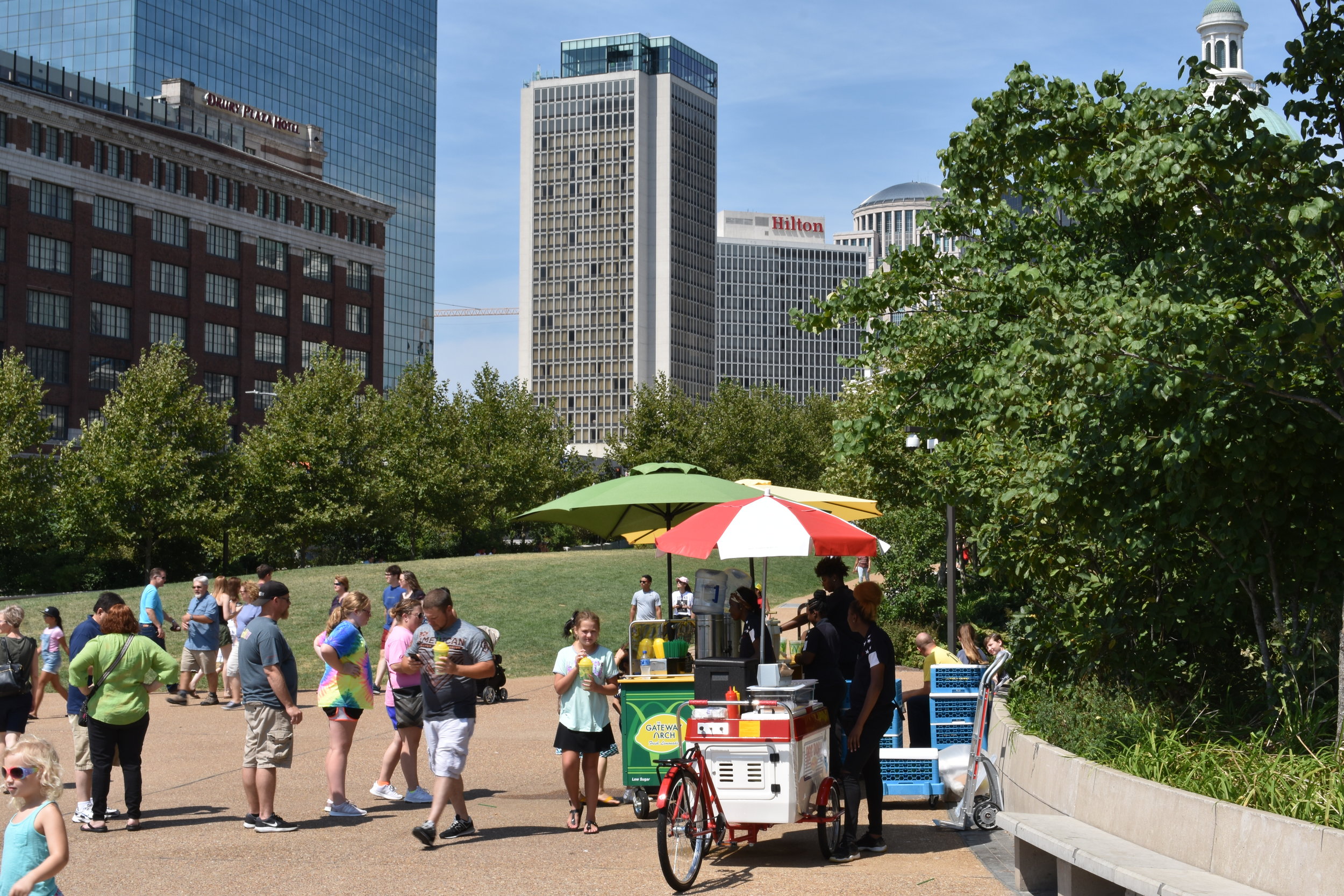
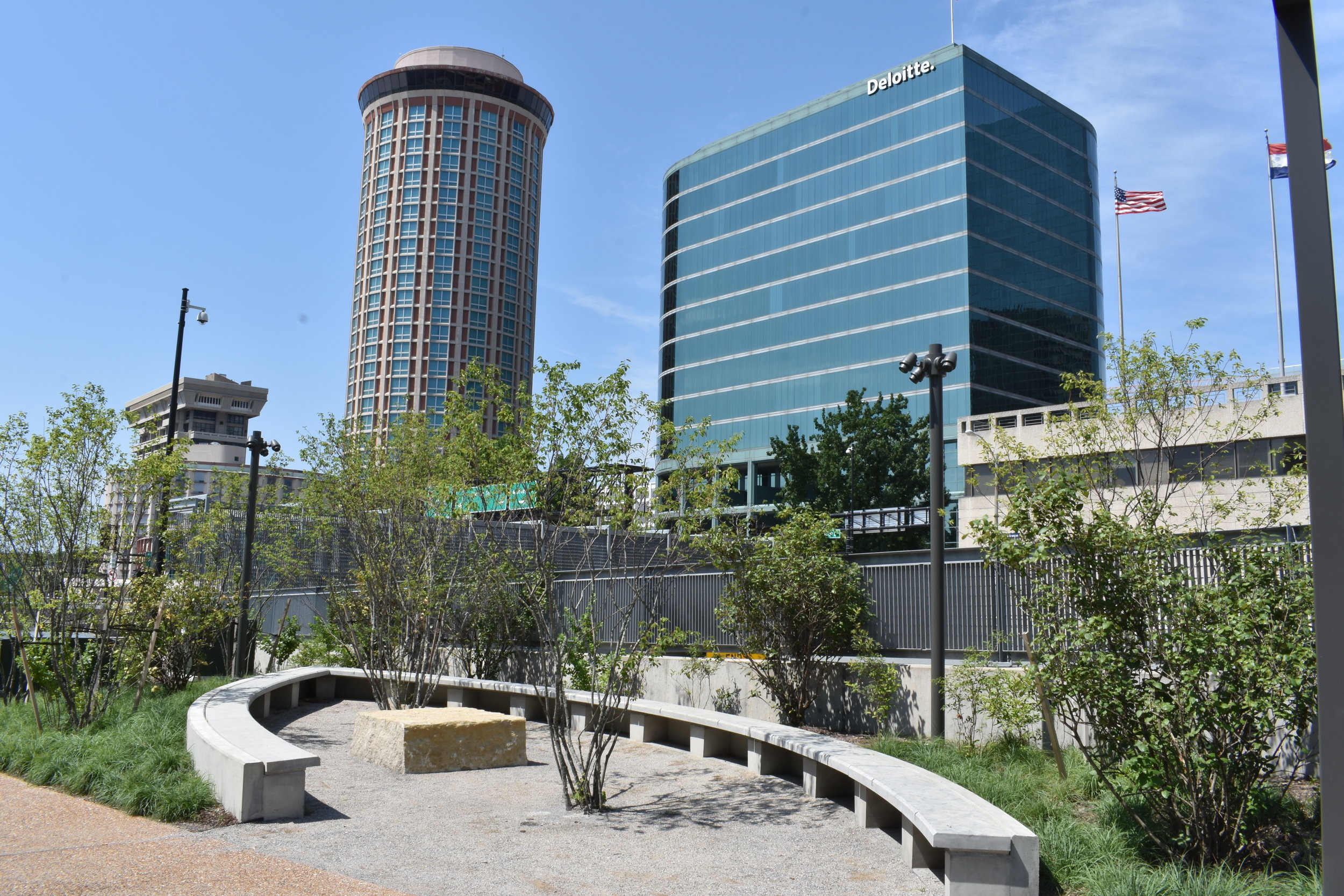
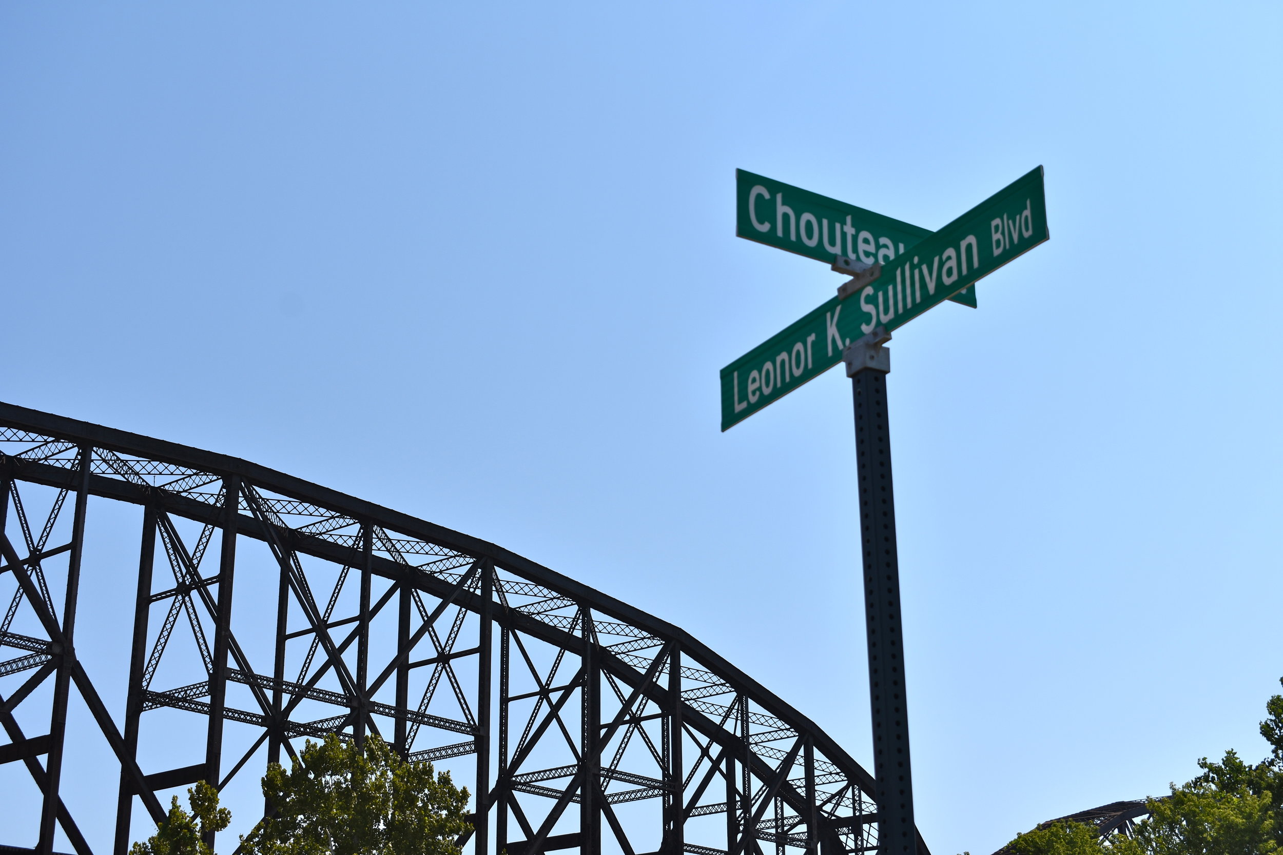
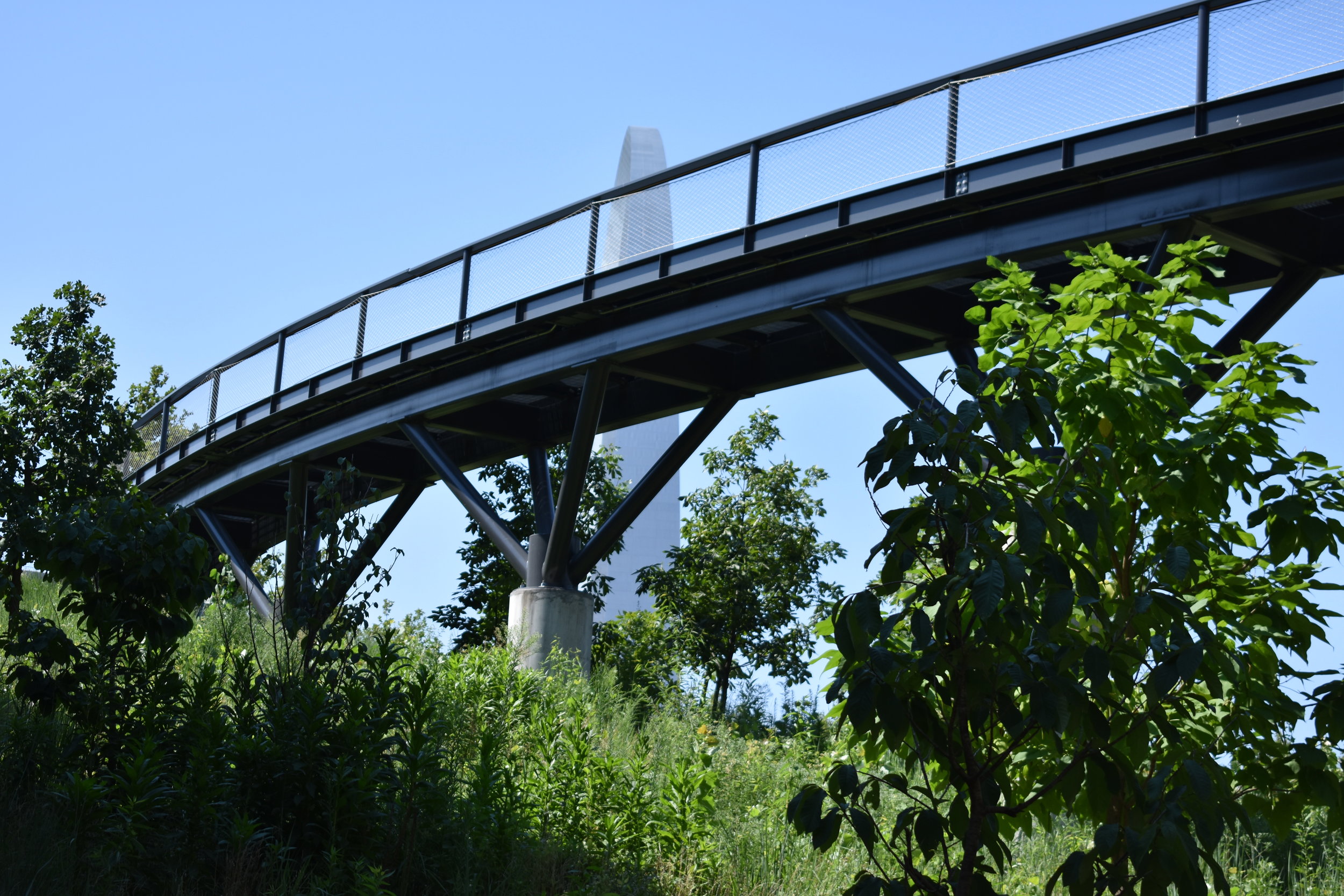
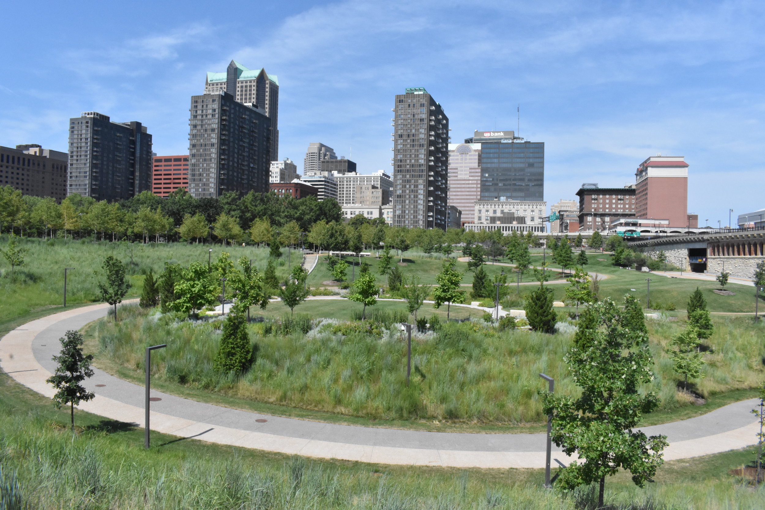
First, the north side of the grounds are a massive improvement. The pedestrian connectivity to Laclede's Landing, Metrolink and Leonor K. Sullivan Boulevard is so much better now that the parking garage has been replaced with the elevated walkway and gathering areas/berms.
You just walk right in from Laclede's Landing or the Riverfront, it is very inviting.
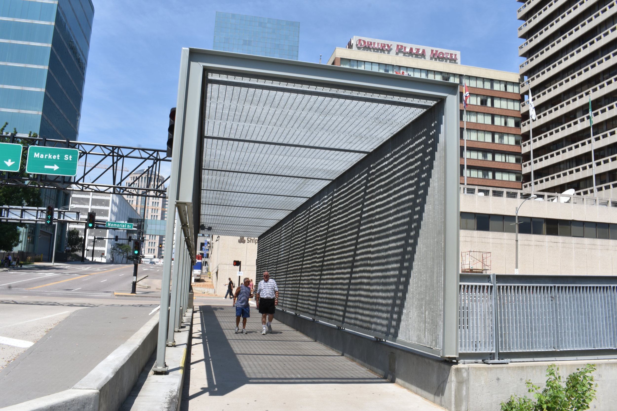
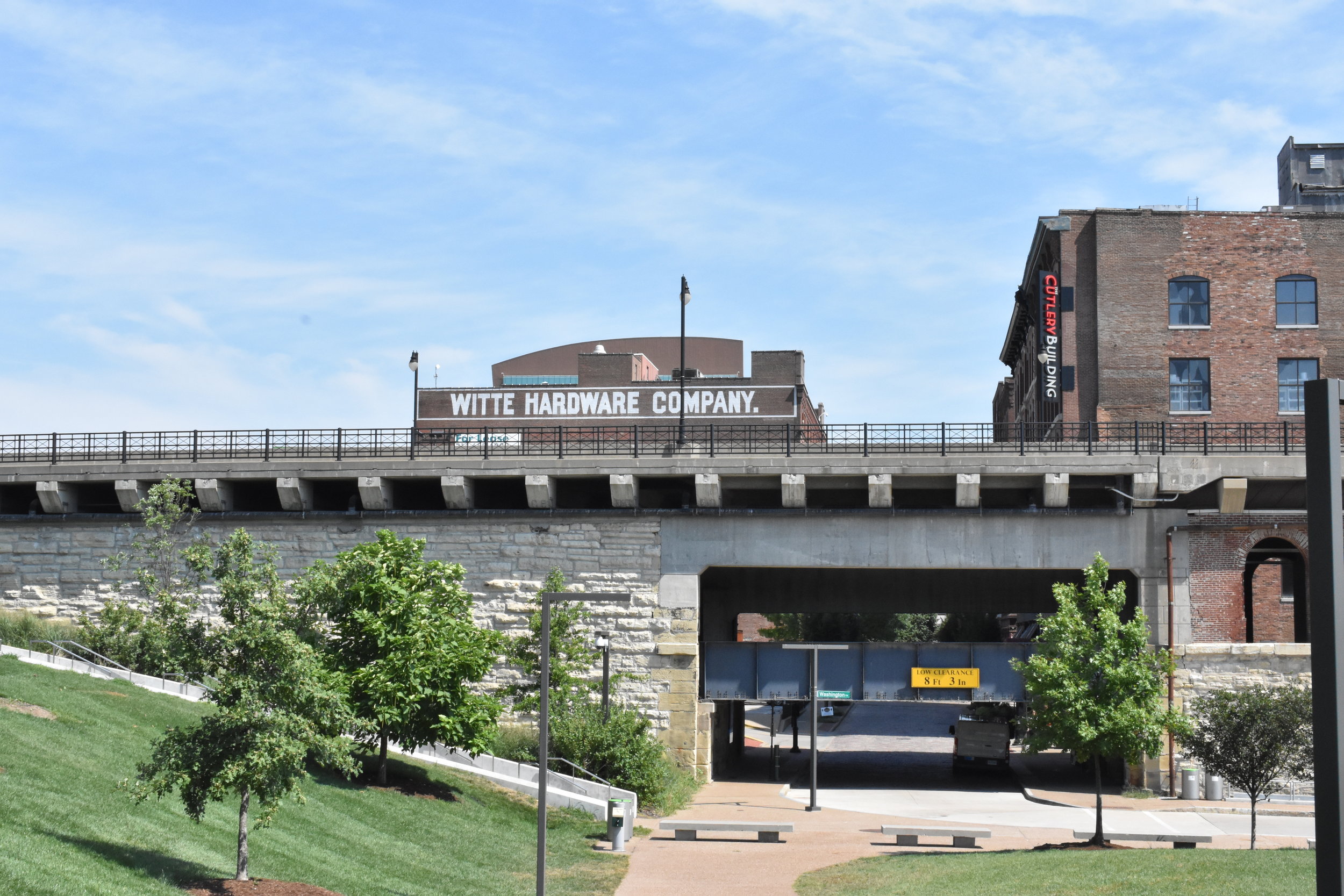
That being said, the connection from Washington Avenue is horrible, dangerous, desolate and pathetic. In fact, it's still not even fully passable as of publishing. It's hard to believe this connection was not taken seriously. It's so bad, I'm wondering if it is unfinished. One can hope.
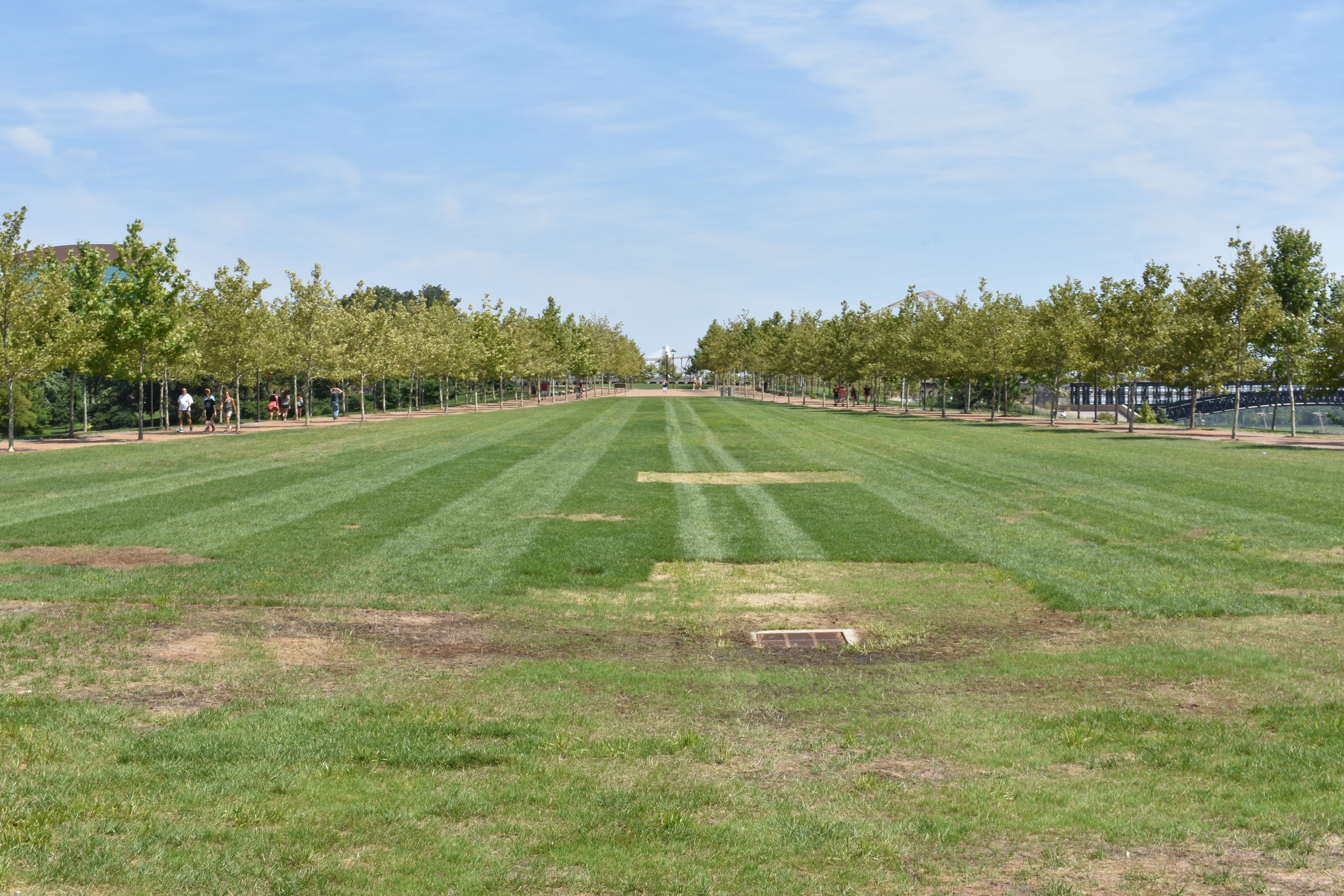
The other glaring miss here is the fact that the south side of the grounds are underwhelming and well....DEAD! There is less "programmed space" or new features or attractions to draw people to this half of the grounds.
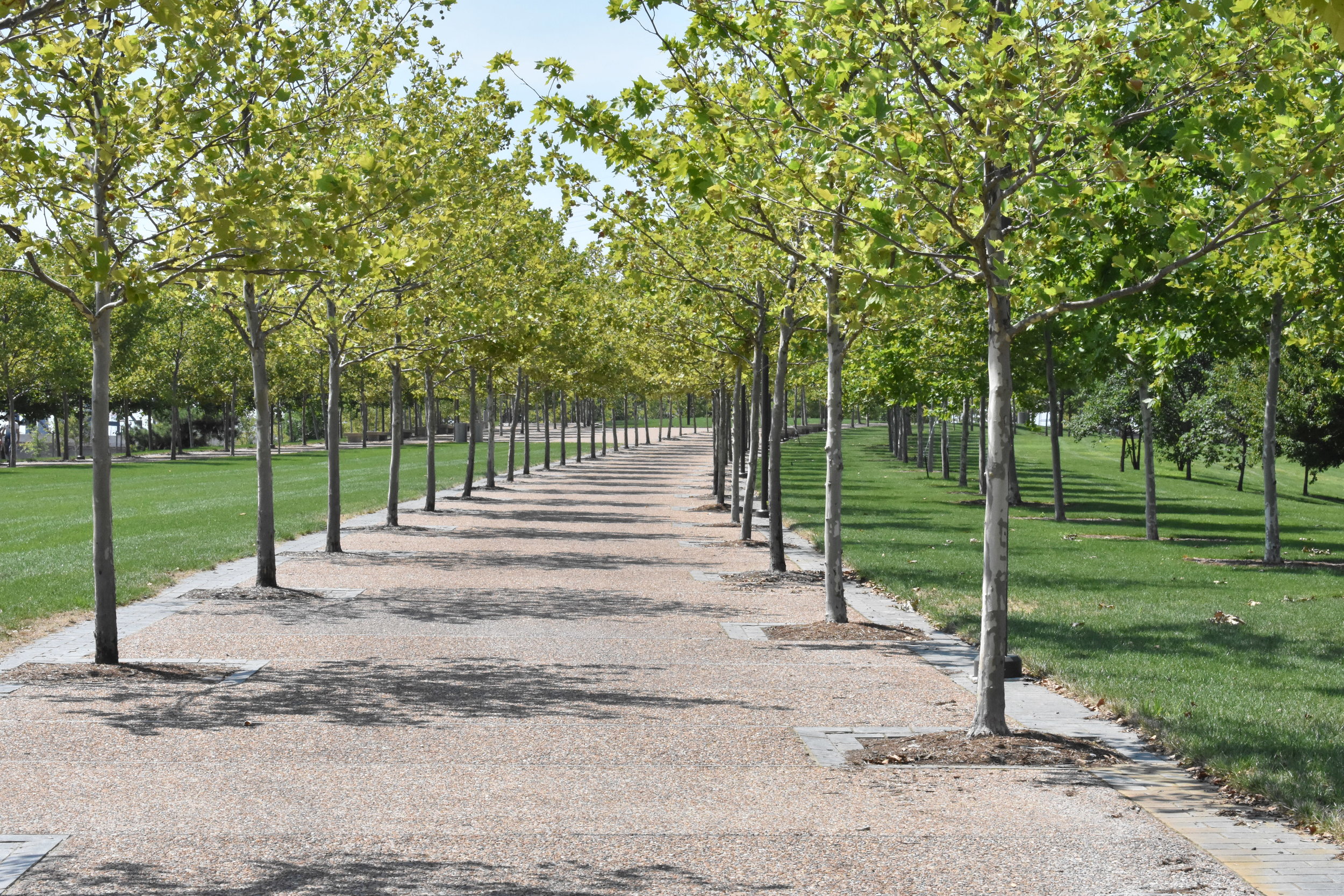
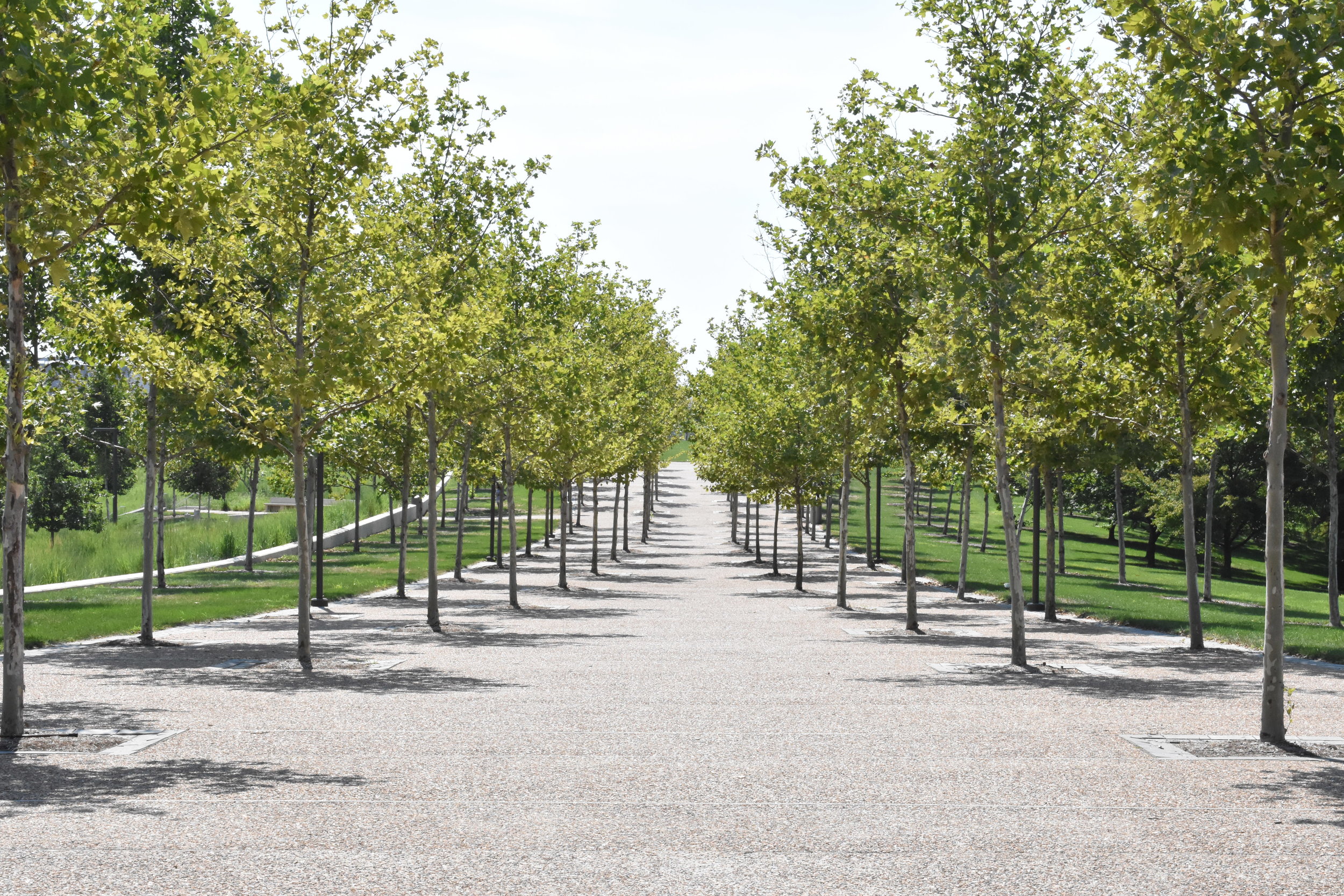
No one, literally no one, was over there. It leads nowhere in particular and is a complete deadzone. Tourists seemed flummoxed, looking south and wondering "What's over there?" The answer is nothing and the grounds pretty much look the same as they did before with the exception of the London plane trees that now line the main walkway.
The hope for this part of the Arch grounds is the Chouteau Greenway and development on Chouteau's Landing. That and the fantastic industrial buildings that remain. Hopefully we prioritize this area for redevelopment before it's lost to squatters, trespassers and firebugs.
The future looks bright with the Chouteau Greenway plans, so there is reason for optimism.
I'm amazed that $380M did not address connectivity to the south and from Washington...and of course that the Interstates still create a massive barrier and lost opportunity for Downtown.
That said, the north side is quite stunning and will be the most noticeable change for most visitors, rivaling the new museum entrance and Interstate-lid which provides a slender connection from the Arch to Downtown.
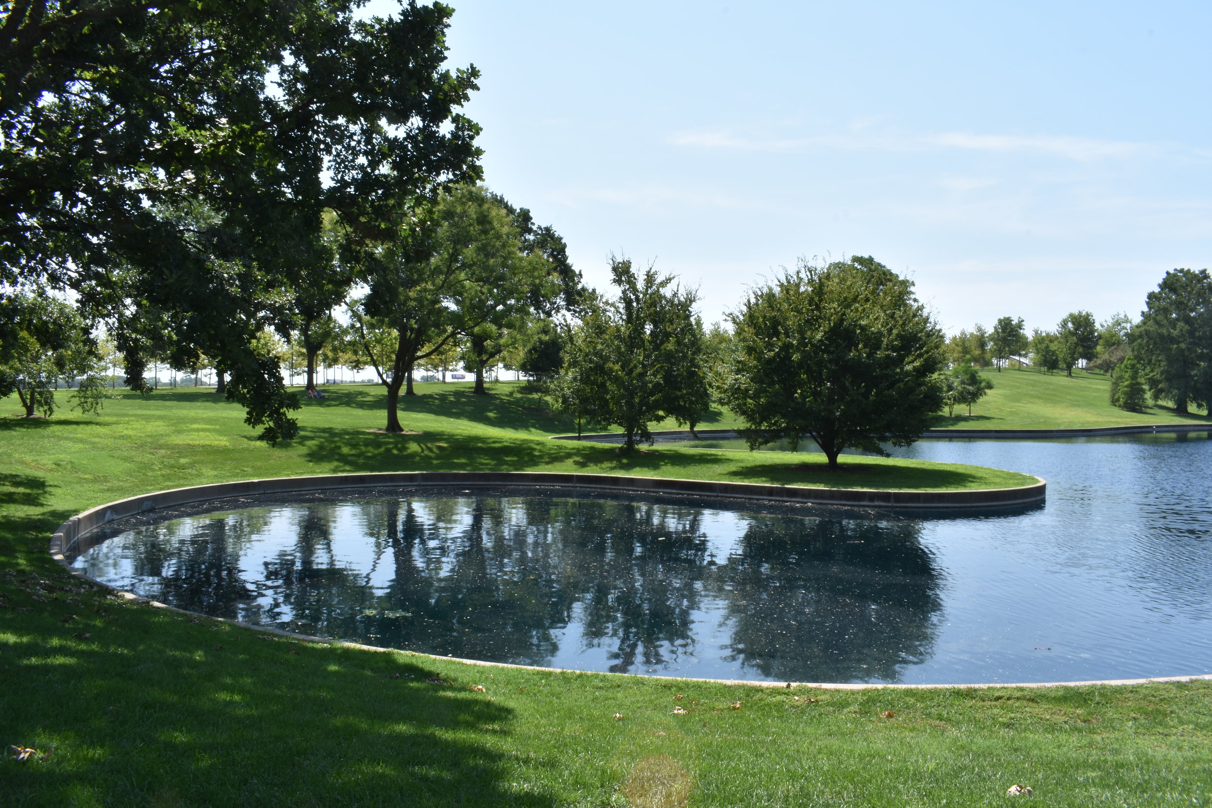
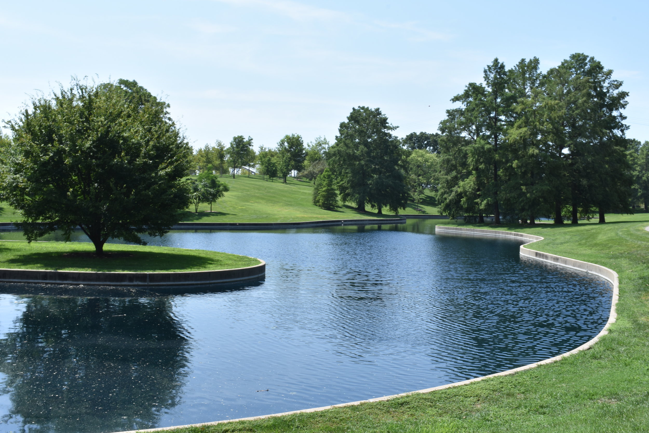
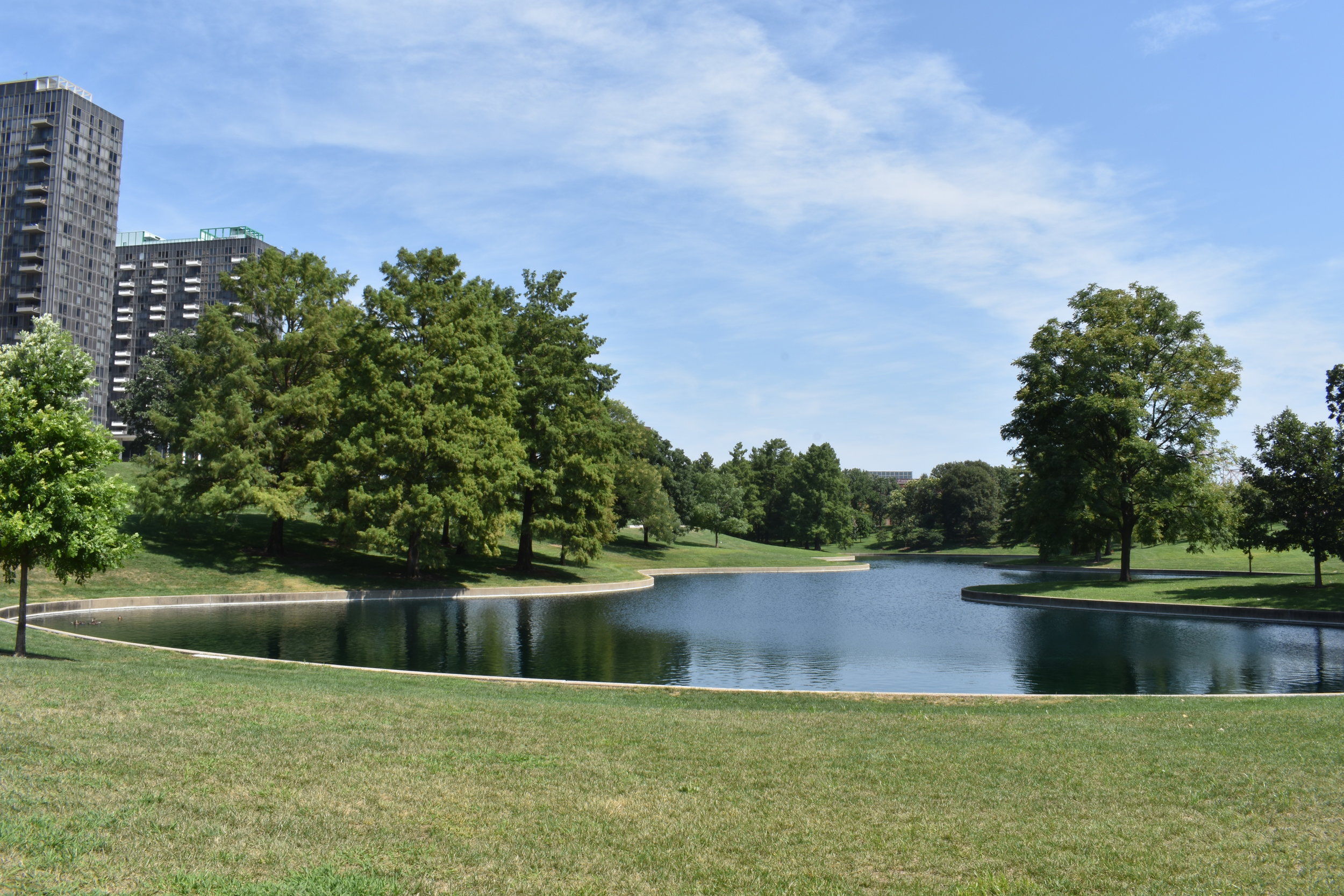
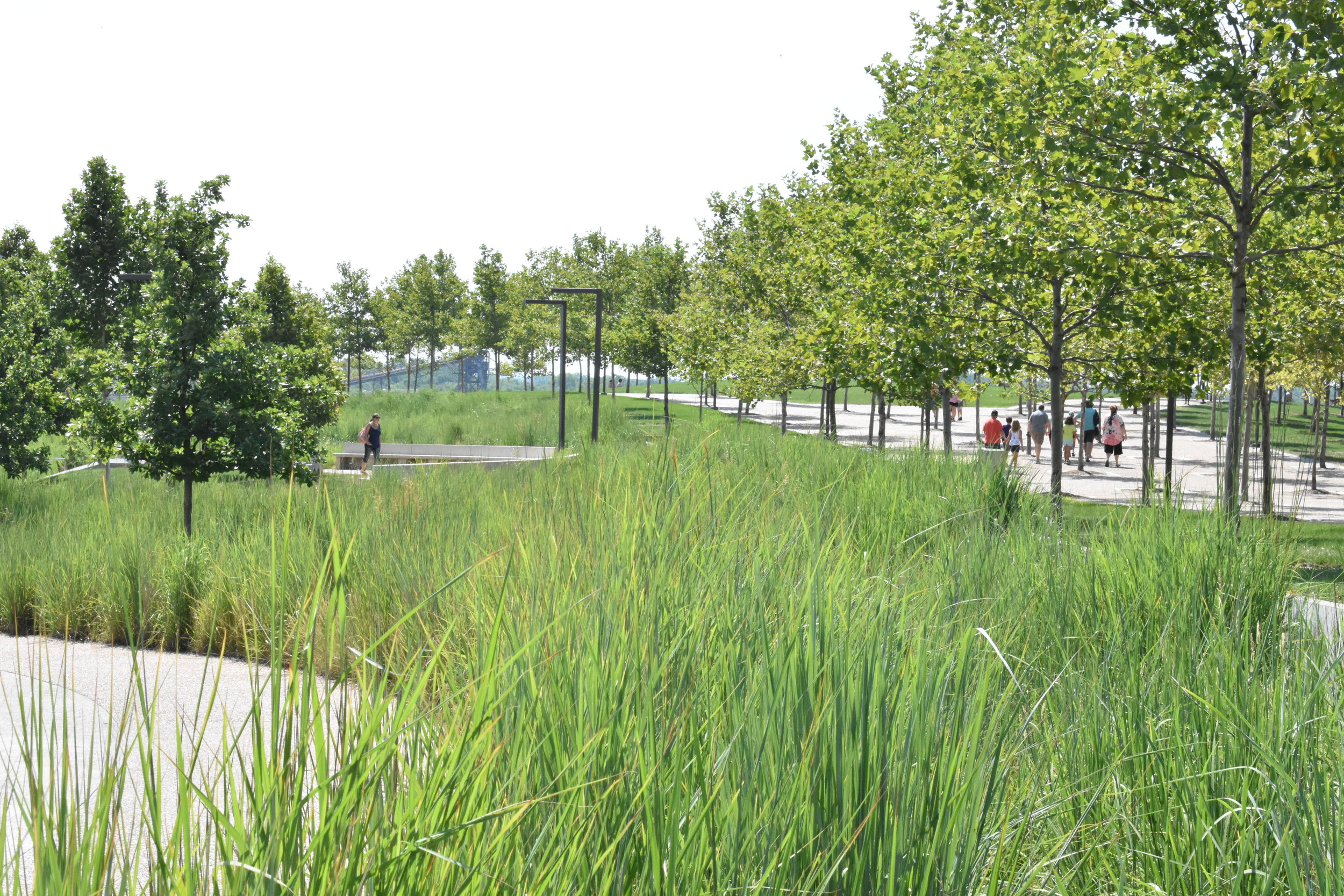
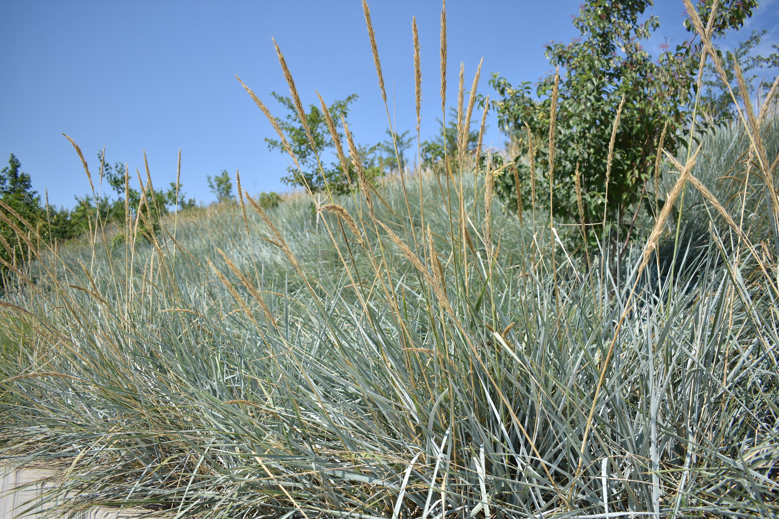
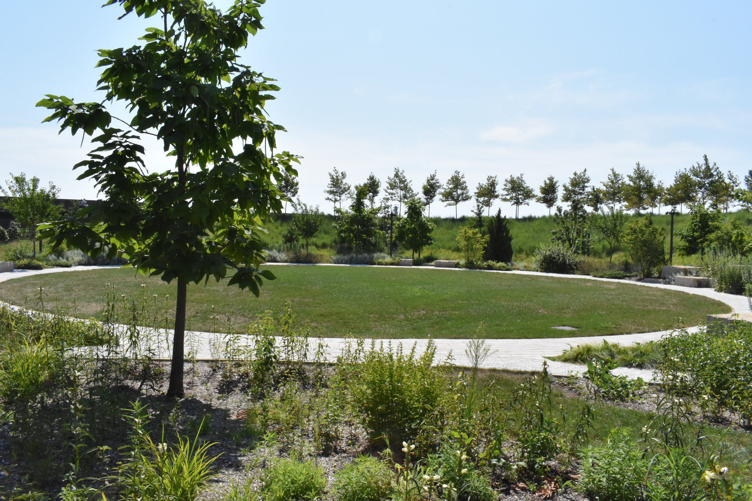
The overall landscape itself is much more diverse and sustainable than...well, the boring grass and highly planned uni-species tree placements in the original design.
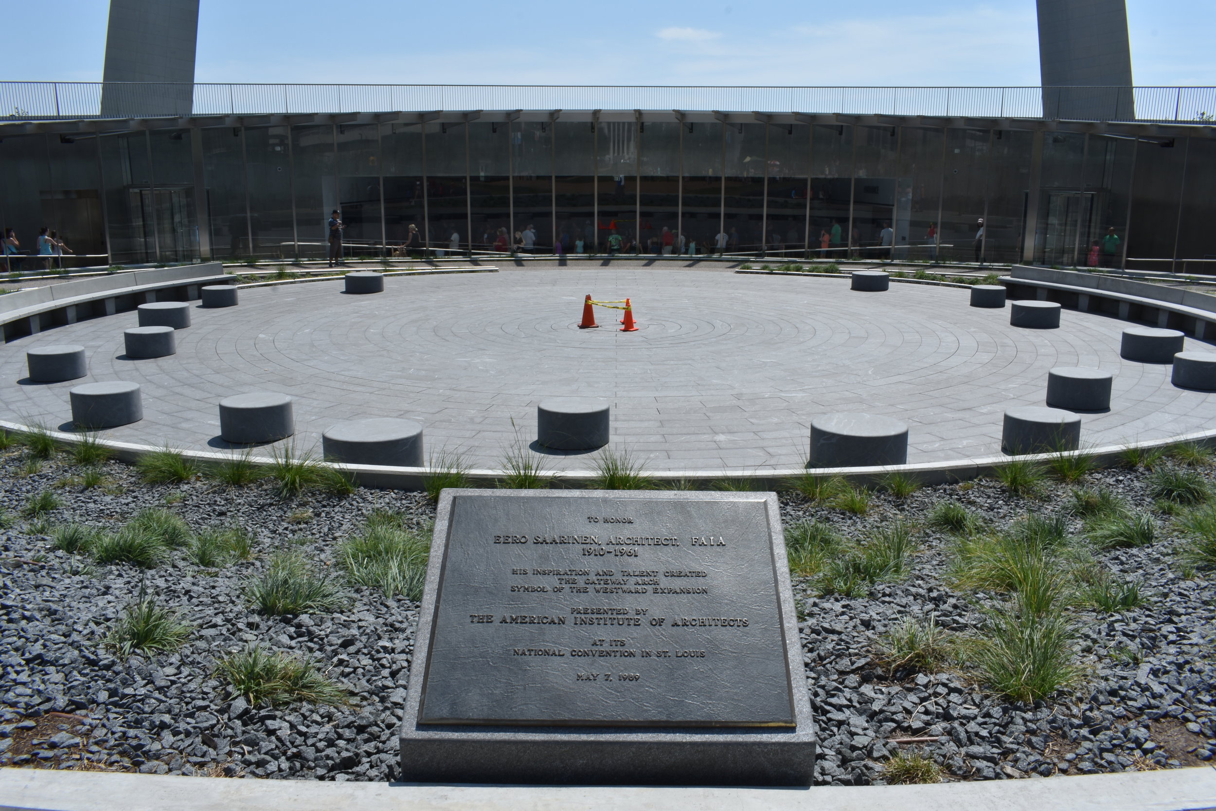
There is still a lot of good old fashioned grass lawns though, too much for my liking, but a drastic improvement over the Dan Kiley (landscape architect on Eero Saarinen's original team) design from the mid-20th Century school of thought that bore sparse, sprawling lawns.
The new landscape design is better and way more interesting from a wildlife, environmental and storm water retention perspective.
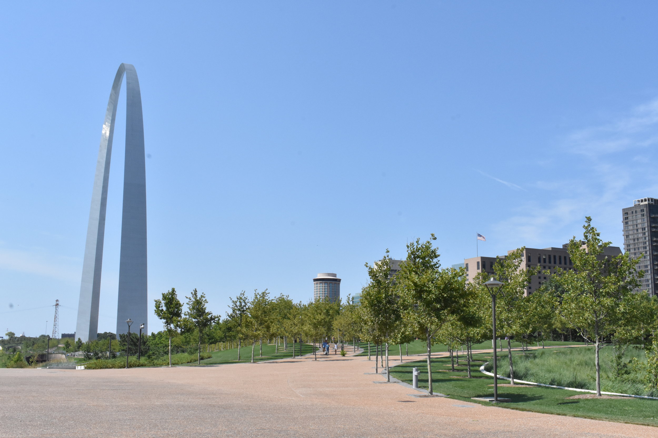
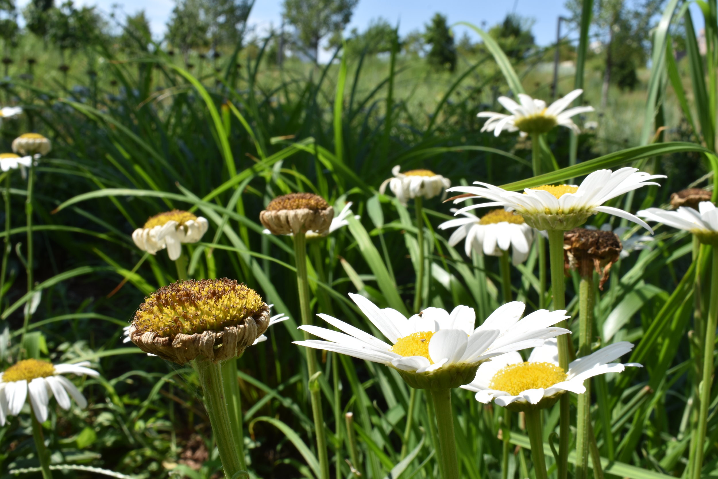
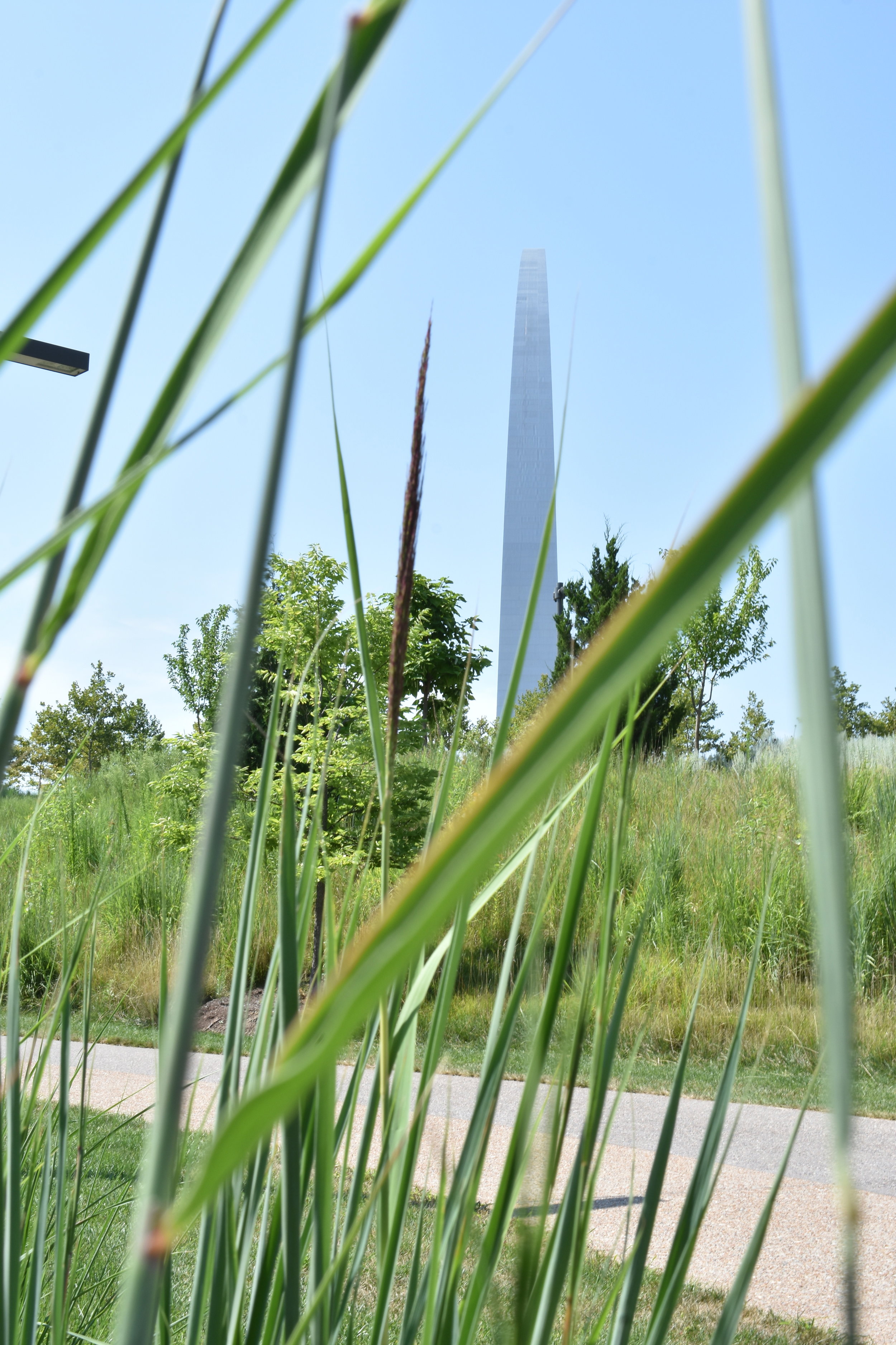
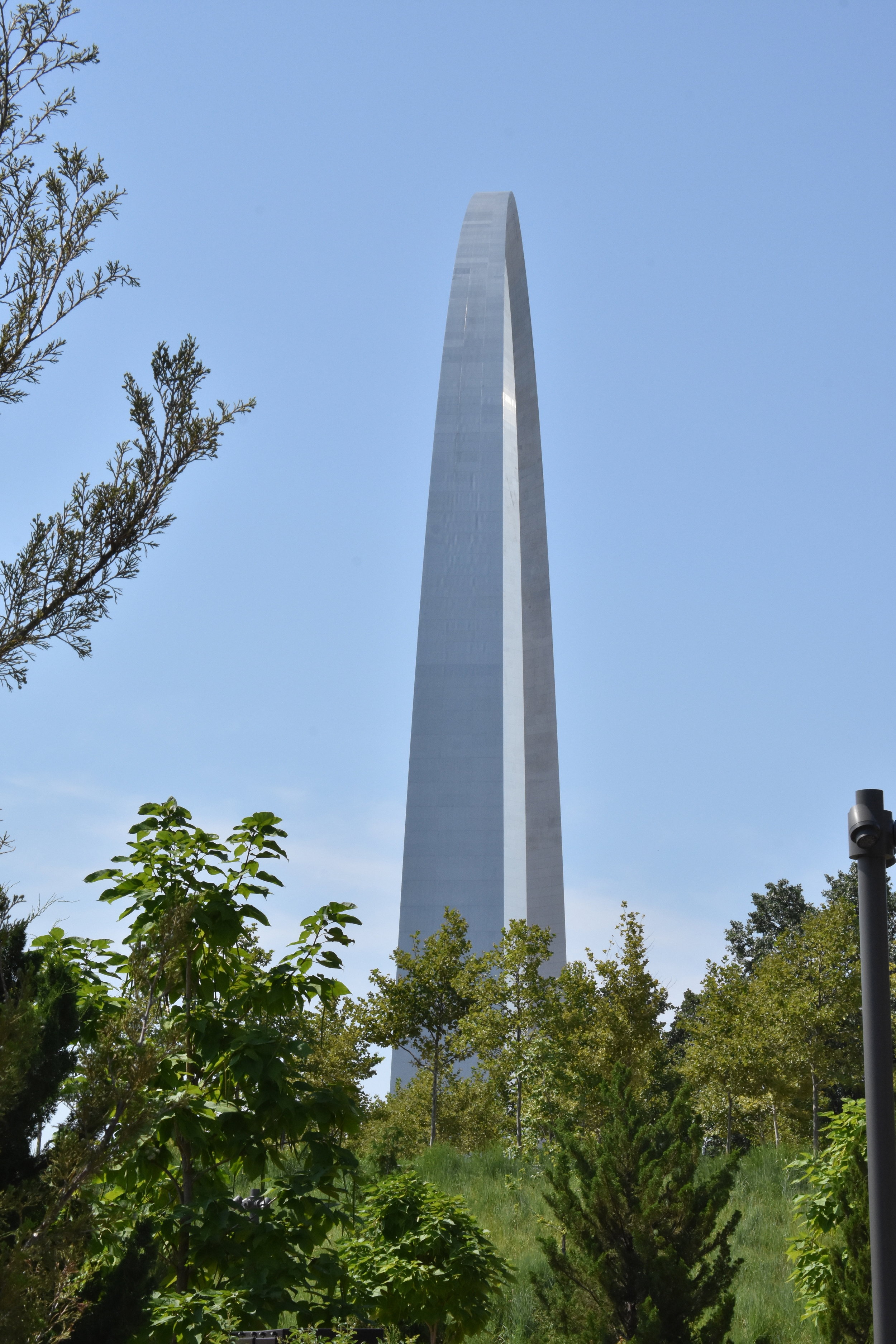
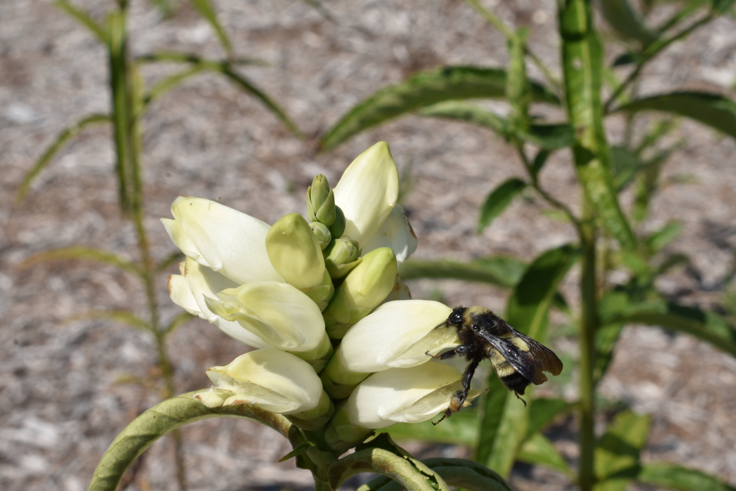
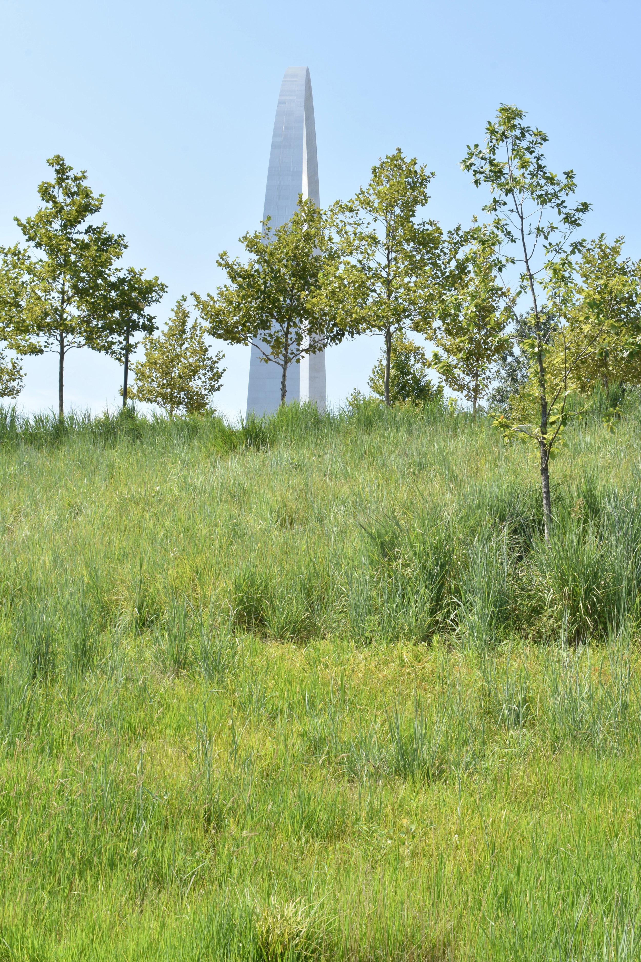
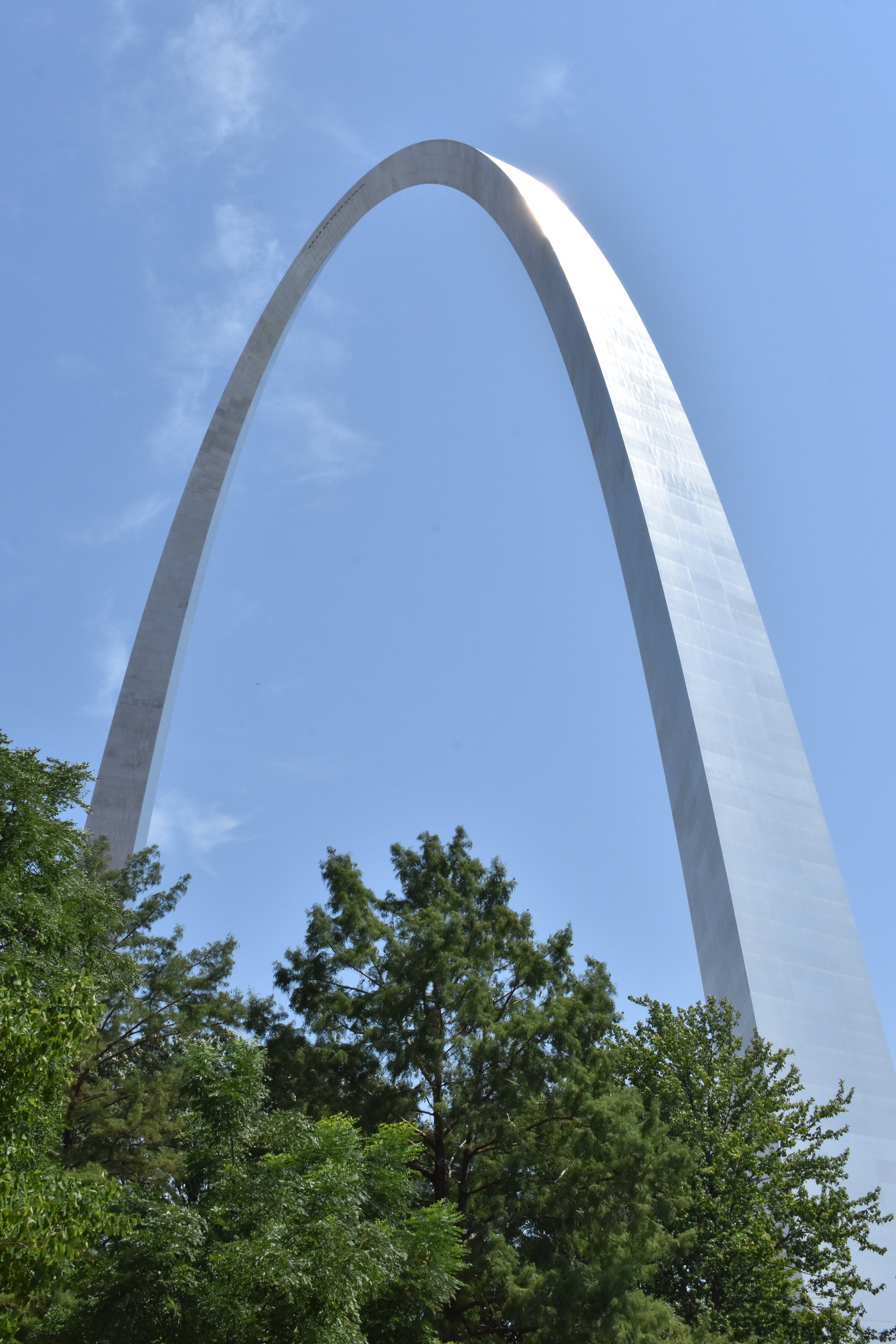
You will now see and hear copious amounts of crickets, bees, butterflies and other pollinators. The grass and trees of the past were much more silent and devoid of habitat for animals of all sizes. Now there are insects everywhere, a much welcomed addition. And, the views of the Arch from the new landscape is even more stunning than the grass of the past.
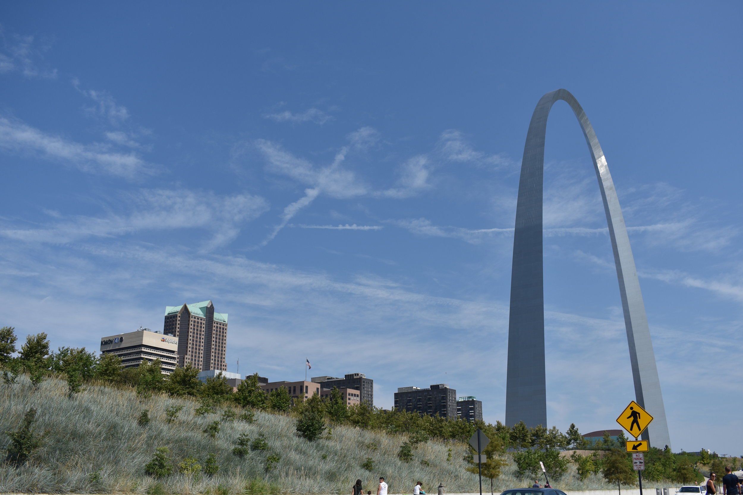
The lid is an improvement and the views of the Old Courthouse building and the Arch are fantastic. The Arch was impressively casting its shadow on this area upon my visit as seen in the second photo below:
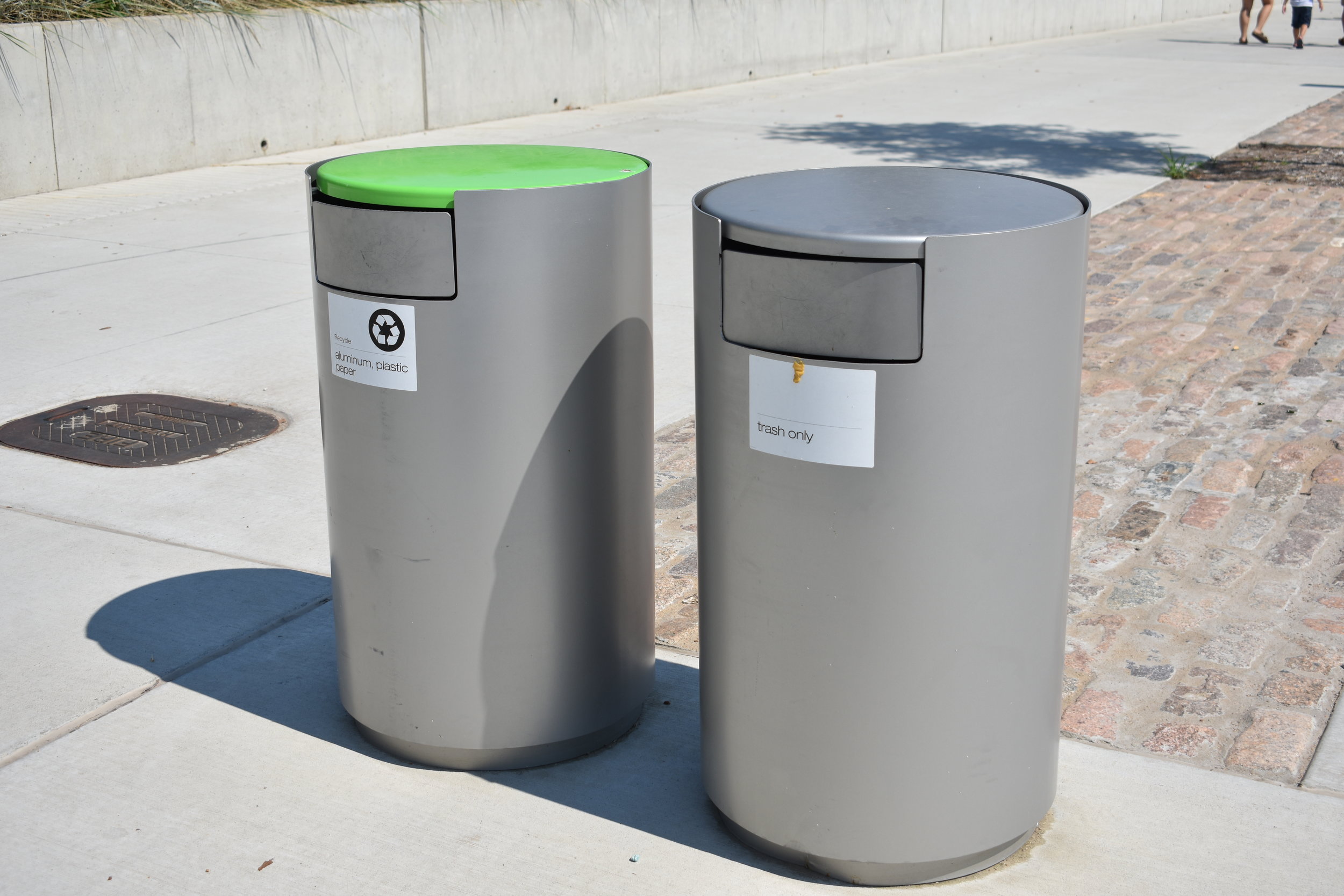
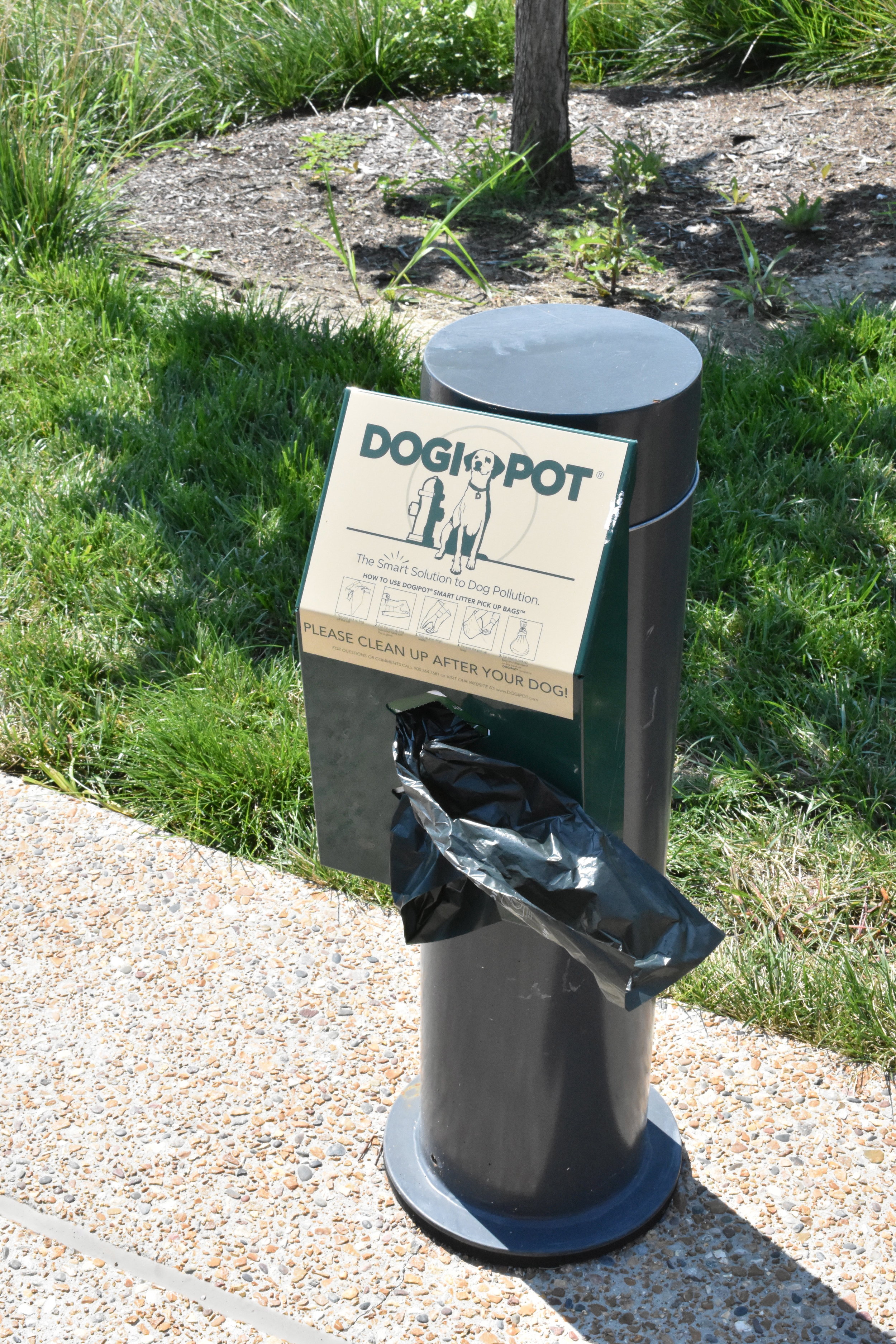
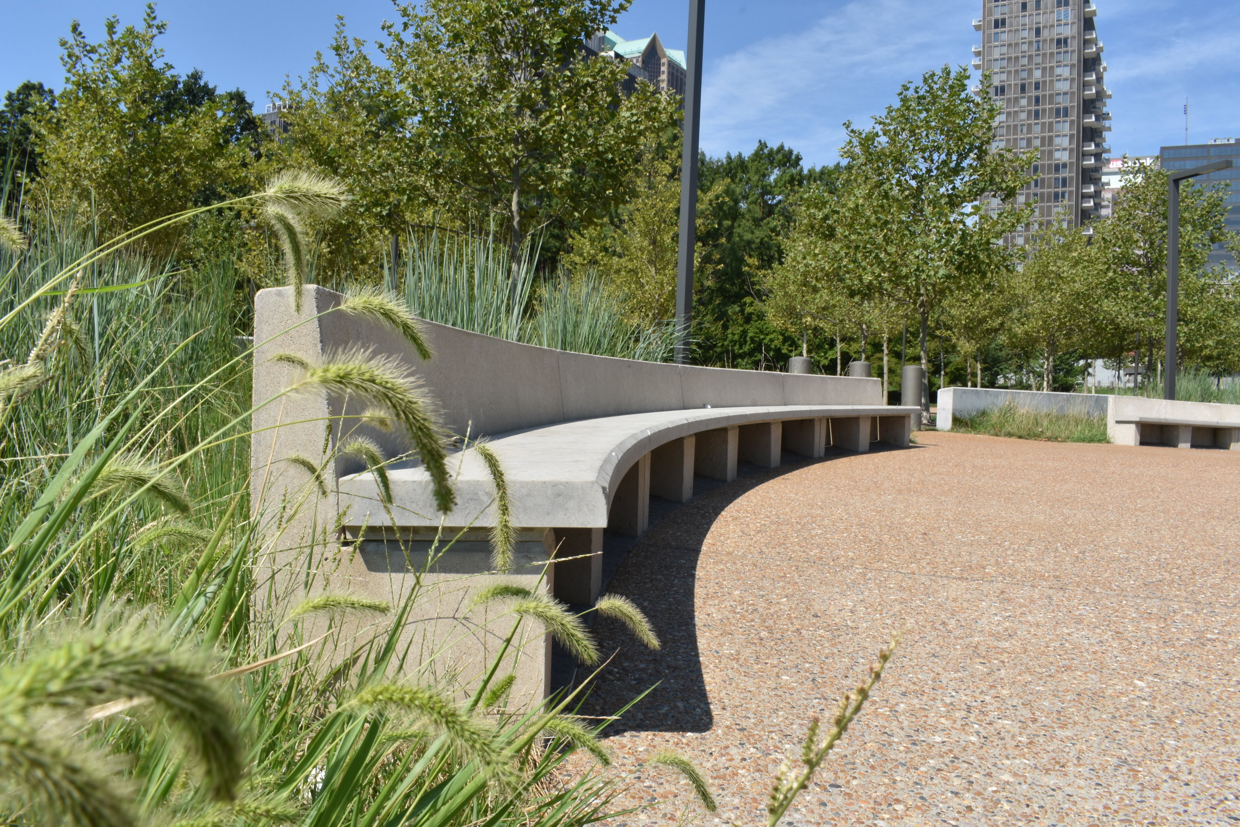
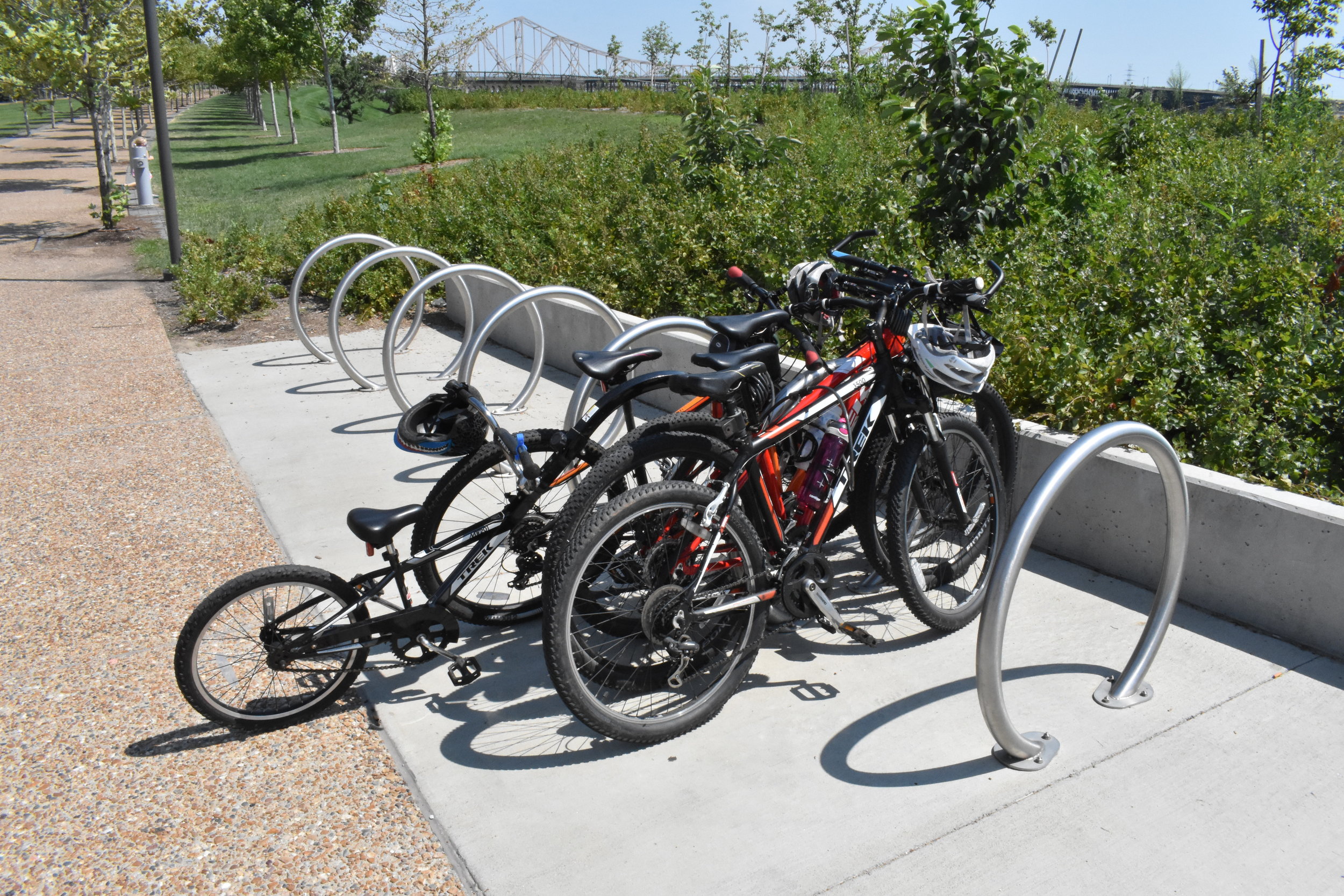
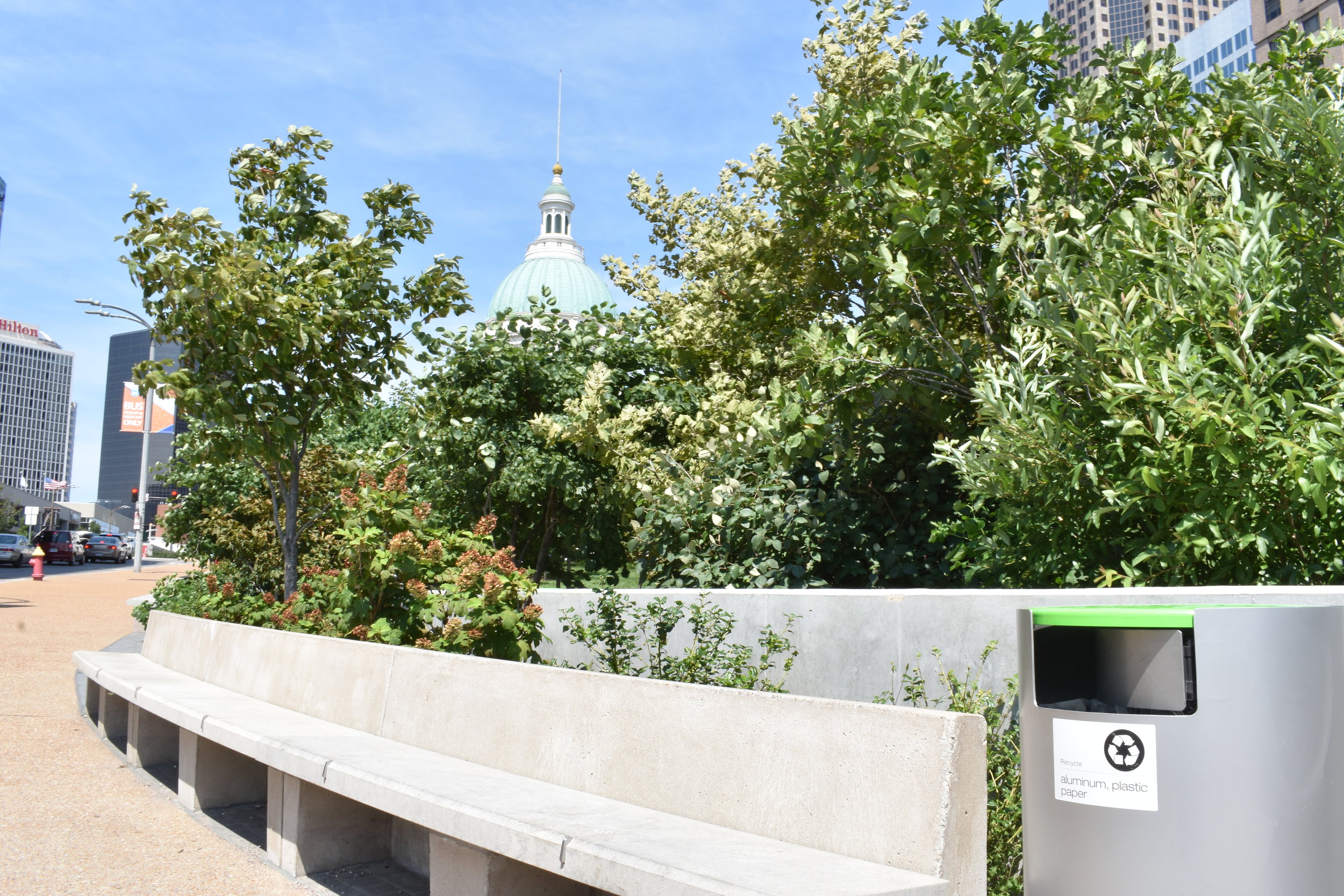
The infrastructure upgrades are much welcomed. Water fountains, bike racks, trash cans and seating are scattered smartly throughout the grounds.
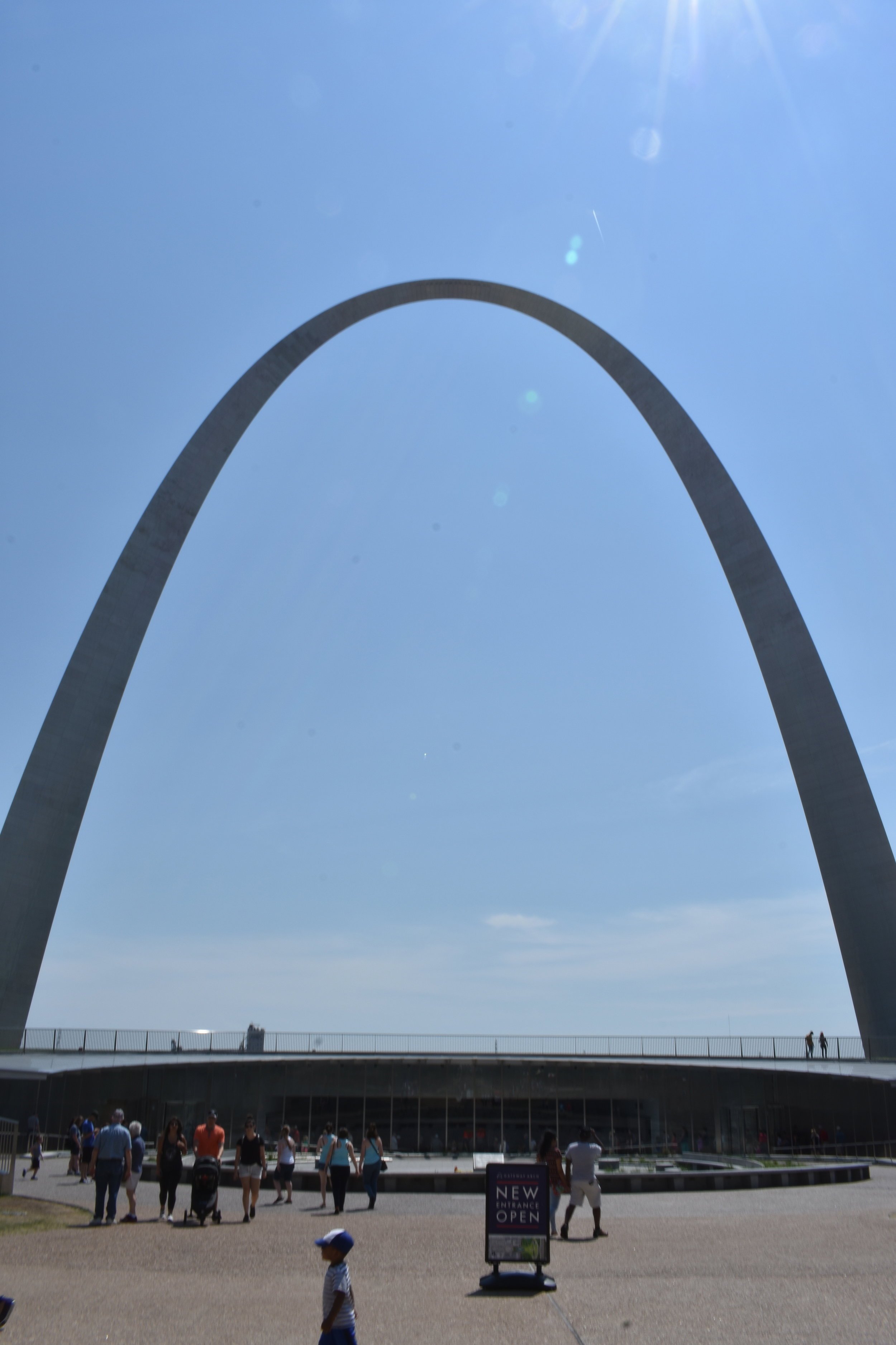
The new museum entrance is beautiful, modern and does not detract from the Arch. I really like the way it fits in, but will come back to visit as it was way too crowded. The water feature was non-functional and drained on my visit, a missed opportunity, because it was so damn hot.
I was on my scooter checking out the latest additions to the graffiti wall, so I entered from the south. In fact, the Great Rivers Greenway signs start at the north terminus of the graffiti wall. As mentioned previously, the southern edge of the Arch grounds are choked out by the off ramps from the Poplar Street Bridge and the necessary, yet underwhelming maintenance buildings.
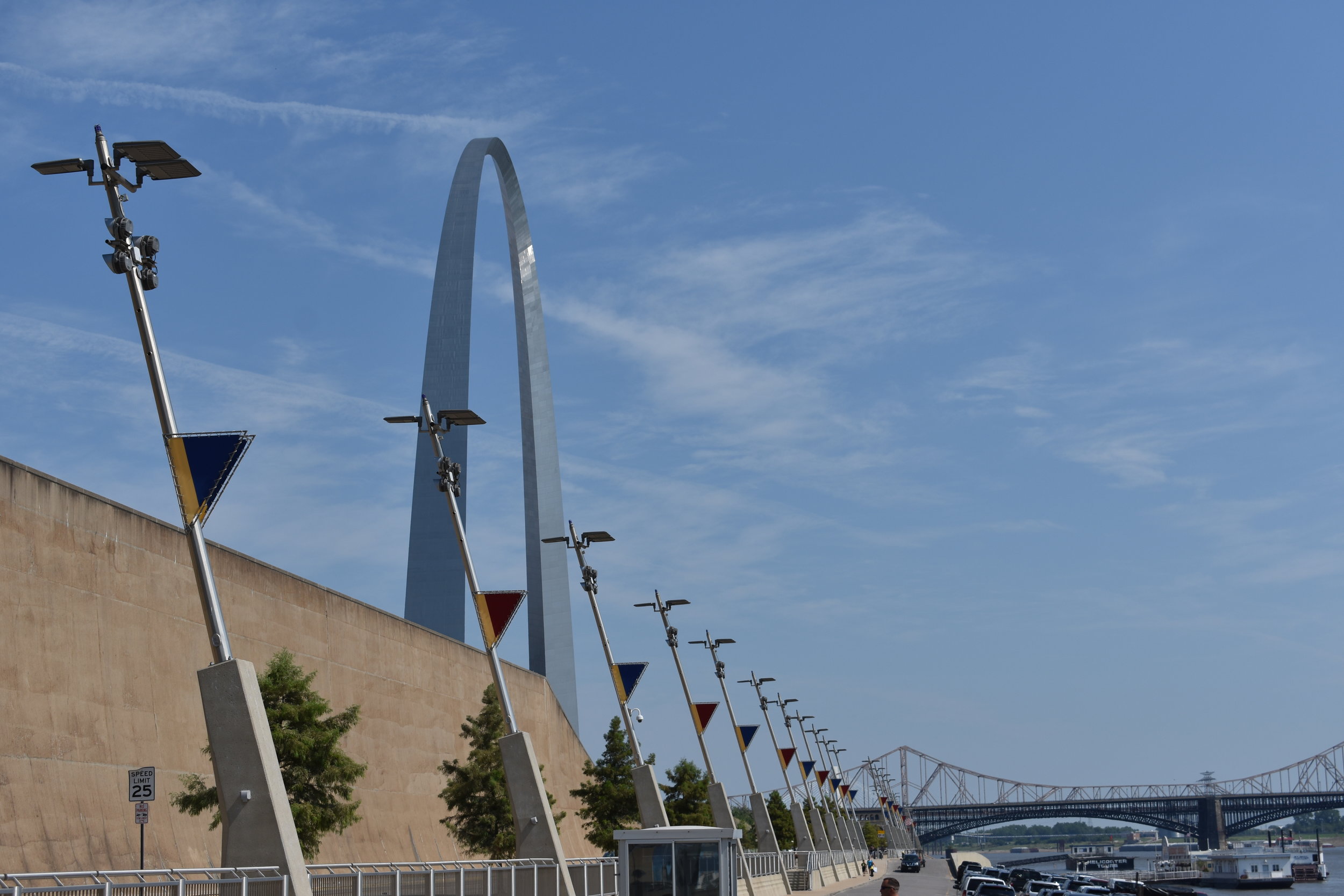
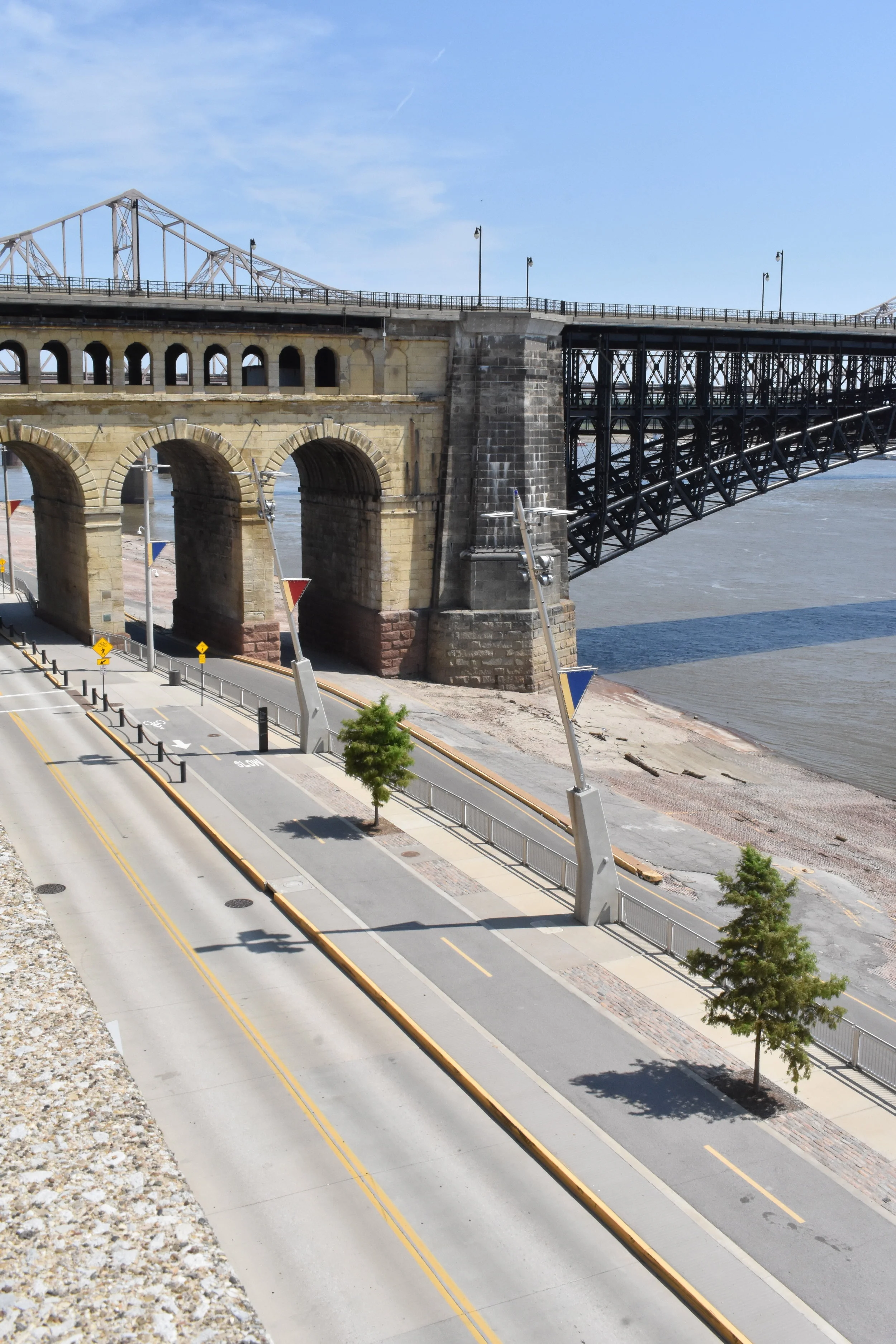
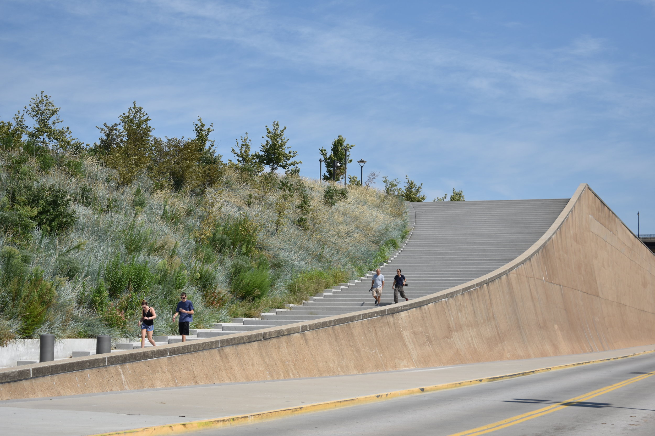
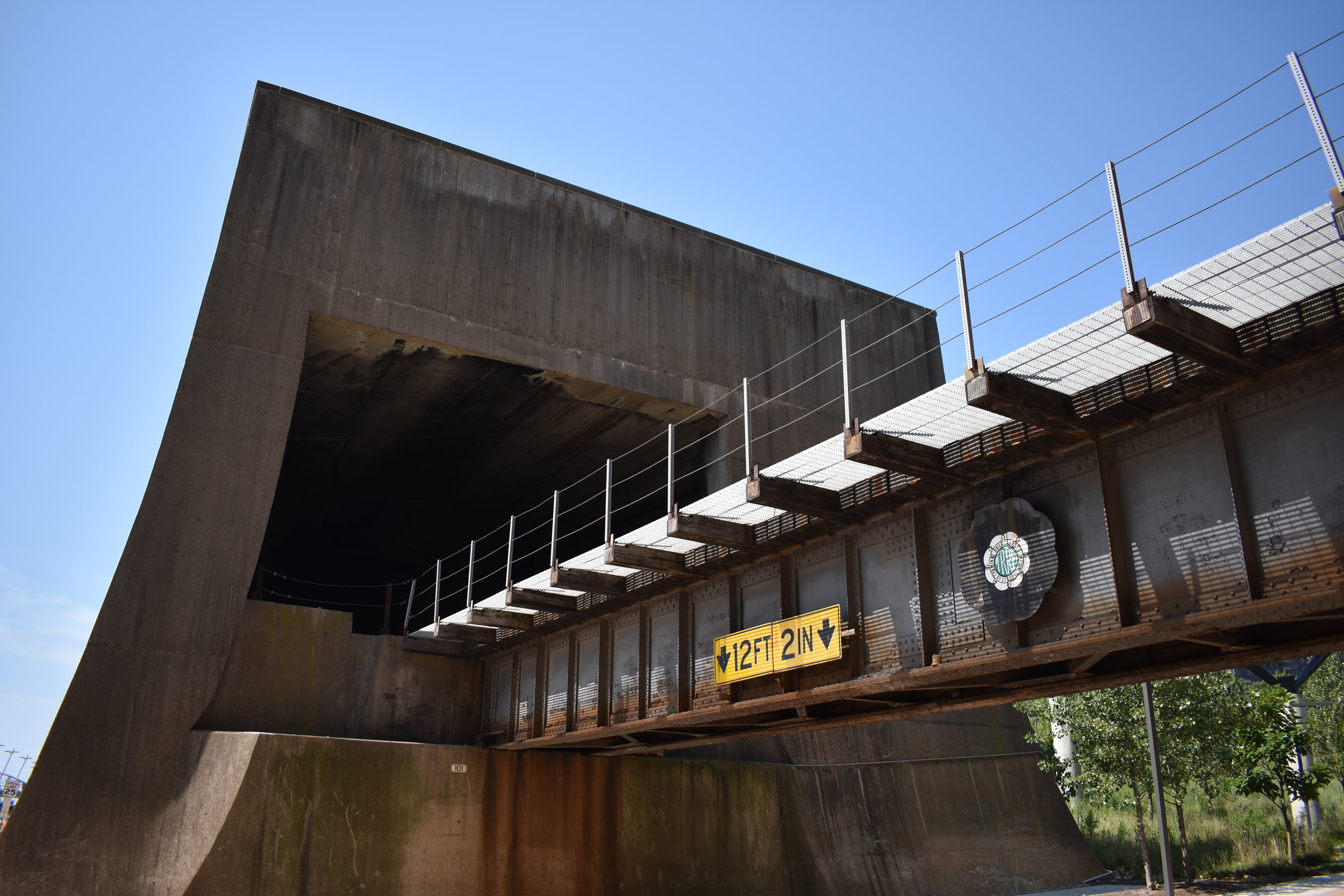
Heading north along Leonor K. Sullivan Boulevard, the scene of the stairs and steep concrete flood walls/train tunnels will look familiar to most St. Louisans. The difference is the bike/pedestrian lanes are elevated from the roadway, making it safer to bike/walk and there are some new lights and fencing.
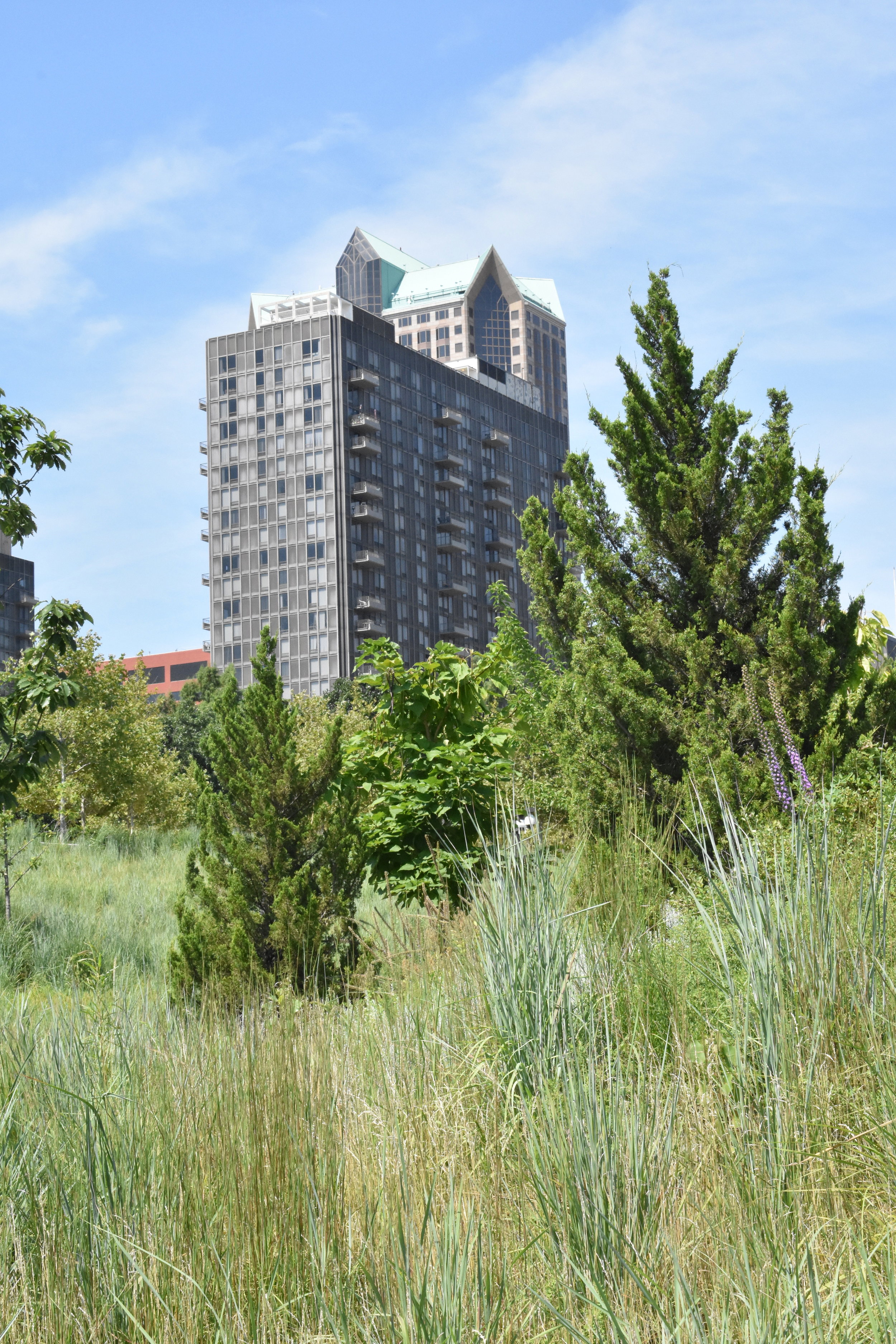
The sweeping landscape on each side of the main stairway is a drastic improvement over the grass that was there. It makes the Arch look like it's busting out of the Midwestern wilderness like the monolisk in "2001: A Space Odyssey". The Gateway to the West now looks like a gleaming, optimistic work of mankind set against the wild scrub of grasses, junipers, catalpa trees and other brushy realism.
The Lewis & Clark...and Seaman statue (The Captains' Return) was moved south a couple hundred feet and raised about 17 feet so it won't flood as often. Personally, I liked how the statue was a mark of flooding, but so it goes, it's new spot makes sense and is higher profile. Tourists were taking photos in front of it.
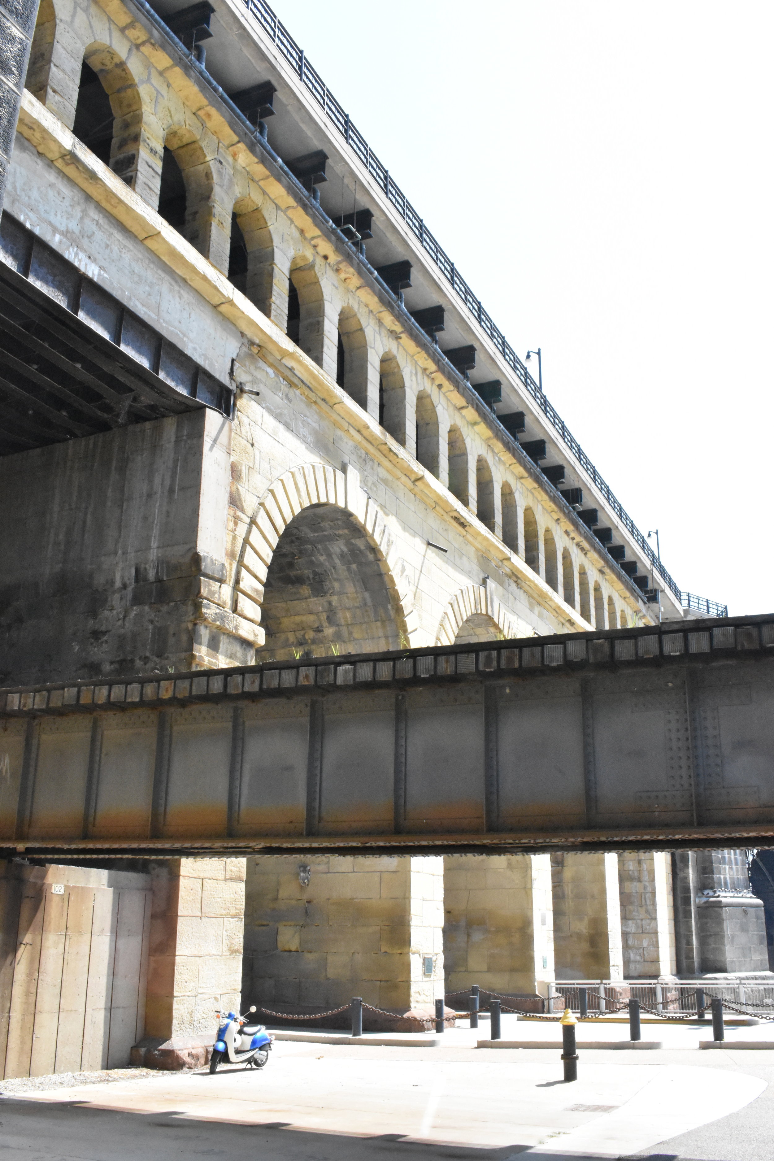
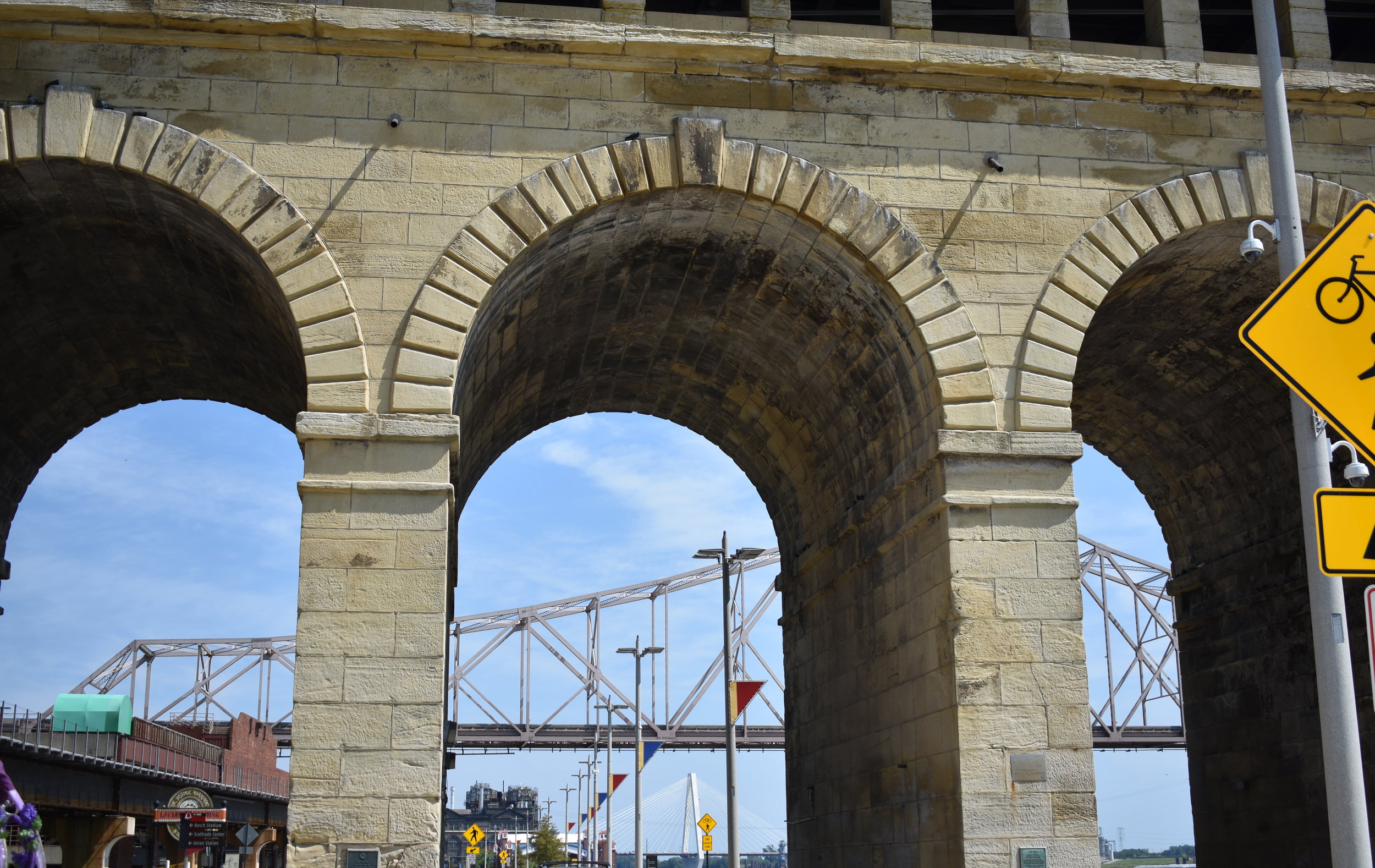
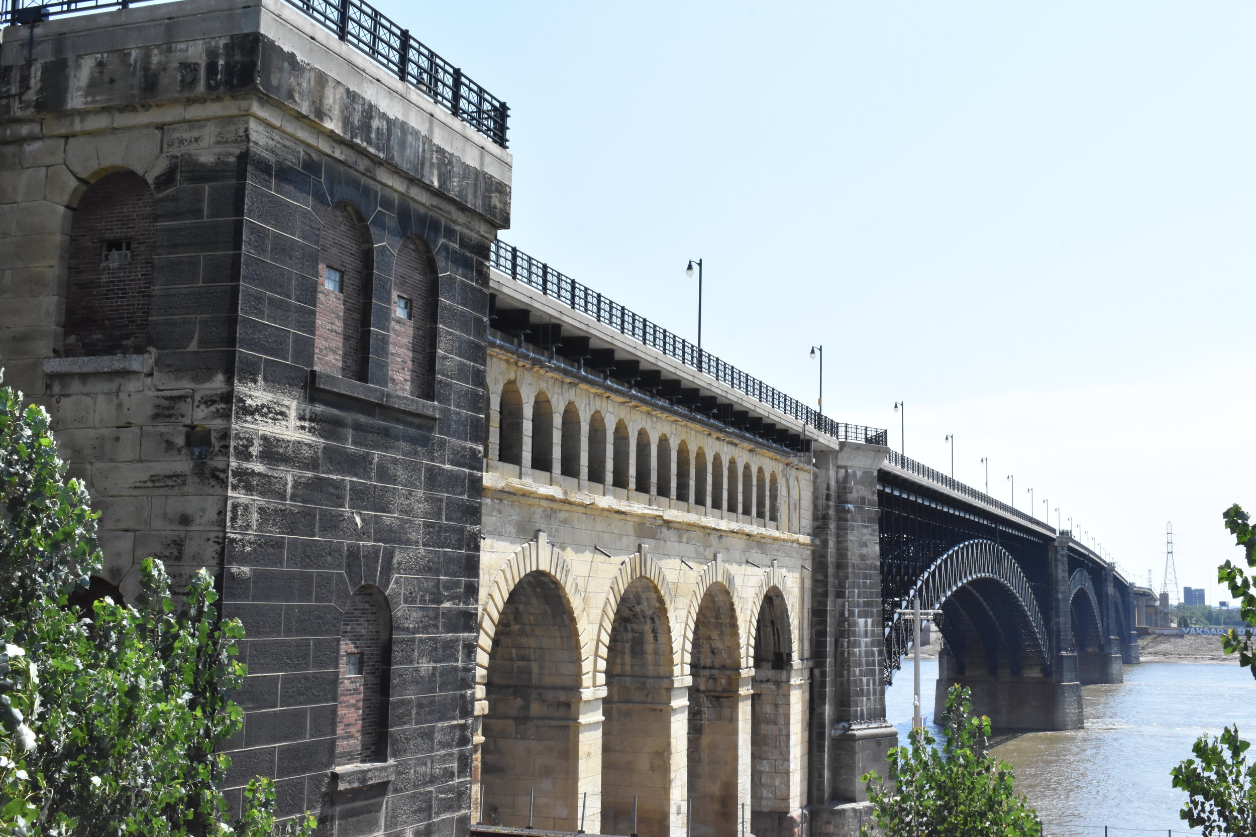
I started my walk at the northern entry right off of Leonor K. Sullivan at the Eads Bridge.
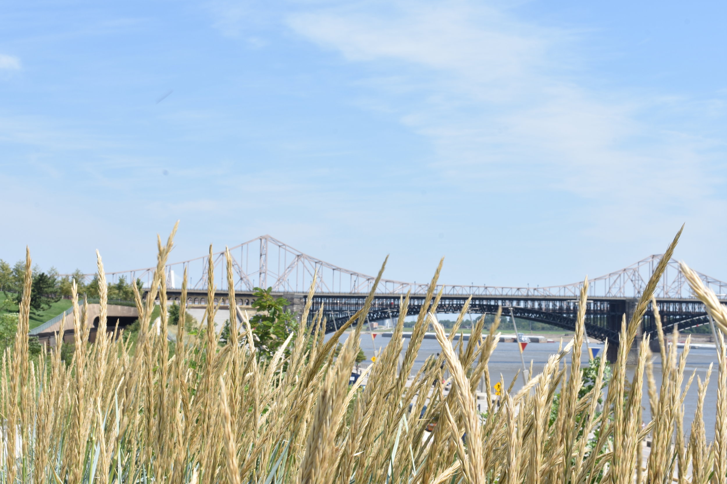
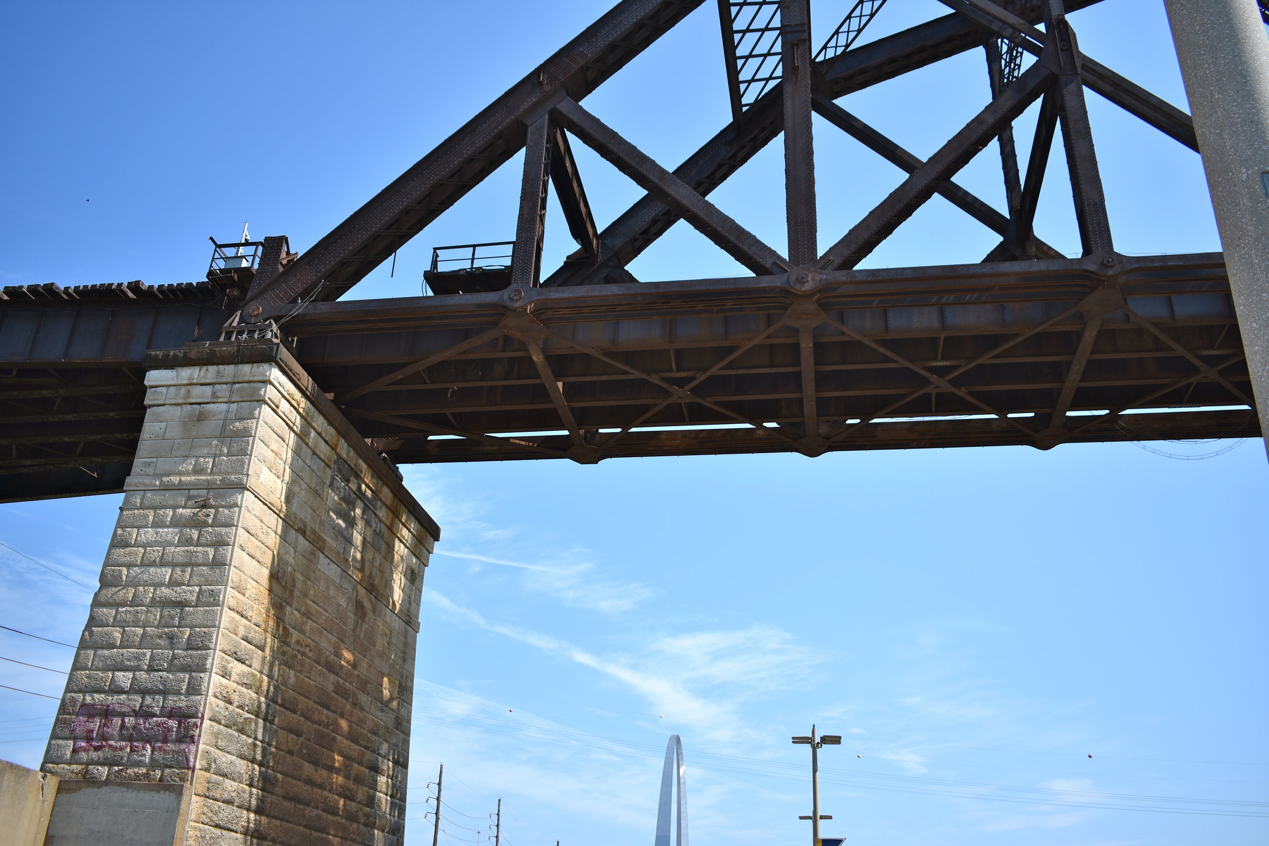
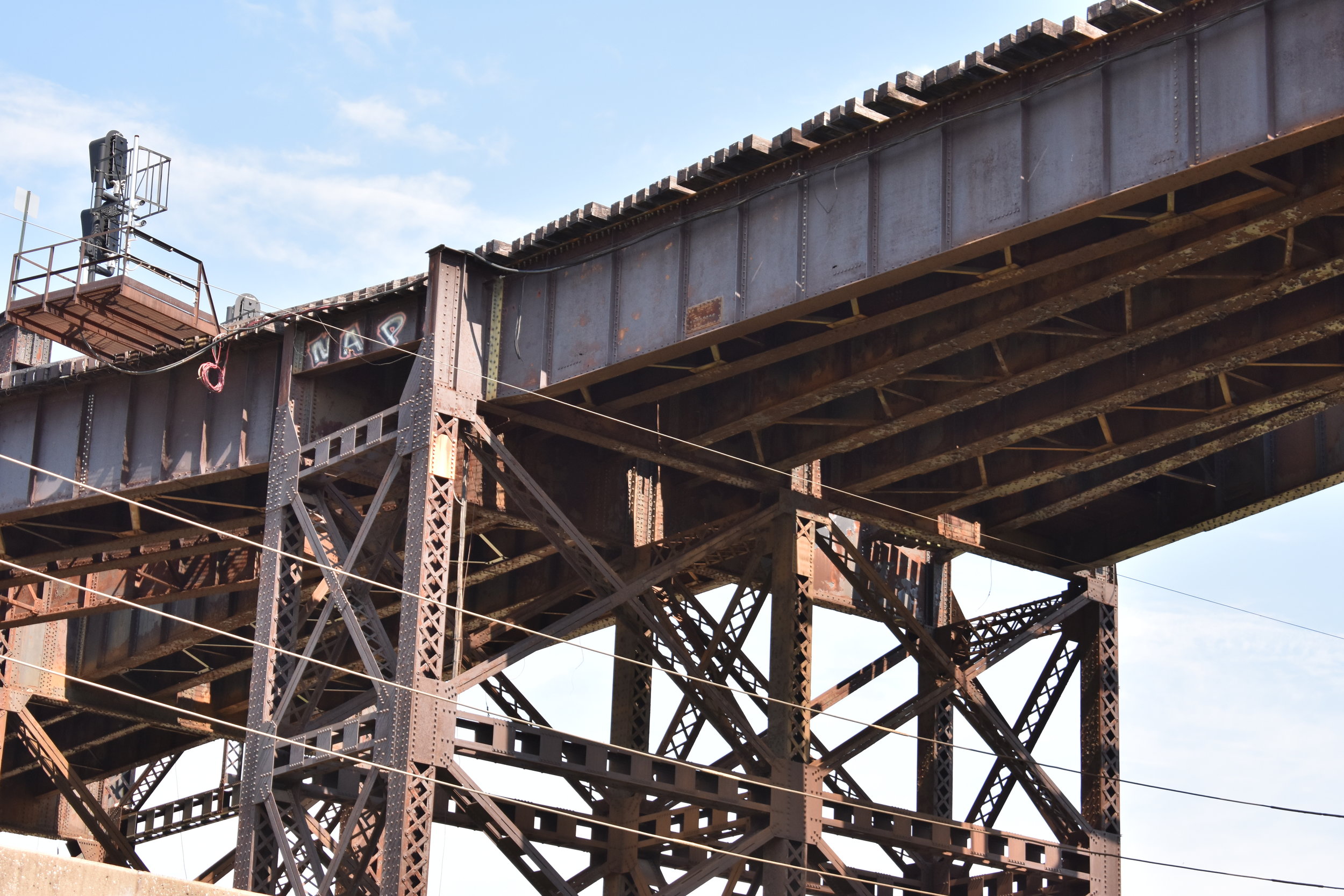
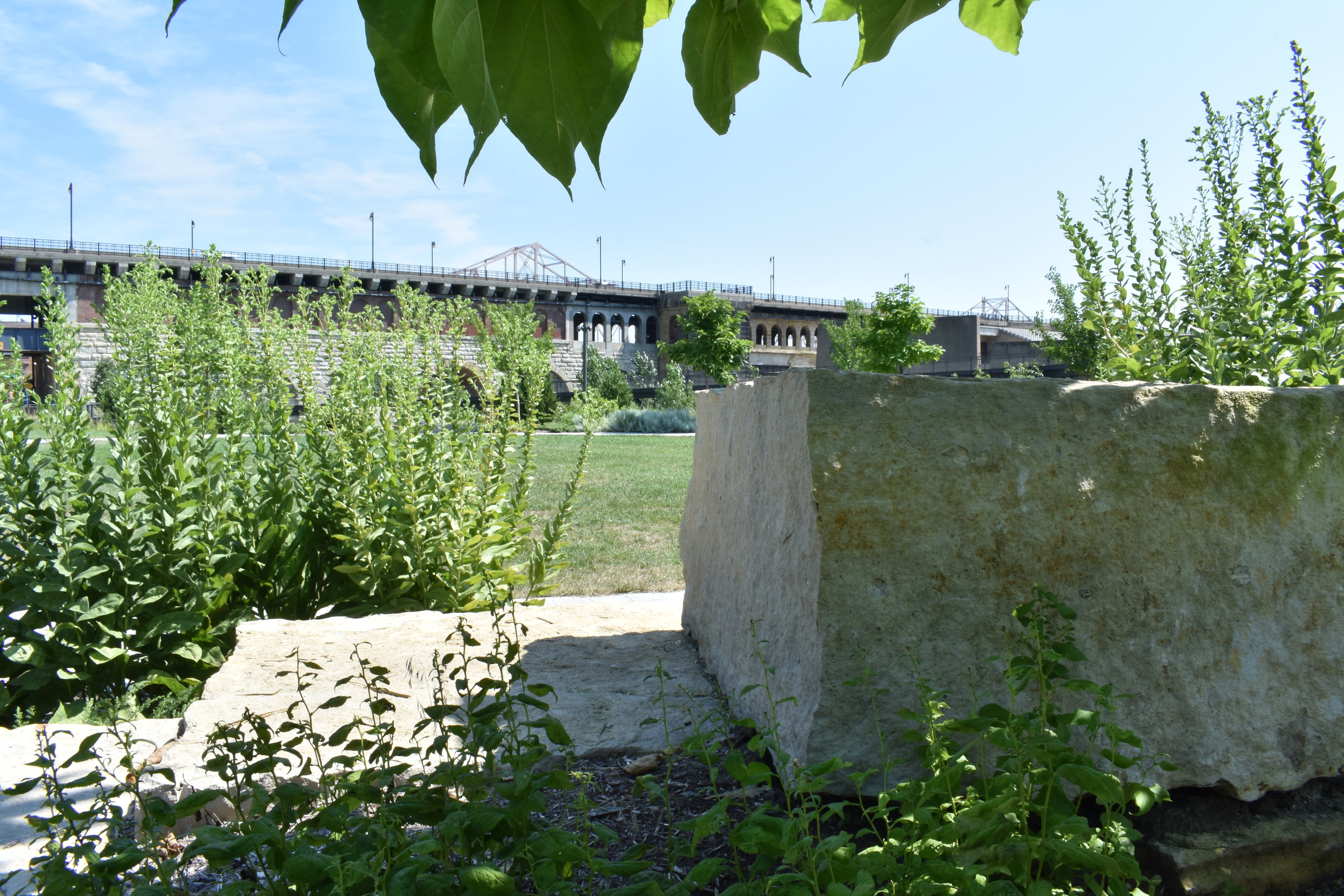
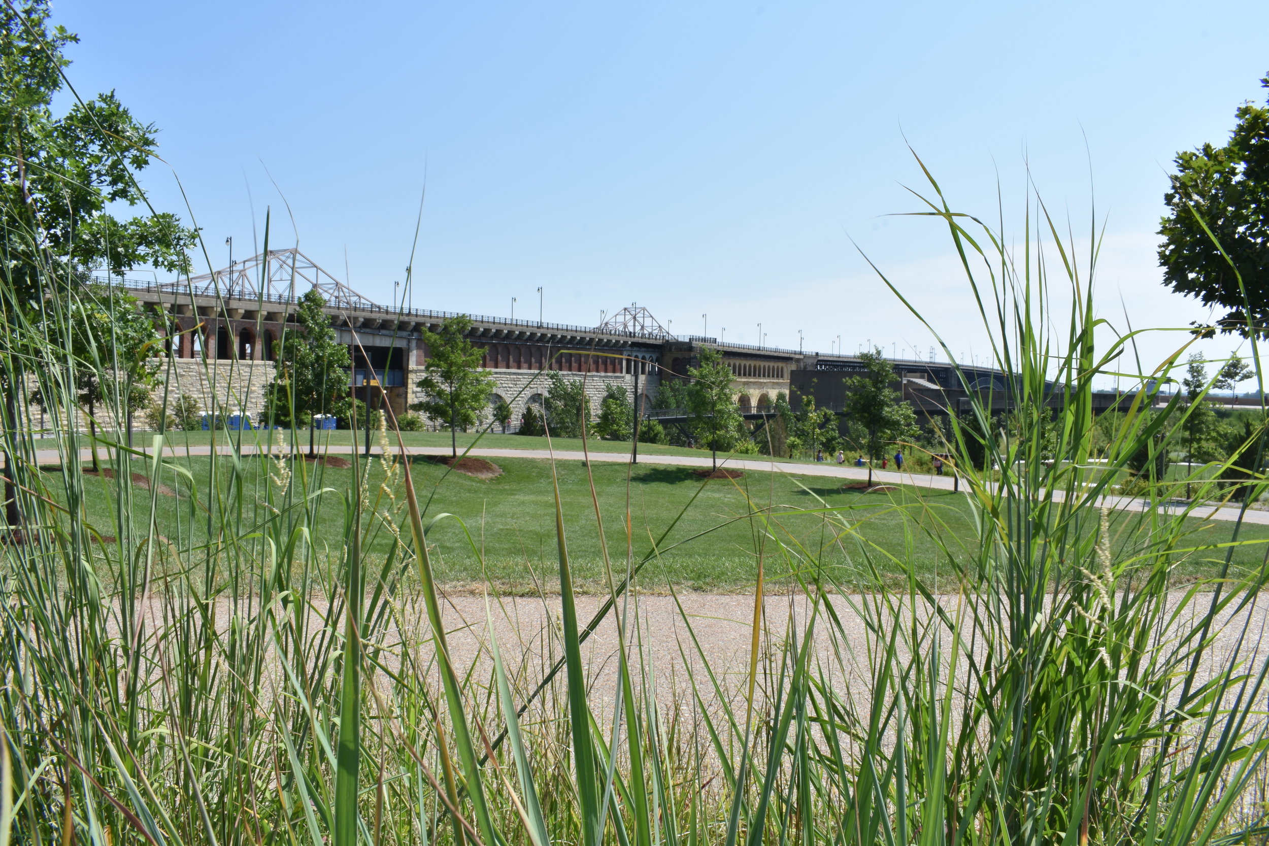
Wow, the Eads Bridge is a prime example of form and function...American beauty at its best.
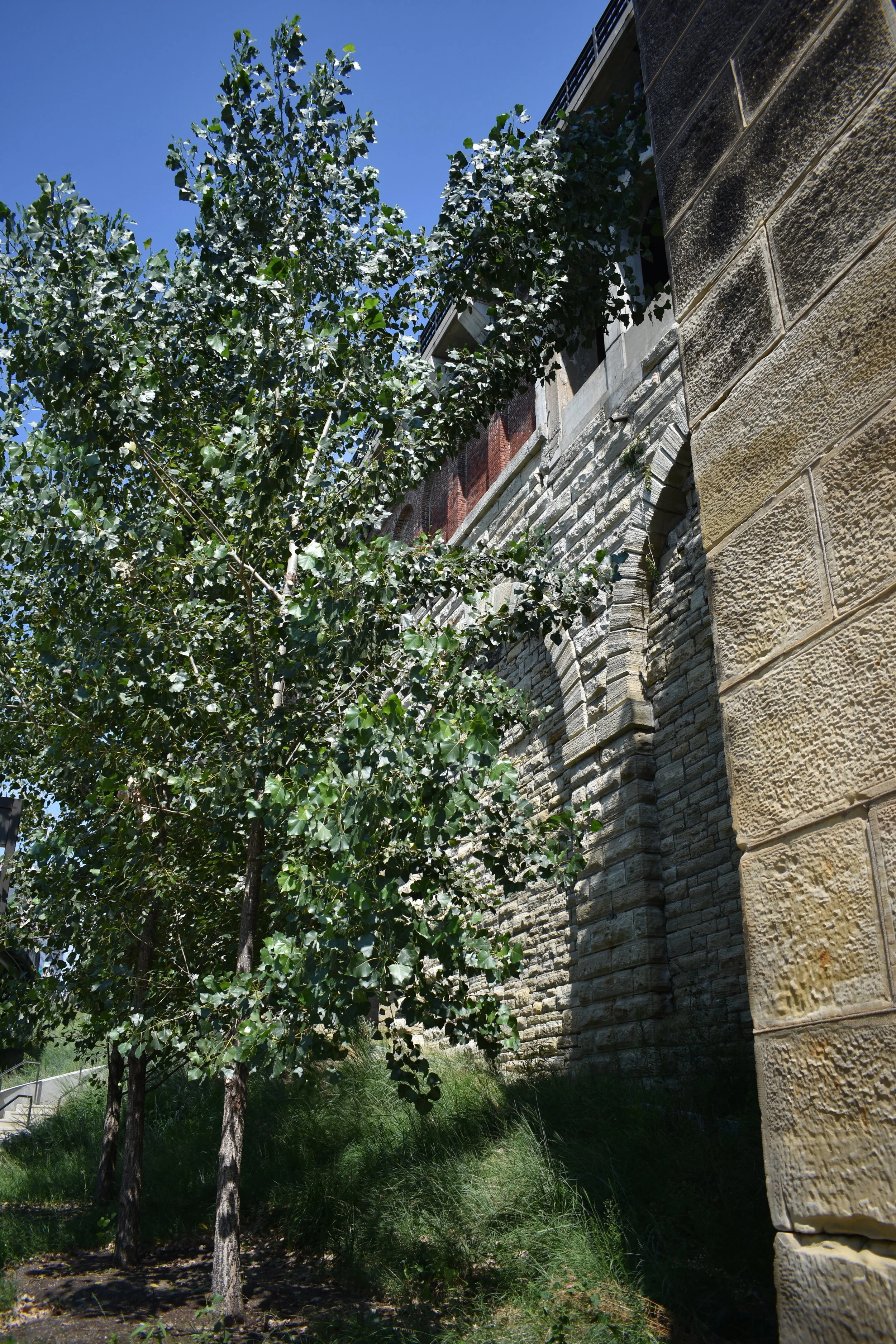
The new, more native/wild landscape hugs the bridge as you enter.
You have to traverse the elevated walkway which provides sweeping views of the bridges, riverfront, Downtown, open areas for gatherings, Laclede's Landing and of course the Casino Queen.
The berms that make the public space for future programming has a nice feel complete with shade afforded by what seems like a fully realized landscape with semi-mature trees ($380M will get you that...no twigs here).
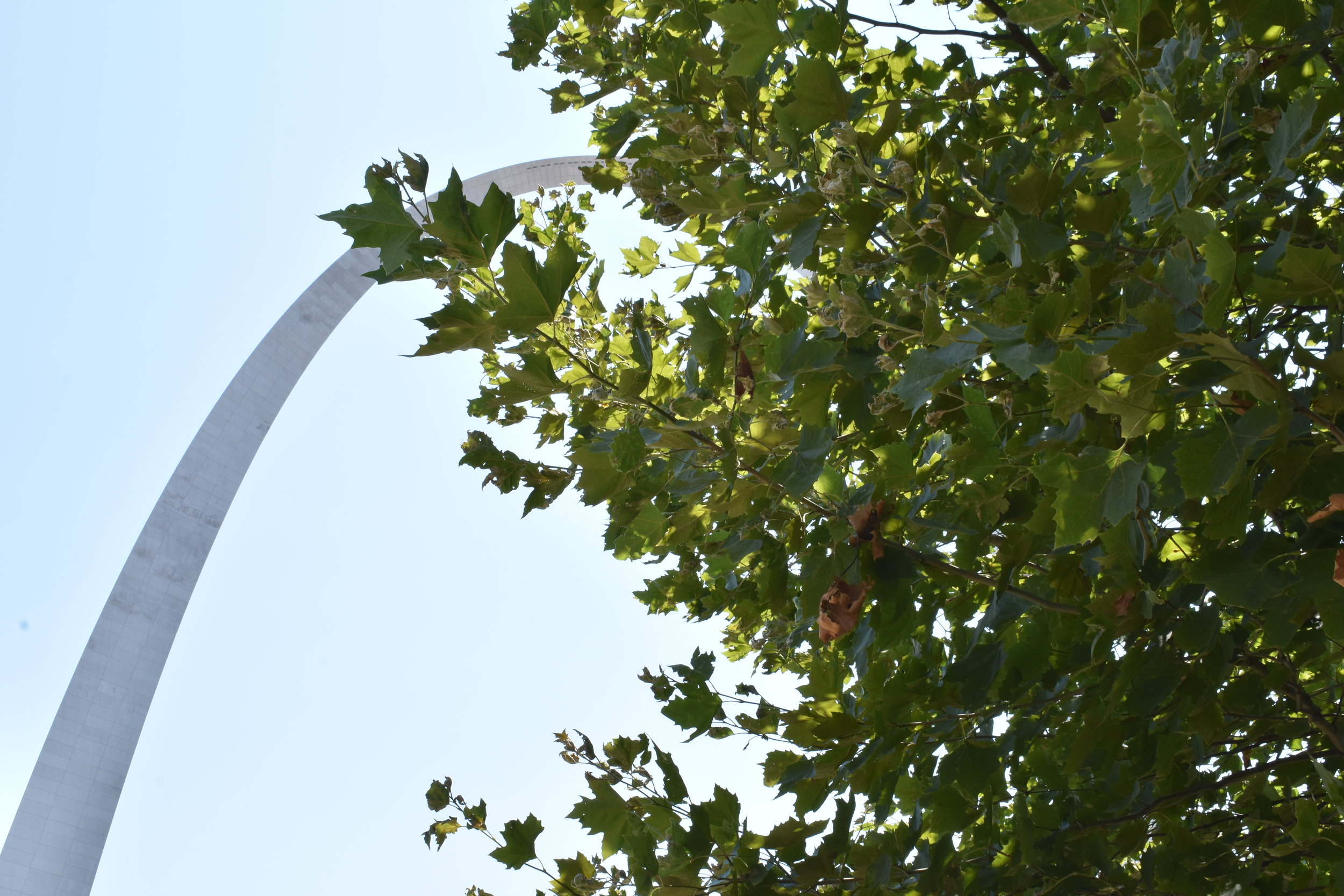
The familiar walkways that lead to the Arch are lined with London plane trees and it looks uniform and crisp even if single-species plantings are risky, it looks great.
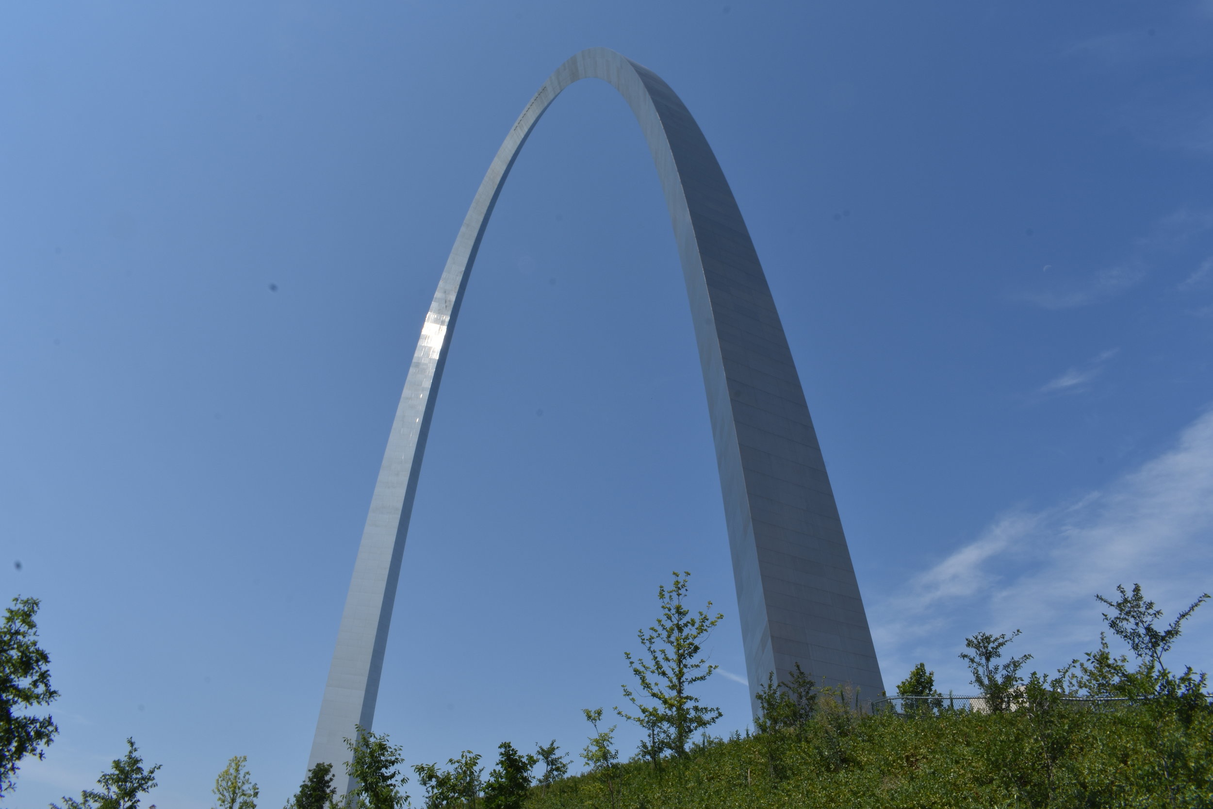
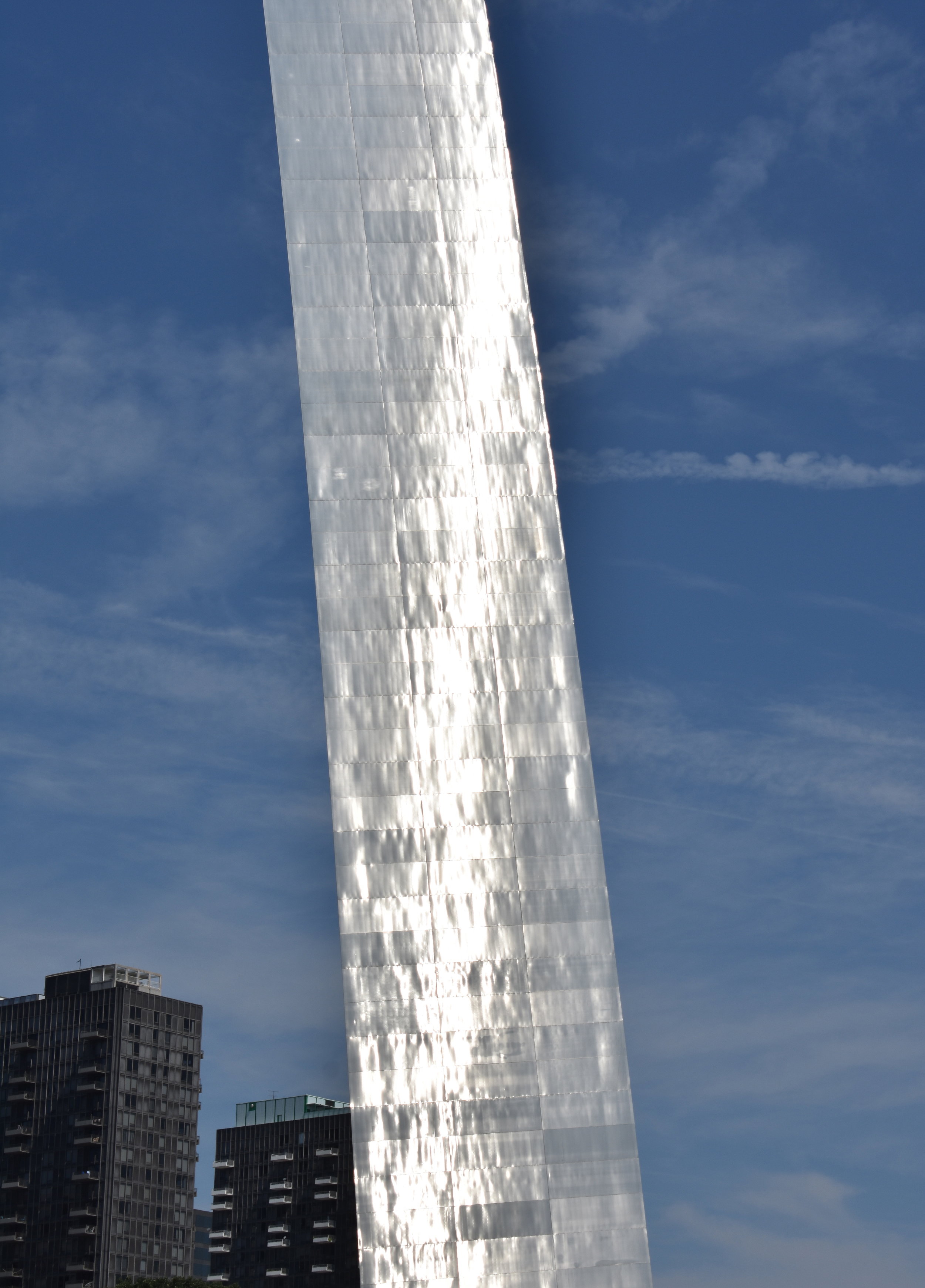
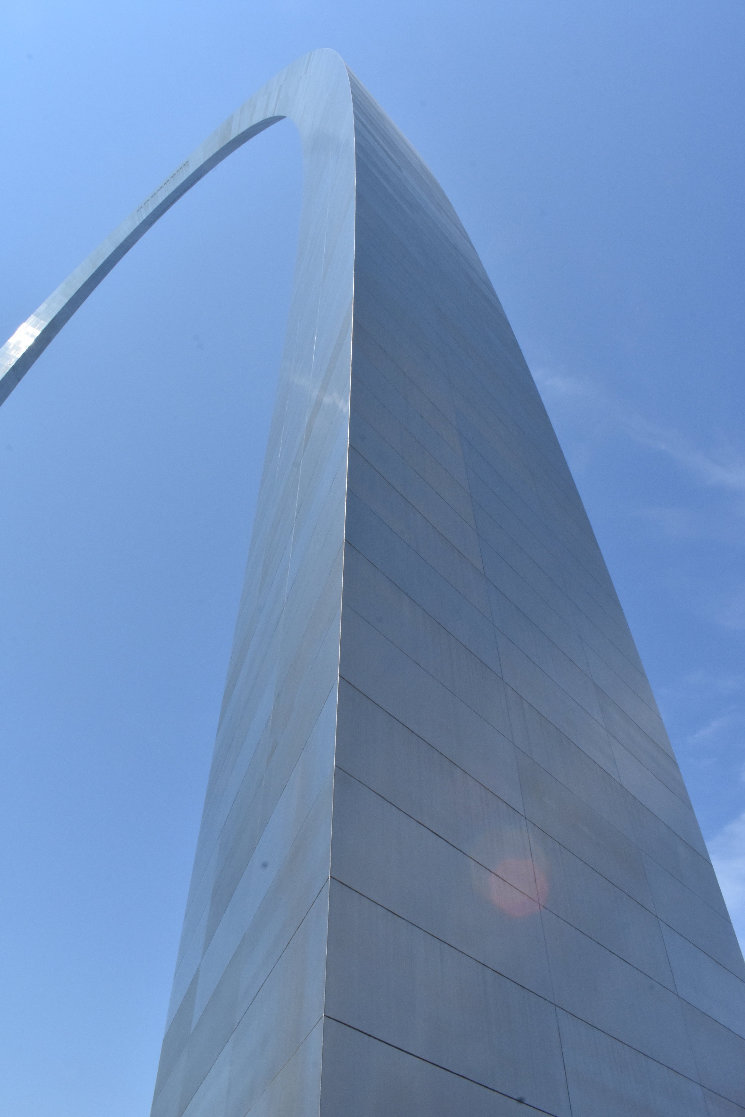
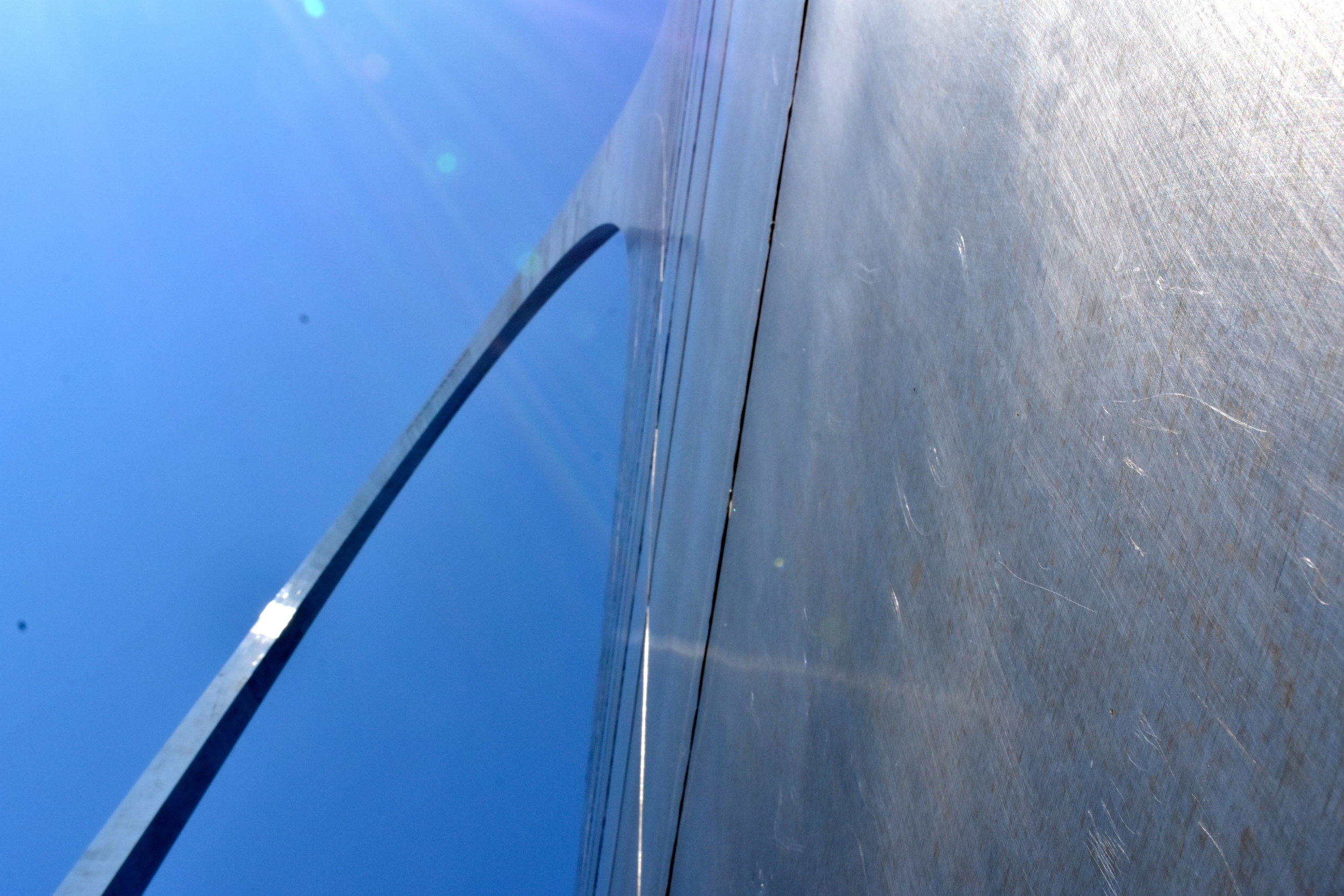
The Arch is an American icon and is indescribably beautiful. It is fun to walk around and take it in from all angles. No matter the impact of the sun or season, it changes every time you visit. It's a true work of art.
We are lucky to have this monument and National Park on our doorstep, and the elevated bike/ped lanes, museum, lid and north side are improvements. The south side will hopefully see much investment in the future to bring people to the other half of the grounds.
